HOME | DD
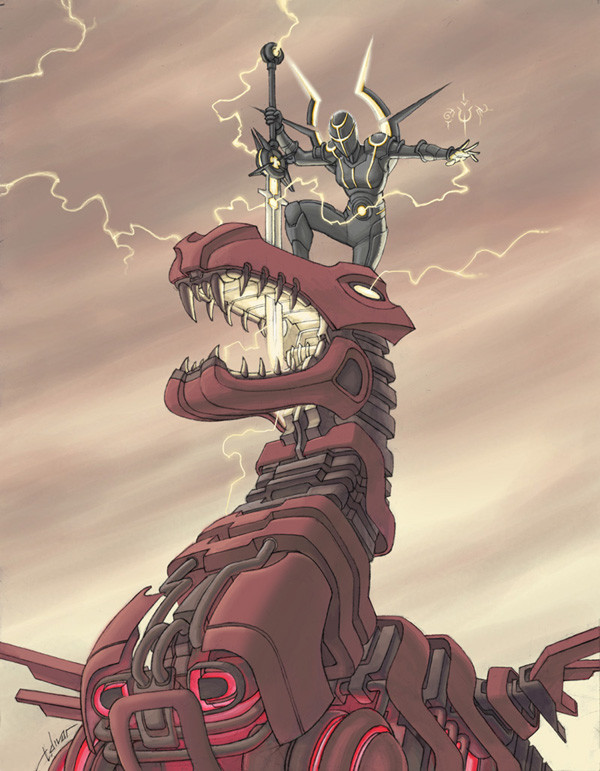
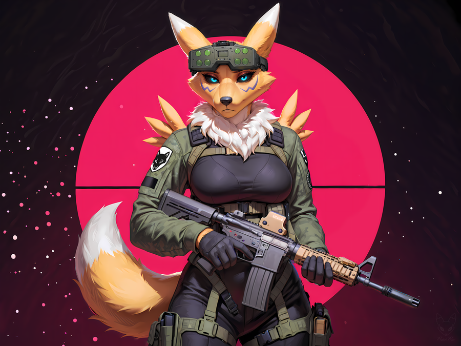
 warp-zero — Cyber Style Paladin vs. Dragon
Published: 2007-07-30 05:15:55 +0000 UTC; Views: 8044; Favourites: 97; Downloads: 0
Redirect to original
Description
So, I finally got my own Wacom Cintiq. This drawing was the first thing I colored on it. (with photoshop about 2 months ago) I did it in like, one long late nighter. It was to be sent off to a printer to be made into prints that weekend.Being really rusty with photoshop...and working late at night when everyone is sleeping so I couldn't call up some more experienced buddy of mine to ask questions.....I made a lot mistakes. But here it is anyways.
Final thoughts: Hmmm....I was kinda going for something and it ended up looking like this instead. Quite frankly, I'm not too thrilled with this piece. The composition isn't particularly exciting, the dragon design isn't really all that cool, and my coloring on it is just ....eh....
Its good practice though. Slowly but surely I'll get better. Maybe I'll redo this piece as an exercise someday. Until then, I'll throw it up here to help populate my tiny gallery.
 (Smile)")
Related content


Comments: 16


")
Nice concept, and I think you should have another crack at it, but it lacks dynamics or kinetics in the action, and feels rather 'flat'. The dragon does need resdesign, but you also need to give both characters some form of movement. Maybe have the paladin posed off his feet as if he's just jumped down with the his full weight to get the sword to pierce, or alternativerly have him barely clinging on to the side of the dragon's head as he drives it into the dragons eye and have thd dragon recoil in pain or it's death throws.
As for the dragon design itself:
1) The chest should be smaller, it dominates the image.
2) The neck could be more segmented, longer and have a more flexable design.
3) Wings could be made to look bigger, or give some indicationn if it can fly.
4) (A personal one) I'd probably had added a row of spine or spike along the back of the dragon.
Having said that your a better artist then I could ever be. I wish I had half as much talent in drawing as yourself. Please don't take it to heart, it's only a personal take on the piece, and as they say opinions are like arseholes...we've all got them.
👍: 0 ⏩: 1

It just so happens that I agree with all your points. That's why a re-working of this piece is on my list of drawings to do (some day in the future). For the very same reasons you pointed out, I am not thrilled with this piece.
Heh heh...I almost didn't put it up. However, at the time, not much was in my gallery. So I put it up anyways. Should a window of time come around where I'm in the mood to do this piece again and post it here, it should be fun to look at both versions side by side. See if I learn from my initial mistakes.
Thanks for taking the time to write out your points. Much appreciated.
👍: 0 ⏩: 0

Mindbending man, mindbending. I'm often the same way with my written work, the longer I take a look and re-read it the less satisfied I am. I think that's because we grow with every line we sketch or write and sometimes, aside from some cleanup and grammatical correctness, the best thing to do might be to just start with a fresh paper and direct that energy that would go into a rewrite\rework into a new work. Just my humble opinion
👍: 0 ⏩: 0
Thanks everyone for the encouraging words. I'm glad you guys like the artwork despite my slight disappointment in its results. I guess its one of those cases where the artist can't stop fussing over his own creation. Its rather odd. The first couple days after I finished it I was rather pleased with it. But the longer I looked at it, the more I disliked it. When I say "dislike", its not like I'm loathing it or something. I'm just not in love with it. That's all. I mean, I think its okay. I just had something different in my head when I started on it.
You know how a piece of artwork "takes" you to different places as you work on it? Most times, your own skills steering it toward a desirable outcome. Artists talk about pleasant surprises on the way. Happy accidents or a bit of their right brain getting in the zone and kicking out something sweet. Well, with this one...due to being in a slight hurry, I didn't have time to properly "steer" this one to where I REALLY wanted it to go. My mind never got in the "zone". The final result is sort of what I wanted but not directly on the mark. So basically what I'm saying is, my personal feelings on it come from the fact that I just wanted it to be closer to the image I had in my brain.
So why put it up at all? Well, my gallery was looking rather sparse.
Anyways, back to the drawing board.
👍: 0 ⏩: 1

Honestly dude, I think every artist feels this way about their work. I could be wrong but I know that, more often than not, I despise my stuff. You just have to get past that and throw it out there anyway. I kinda feel like if you ever grow to be happy with your work and fall in love with it you might as well hang it up because that's when you become complacent and stop progressing. At least that's my theory on it. Alright enough with the philosophy... I think it's cool! Do more!
")
👍: 0 ⏩: 0

Awesome work Tim. Nice to see ya post something.
👍: 0 ⏩: 0

Great pose, nice colors. Don't be hard on yourself! This is excellent.
👍: 0 ⏩: 0

You're not giving yourself enough credit. It looks great!
👍: 0 ⏩: 0

That's really impressive.
I'm planning on buying a cintiq someday, when I have the money.
👍: 0 ⏩: 0

very nice, i like the dark yet clean looking colours
👍: 0 ⏩: 0

I think it came out great! Imagine what Maduro would look like with all this new technology at our fingertips.
Always good to see more stuff from you.
👍: 0 ⏩: 1
Ooooo... 
Anyways, thanks Phillybee and Sideshowmonkey for the kind comments.
👍: 0 ⏩: 0
