HOME | DD
 Wen-M —
Metatron
Wen-M —
Metatron
Published: 2004-09-23 15:03:20 +0000 UTC; Views: 156024; Favourites: 2992; Downloads: 28977
Redirect to original
Description
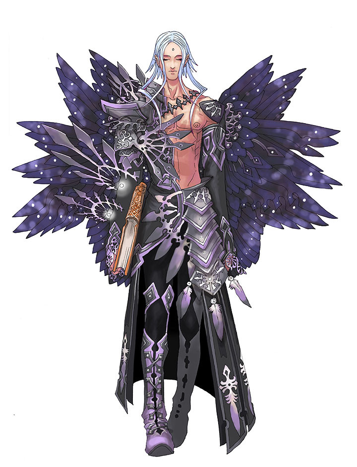
The concept was, he is tall and wise.So hes tall, and has a book (wise...hahahah)
2 hour drawing, 2 hour coloring, i had a hard time coming up with a color scheme. i still dont like the colors for the outfit much but i liked the wings.
Related content


Comments: 697

@_@ reminds me kinda of trhe drawings that are for War of Genesis III and Magna Carta @_@...The character design is wonderful i LOVE how you color @_@ *bows down*
👍: 0 ⏩: 0

I really like the positioning of the feet and the feathers are cute too. Verreh nice.
👍: 0 ⏩: 0

Frickin incredible as usual. You have a really interesting style that holds itself up even without a background. In fact, a background might fight the whole thing and lessen it's appeal. To have characters that can survive on a completely blank, white background is a feat in itself.
Great job
👍: 0 ⏩: 0

This is one fine looking picture you got here. The detail everywhere is just awsome, its even on the book. Mus be slowly walking forward too, with the way his foot is going. Nothing helpful from me, just "Great stuff" and "Damned impresive."
👍: 0 ⏩: 0

man.. i think the colors are great.. although if u are not really satisfied with something it means u can do better  (Wink)")
👍: 0 ⏩: 0

You are a great ARTIST, Estoy celoso!!! ; )
👍: 0 ⏩: 0

I love his wings too. ^^ Great character design
👍: 0 ⏩: 0


aniki, how do you draw so fast!!! *cries*
👍: 0 ⏩: 1

it took me 4 hours, thats not fast at all @___@
👍: 0 ⏩: 0

Yep the wings are great but they loose a little bit when you use that colour scheme.
👍: 0 ⏩: 1
yeah, its too dark but i seemed to like it, i think its cuz it resembled a night sky, more so when i added the white dots on it. XD
👍: 0 ⏩: 1
Oh, I said it looses a bit. I didn't said I don't like it at all!
")
👍: 0 ⏩: 0

That is gorgeous. I love the wings so much.
👍: 0 ⏩: 0

I enjoy looking and the symmetry of the silver shards on his right arm and the wings are a beautiful touch. He looks like a wise angel of solitude.
👍: 0 ⏩: 0


Hey there! I think this is one of my favorites. Of course, I love *all* your angel/demon pictures, so I don't think this helps much.
👍: 0 ⏩: 0

it's Metatron!!! *applauds* Hmmm... black and purple don't seem like angelic colors, though. Although i am digging the purple wings. Someone who hangs around God so much should be a bit more.... shiny. White and gold would probably be boring.. although with your mad skillz.. who knows?
👍: 0 ⏩: 1
I had the same doubts as you, however i dont want too many bright colored angels. I already have like 3 or 4 that are soft and bright colors =\
that was the reason why i had a hard time coloring him, a part of me demanded bright colors for him.
")
👍: 0 ⏩: 1
Maybe something cool like gold and red.. or better yet.. red to go with the deep purple you have there. Nothing too bright but still.. not to dark and subdued either.
Just thinking out loud.
👍: 0 ⏩: 1
I actually tried Red but the contrast was not to my favor. Damn dude, we think alike color wise, huh LOL
👍: 0 ⏩: 1
what? I think like the great Wen??!!
Honor!!!!
👍: 0 ⏩: 0


i love it O.o
and i like the colouring, even if your not pleased with it...
👍: 0 ⏩: 0

Bellicimo! See, this is why I'm Devwatching you. You churn out beautiful images like this, and all I can do is 
👍: 0 ⏩: 0


Amazing.. I love You colouring...
Best wishes, Ren
👍: 0 ⏩: 0

oh, I love the motion in this. ")


👍: 0 ⏩: 0


👍: 0 ⏩: 0

Beautiful colors in this one. *__* Also if you want to make him even wiser than book-carrying, I hear glasses do wonders for one's intelligence.
👍: 0 ⏩: 1

He looks not only wise but kind, in spite of all the dangerous sharp looking armour.  (Smile)")

You did fine on the color scheme. It looks appropriate for this character.
👍: 0 ⏩: 1
hahahaha, cool.
a nice comment. XD
👍: 0 ⏩: 0

This is the 2nd pic of Met I've seen in 2 days. I like this one better. 
Why do wise ppl always look so sleepy?? 
👍: 0 ⏩: 1
I was just lazy to make him look different so i just made him closed his eyes ROFL
hahaha
👍: 0 ⏩: 1
the wise man finds that any time is a good time to nap. 
or at least that's what fortune cookie say.
👍: 0 ⏩: 0

wow! that's absolutely beautiful! great job! *runs off to draw*
👍: 0 ⏩: 0

wow. the design is amazing. do you come up with it as you draw, or is it already in your head when you sit down to draw it? oh, and one more question- how long have you been drawing for?
ps. i love the ends of his sleeves!
👍: 0 ⏩: 1
Metatron had two previous sketches.
It takes a while to come up with the concepts in my head, I usually read what would help me come up with the idea and then let the idea grow in my head. when the time is right, i just put it on paper.
👍: 0 ⏩: 0

Okay, this is very cool. I always love how, near the bottom of your pieces, or wherever you have someithing more in the background than the foreground, the colors fade to neutrals. VERY stylish and awesome! As for metatron, okay, honestly when it said metatron the words "transformers, robots in disguise" popped into my head.....is that bad? LOL
👍: 0 ⏩: 1
haaahaha, yeah, i had to type slowly to make sure i wasnt typing megatron XD
👍: 0 ⏩: 0


I think the purple/grey colour scheme works quite well. Personally I think he would look cooler without the wings but i'm nitpicking here. Amazing pic for 4 hours work! Kind of reminds me of Hyung Tae Kim's (sp?) work.
👍: 0 ⏩: 0

Yep, the wings are fantastic. As are the details on his armor. You're really good with this type of designs. (And I think the colors are pretty good too
👍: 0 ⏩: 0

this is absolutely amazing...i love it. the whole demon/angel series thing you are doing is inspiring to say the least. i cant wait to see what else you come up with.
👍: 0 ⏩: 0

dude!! i have no idea why you don't like the colors.... they're sick man!! and sick in the good way!
👍: 0 ⏩: 0

oh wow awesome! I love the coloring the design and the detail is always so clean and amazing!
👍: 0 ⏩: 0

Just when I think that you've done the best artwork around, you go and throw me for a loop! Awesome work! 2 hours drawing? do you ink? or just pencil?
👍: 0 ⏩: 1
<= Prev | | Next =>