HOME | DD
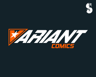
 whitefoxdesigns — Variant-Logo
by-nc-nd

#brand #comics #crest #design #logo #star #variant #v
Published: 2017-03-02 16:00:04 +0000 UTC; Views: 998; Favourites: 31; Downloads: 0
Redirect to original
Description
This logo belongs to , all rights reserved. Please don't try steal it.Related content
Comments: 14

Really well done! I like how you arranged everything
👍: 0 ⏩: 1

Ya know, I've started using your design an inspiration for a lot of my university work
Really awesome logo man!
👍: 0 ⏩: 1

Thank you!
Really? I find it hard to believe. I feel I still have a long way to go and teacher usually prefer more technique and classic work.
👍: 0 ⏩: 1

Well I'm not sure what they're actually asking for. But overall all ur work is quite convincing and emotive. It always looks like what it is talking about (if that makes sense, lol).
Plus it's not Kitsch or overly simple (which is what my lecturers always seem to like). There's enough elements to create a strong personality, but it's still simple. I can't think of how to make something more "comical" than this is, and still look so classy
So well done, the teacher is probably not looking from the same point of view as me. Personally the emotional persona is the biggest thing, and this would bring that across even if all the elements are jumbled up and unreadable... it just has that "thing" lol... ya know
👍: 0 ⏩: 1

Well, teachers usually say abstraction is important in logo design. I think it's more important that people understand what the logo is about than making it memorable because people couldn't understand it the first time.
👍: 0 ⏩: 1

Well, abstractions can work and can leave a person wondering... but maybe that's not what you want, I mean, but what's the point if you don't know what it's saying right?
...besides, this looks pretty memorable to me
👍: 0 ⏩: 1

Exactly. I feel abstraction is a cheap way to grab attention in many cases. And in the good ones, it's very difficult to achieve.
👍: 0 ⏩: 1

Agreed, it's what I use when I don't know what to do >u<
👍: 0 ⏩: 0


