HOME | DD
 WhiteRaven92 — OS X Leopard for Rocketdock

Published: 2008-01-29 23:37:59 +0000 UTC; Views: 78807; Favourites: 91; Downloads: 29524
Redirect to original
Description
Oh boy, another Leopard skin!This is the fixed version that doesn't look stupid when used with tiny icons. Even so, I don't recommend using this with your icons below 32x32. Still, it's your dock, enjoy


Related content
Comments: 22

👍: 0 ⏩: 0

does this include icons because mine didn't chANGE?
👍: 0 ⏩: 0

Love it! Downloading and installing now. 
👍: 0 ⏩: 0

nice! icon's cool,i'm just here making my pc look like mac osx 10 .5 and it's all most like the real thing .
👍: 0 ⏩: 0

nice dock
but one thing that bugs me
and that is can you guys create something original for windows
i mean can u guys stop trying to mimic the mac(i know it looks coll but how about somethinng that looks better than windows...we r windows users rite???))
i hope u guys know what i mean
but i love this dock style.it looks gr8
👍: 0 ⏩: 1

i will put out TIME vs's sometime after christmass, when i get stylebuilder. it will be completly different from mac, pc, linux, xp, everything. but it will be based on a mac vs for win7, though.
👍: 0 ⏩: 0

For some reason, the front of it (which makes it look three dimensional) is below the screen when edge offset is 0. I have to set it to 5 px for it to show. The indicator I use, which looks best with a dock that has a "front" like the one in this preview, is moved too far up and thus still looks weird. Think you could do something 'bout this?
👍: 0 ⏩: 0

looks great. i didn't like the seperator, so i just replaced it with another 1 that looks like mac
👍: 0 ⏩: 0

can u make a version with a ''leopard like'' separator? thanks man!
👍: 0 ⏩: 0

Ps : Could you think about a version with the wave instead of this straight effect . I mean, like the original running on leopard ?
👍: 0 ⏩: 0

As you said , a good one to use with tiny icons ! The inclinaison is pretty good as well . Thanks . Add to Fav
👍: 0 ⏩: 0

Beautiful! I'm using it right now, thanks so much
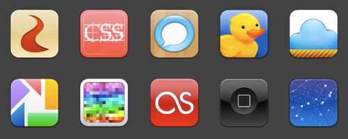
Also, what are the 5th, and the 8th through 15th icons?
👍: 0 ⏩: 1

Icons from Leopard. I found a download pack of a bunch of them, I don't remember where, though. Try searching Winmatrix.com or Aqua-soft.org. I think I got 'em from one of those.
👍: 0 ⏩: 0


