HOME | DD
 willwill100 — Interpid Ibex Mockup Part 2
by-nc-sa
willwill100 — Interpid Ibex Mockup Part 2
by-nc-sa

Published: 2008-08-02 18:16:06 +0000 UTC; Views: 249848; Favourites: 320; Downloads: 10164
Redirect to original
Description
This is a mockup for the new Ubuntu release Intrepid Ibex. If you like the designs please please email the Ubuntu design team to try to get a move on with moving Ubuntu into the 21st century. If you don't like some of the things on the design, please comment, i feel moving these kind of designs needs be a real community effort.***
Youtube - live version of part implementation: [link]
***
*** Want this desktop?!?? Find resources below
 (Smile)") ***
**********************************************
So basically, people have been commenting about a) how they want to use this theme and b) how it's infeasible which i find a little silly really, since i've been using it for a while now and im quite happy to use it so I thought i would share with you. Enjoy
GTK Theme:
[link]
Login Screen:
[link]
(Thanks to DanRabbit)
Wallpaper:
[link]
Dock:
Avant Window Manager (Available in Repositories)
Search Utility:
GnomeDo (Available in Repositories or here:[link] )
PSD Source file:
[link]
Okay.. I wasnt too happy with my emerald theme part of the mockup so at the moment im just using a vista theme :0 but it looks pretty lush so i thought i would link.
Emerald Theme:
[link]
*******************************************
*******************************************
Vote for this theme here: [link]
***
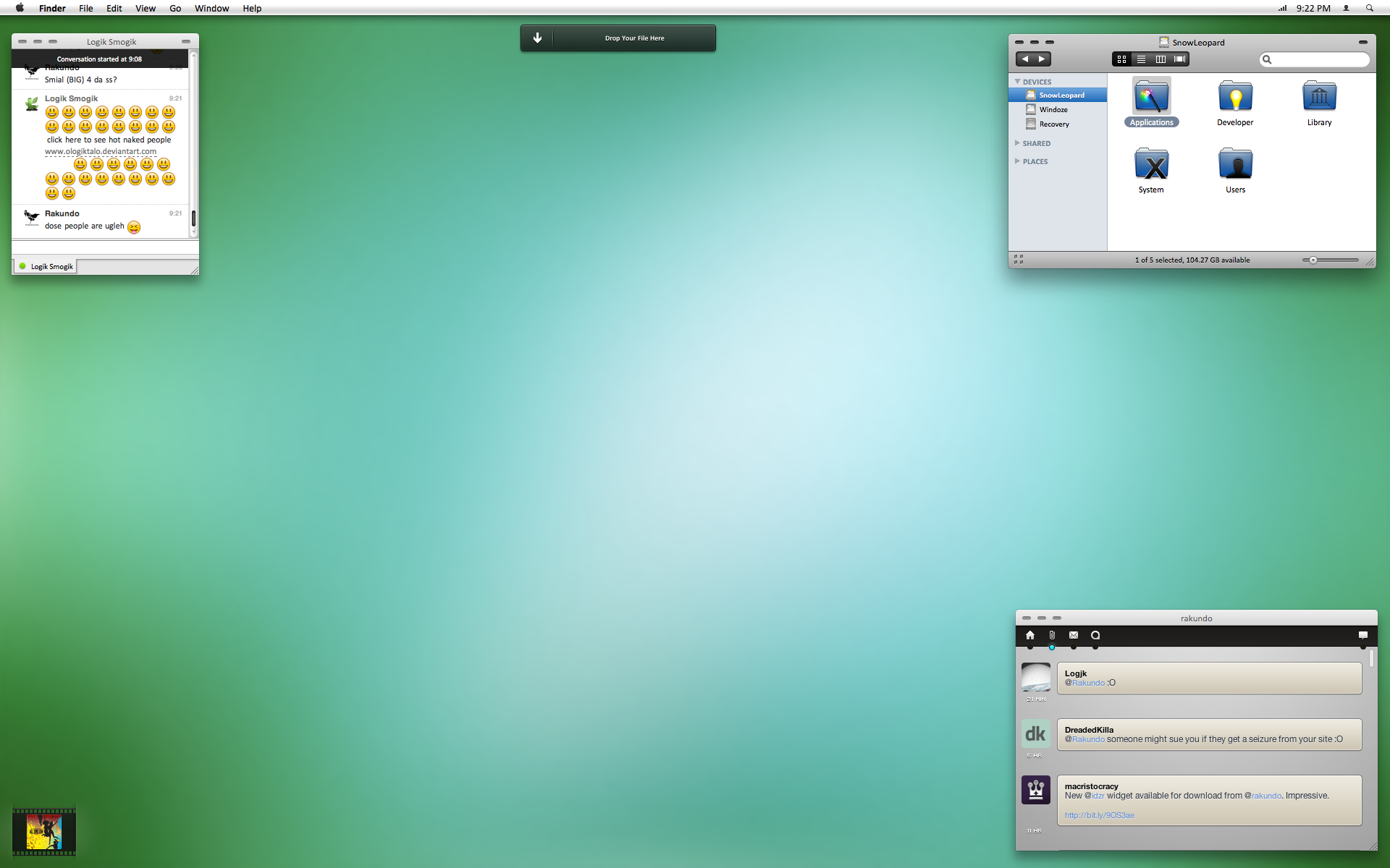
This is part 2 of 3 (featuring a modified GnomeDo)
PART 1: [link]
General Screen
PART 3: [link]
Login Screen
The clock on the right is from Screenlets, the dock is AWN, application in middle is GnomeDo, the music updater box on the right is only a mockup, hope that can keep you going for the moment!
Full size 1680x1050 available on download.
***
YET TO BE IMPLEMENTED! (CALLING ALL PROGRAMMERS!)
# Music Screenlet (which supports Songbird)
# Sleek GnomeDo Theme
Related content


Comments: 149

Its flipping beautiful, but some things feel a bit flat. The white would look better (imho) like this:
[link]
But, anyways. Beautiful.
👍: 0 ⏩: 0

That's really quiet pretty. Like the way you've meshed components of the designs of Vista and Mac OS X to create something just as nice on the eyes.
👍: 0 ⏩: 0

Awersome !
Is there a way to get and install this theme. I don't want to wait for using it. It's the best theme I've ever seen !
👍: 0 ⏩: 0

Some thoughts of mine (copied from Ubuntu Forums).
The positive:
+ Looks absolutely great.
+ No trace of the old Windows 95 'gray squares' style can be found.
+ Wallpaper is very tasteful and non-intrusive.
+ Even though it uses a lot more advanced functions than the current layout, it's simpler.
+ My first spontaneous reaction was that this was an operating system I would like to use.
The negative:
- I'm not sure if Canonical and the Ubuntu developers are comfortable using AWN, Screenlets and GnomeDo by default. Though they could be implemented like Compiz Fusion is today (only activated when proper video drivers are loaded).
- Some things are very reminiscent of OS-X and Vista. This could cut both ways. People could look at it and think "It's typical of Linux to copy others", or they could think "This looks familiar, I could try this out".
Other thoughts:
* I would very much like to see a mockup of something like Open Office or Nautilus.
* I wonder if any current theme engine can recreate that look.
* Mounted partitions should not show up on the desktop as default.
👍: 0 ⏩: 0

Sorry to say, to me it lacks of originality. It looks like a hybrid of Vista and OS X. IMHO, we need to have a unique identity for Ubuntu. Anyway, this mockup is visually appealling.
👍: 0 ⏩: 0

The dark theme does not work. yeah it looks really pretty on the picture but it's not usable, why don't you take a screenshot with firefox open + openoffice ? it looks ugly as hell. U can't just make a beautifull picture and say, there u have it a pretty UI !!
👍: 0 ⏩: 0

If Ubuntu looked like this, I'd be over in a flash!

👍: 0 ⏩: 0


like it a lot... the wood paneling wallpaper is gorgeous.. and that gnome-do looks amazing.
👍: 0 ⏩: 0

very nice, i left ubuntu when i finally got vista recovery disks and have been too lazy to go back, but if it looked like this i most definitely would.
👍: 0 ⏩: 0

Looks good but I doubt ubuntu would take such a drastic change in their appearance. The running theme is African. The name of the os is african. I can imagine a visual style like this being included with a distro but I doubt it would be the default one. I really like this. You should try and get a visual style similar to this into the wild, Im sure it would be popular. Can you make more of these? One visual style like this can be ignored but if you create a whole palette of ideas, elements can be mixed and matched through community feedback until we come up with something thats new but still "ubuntu" enough for Canonical to put in a distro. Just an idea.
👍: 0 ⏩: 0

Ugh. Are there really people who think that good design or "moving into the 21st century" really means trying to replicate OSX with the maximum possible accuracy?
👍: 0 ⏩: 1

Well, Linux distros have generally mimicked other GUIs, but unfortunately to facilitate switching from the most used GUI - that of windows - it has mimicked its pretty unintuitive and ineffective methods. Unless something original is going to come out, might as well copy something well done.
👍: 0 ⏩: 0

If I had money, I'd pay you for this. It's gorgeous.
👍: 0 ⏩: 0

2 suggestions:
1. Vista went with almost a 2x wider "X" for its close icon for a reason. On the middle menu minimize bar, I would make that visually obvious that it is wider than the little drop down arrow. Think ease and graphic polish.
2. The yellow menu backgrounds at the top are a little "old school" even though they're nicely curved. I would experiment with a 50% transparent "foggy" background like you have behind the middle menu selection. You may need to make the text white, but the effect of a "transparent" but intuitive interface is I think what we're after anyway. If that works well, try working with a very light transparent gradient - even try a horizontal gradient with more opacity on the left near the wording to the foggy transparency toward the right.
3. Finally, the contrast below the middle selection that says "advanced graphics editing program" and also "firefox 3.0" below, as well as the "Now playing" and "usb hard drive" should be higher. I see the subtlety you were going for, however as a mass user, something slightly transparent here might work as well.
I do like the overall feel and look, nice job!
👍: 0 ⏩: 0

Jeezus, I honestly really like what I am seeing here. I really hope the developers at Ubuntu take notice to this fine work.
👍: 0 ⏩: 0

looks ok I guesss. But what's with the Word logo, and the mac fandom? surely something that is usable, interesting and beautiful can be created without it mimicing Cuperino?
👍: 0 ⏩: 0


agreed... where is this wallpaper from?
👍: 0 ⏩: 1

Where is this wallpaper from?? (3) pleeeease...
 (Wink)")
👍: 0 ⏩: 0

Please, put Micro in the mockup details..
👍: 0 ⏩: 0

I'd be more interested to see the window/toolbar designs rather than just the desktop.
One of the somewhat overlooked aspect of the default Ubuntu theme is the rather amateur looking fonts/sizing.
We need to mature the current design with more subtle colors while still keeping Ubuntu's recognizable color scheme.
If you want to talk more about your design feel free to email or add me to an IM.
👍: 0 ⏩: 1
I just saw the other mock up's so forget the part about the windows/toolbars.
👍: 0 ⏩: 0


Oh Crap you hit the Digg front page, ")
If Ubuntu made there OS look like this and got some Native Adobe support I would switch instantly.
But until then nice work.
👍: 0 ⏩: 0

makes it look really OSX ish if u know what i mean. I like it tho!
👍: 0 ⏩: 0

Its great -- would be better if we could inspire something as great as the Apple GUI, but looks nothing like it.
👍: 0 ⏩: 0

Oh no, you have been Dugg!
Anyway I like the design a lot, really unique.
👍: 0 ⏩: 0

I love the design, I would only change one thing because it's a fault in my own mind.
Make the wood panel floor a seamless wood design using the same colors, shadows you're working with now.
top notch!
👍: 0 ⏩: 0

Amazing work.. can you make that firefox logo available for download?
totally badass.
👍: 0 ⏩: 0

don't you mean the gnome development team?
👍: 0 ⏩: 0

This is awesome, if ubuntu is welling to make this i will only use ubuntu for life! Very beautiful
👍: 0 ⏩: 0

Man, this is awesome! It's the first time that I see that brown can be good
👍: 0 ⏩: 0

Wow that's indeed great. Even though I personally don't like the Ubuntu color scheme, I'd love to use this one.
Let's hope some parts of this get part of Ubuntu somewhen in the future.
I hate not seeing mockups becoming reality - especially this one!
👍: 0 ⏩: 0


looks good
could you also make one with grey/blue combination
👍: 0 ⏩: 0

Wow, this should be the new ubuntu main theme, even If I hate the default ubuntu theme and brown I would defenitly use this. The colors fit very well!
👍: 0 ⏩: 0


<= Prev |