HOME | DD
 WindowsNET — The ViUltimate Perfect 3.1

Published: 2008-01-26 23:34:47 +0000 UTC; Views: 7079; Favourites: 7; Downloads: 27993
Redirect to original
Description
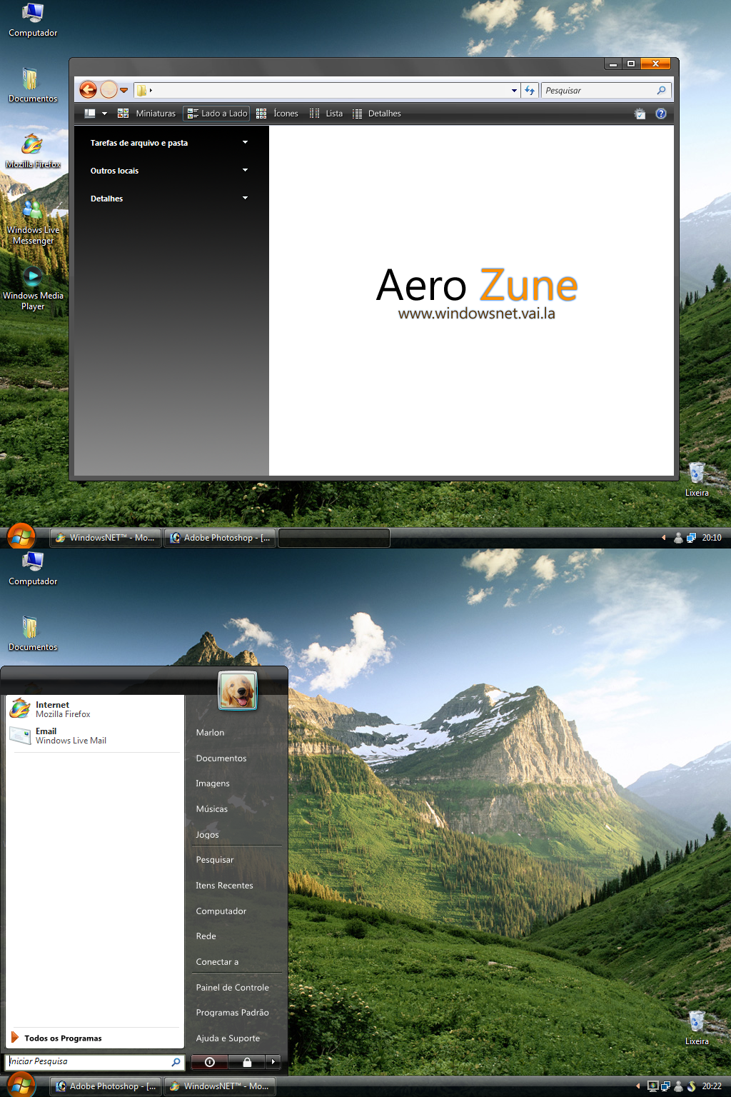
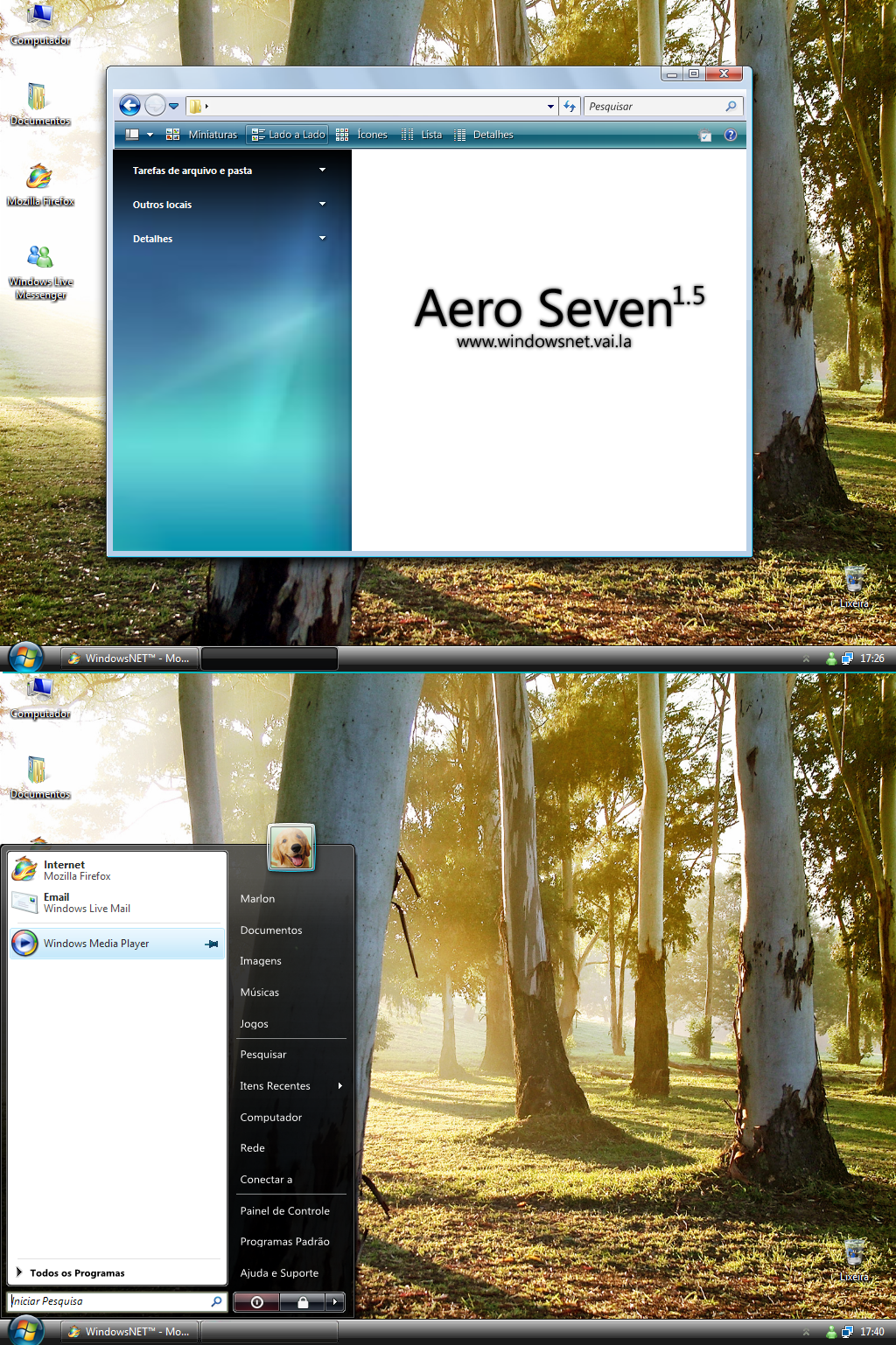
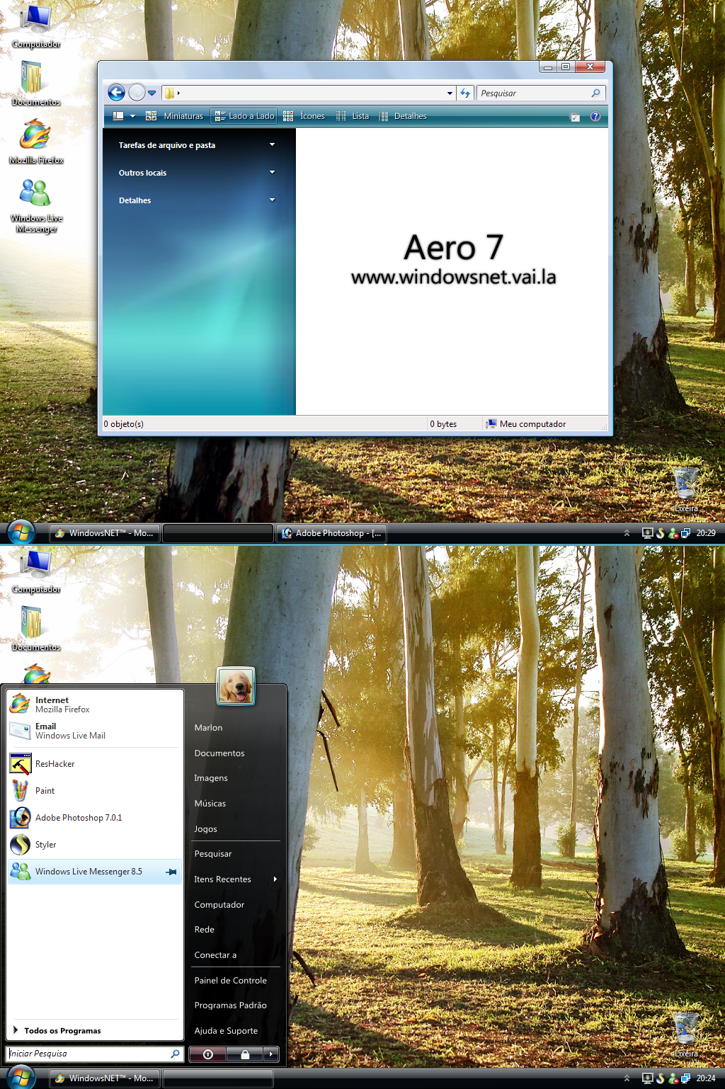
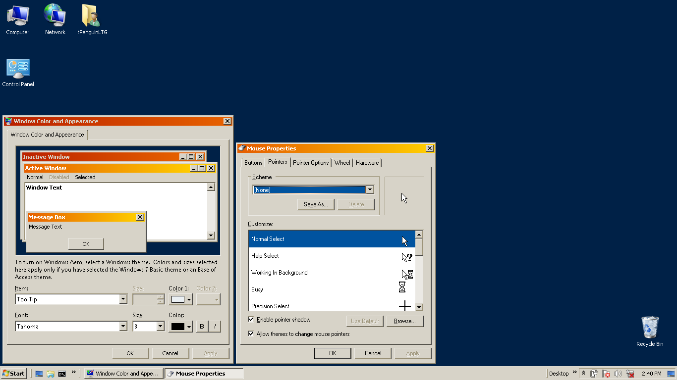
O Projeto "The ViUltimate Perfect" ganha uma nova versão! Depois de exaustivas 7 horas procurando imagens, fazendo testes perdendo a paciência e achando-a de novo, Finalmente sai a versão 3 do Menu iniciar 90% Idêntico ao do Vista, deu muito, muito trabalho mesmo, espero que tenham gostado!Changelog:
Versão 3.1:
Corrigida a posição da setinha no menu "Itens Recentes"
Novas correções na sombra em volta do men
Pequenas modificações a interface da skin
Versão 3.0:
»Modificada a versão do ViStart (Anterior: Build 2502, nova: 2721)
»Efeito suave na mudança de ícones no topo do menu
»Corrigida a sombra em volta do menu
»Correções nos botões de Desligar, Fazer Logoff etc.
Versão 2.0:
Correções de linguagem
Adicionada a pasta "Jogos"
Versão 1.5:
Botão Desligar corrigido
100% Livre de vírus e totalmente PT-BR (English version here >>> [link] )
Related content


Comments: 12

Está um espectáculo!
Parabéns pelo excelente trabalho realizado.
Obrigado por partilhares!.
👍: 0 ⏩: 0


Está realmente 99% boa, ")
👍: 0 ⏩: 0


This is really good! The shadow on the start menu looks great! Though, you could make the start menu look a bit brighter like mine. But other than that, it looks great!
 (Smile)")
👍: 0 ⏩: 1
Great! I have one suggestion about the start menu resource. The borders around the buttons. The colours don't exactly blend in like mine. You are welcome to use the borders on my Start menu resource it you want.
👍: 0 ⏩: 1

I can use your button on Logoff?
👍: 0 ⏩: 1
Not exactly what I meant. I meant that you could use the borders around the buttons to ake it blend a bit more. Plus, there are no borders on the button resources. They are on the Start Menu resource!
👍: 0 ⏩: 0

ficou realmente otimo! parabens pelo belo trabalho!
👍: 0 ⏩: 1