HOME | DD
 winsontsang — Word 2014 Preview for OS X - Concept
Published: 2012-08-09 02:30:18 +0000 UTC; Views: 9487; Favourites: 34; Downloads: 194
Redirect to original
Description
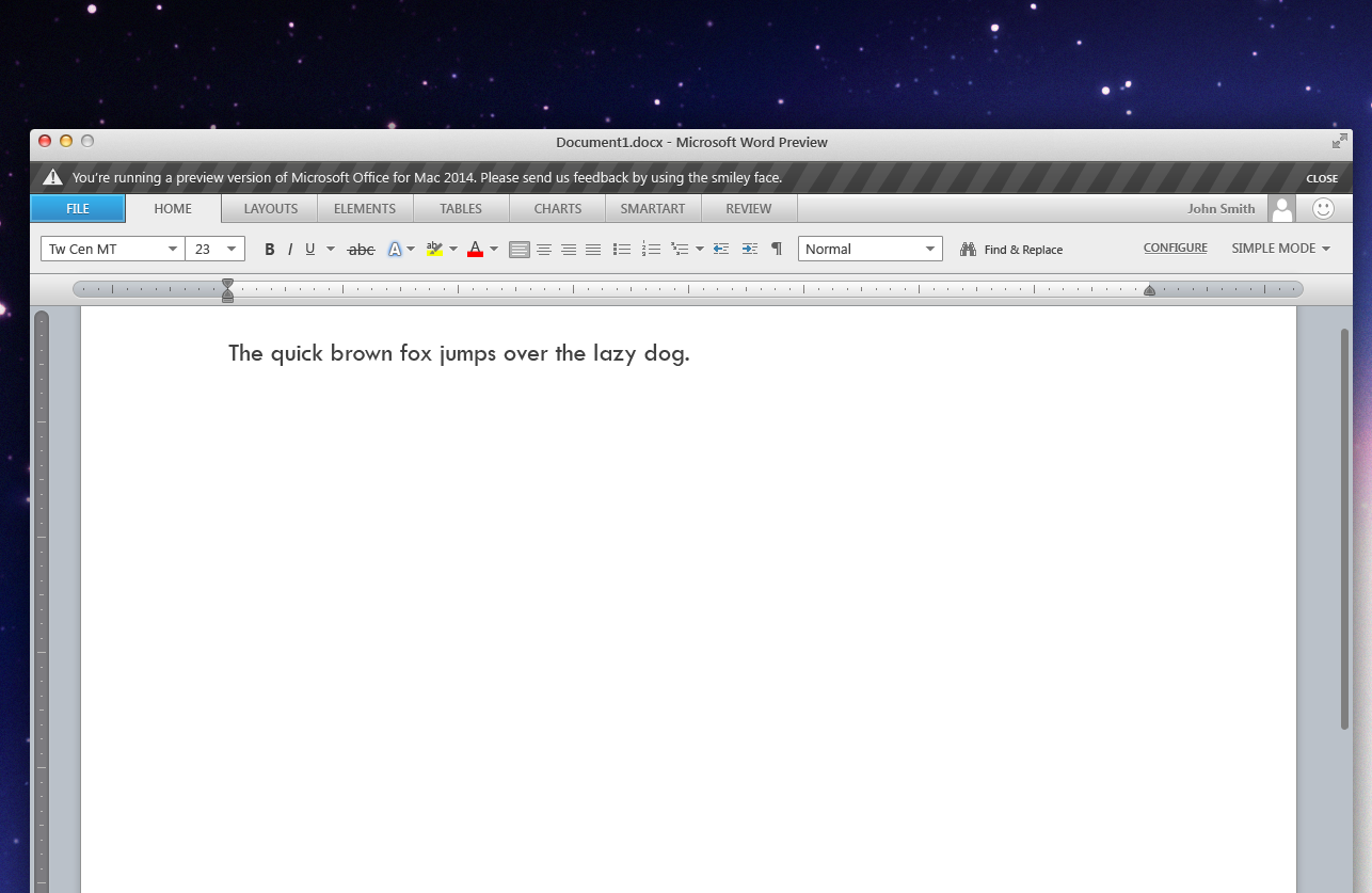
Please hit 'download the image' for the best resolutionThe background is my mod of the Mountain Lion background wallpaper, you can download it here: [link]
About this Piece
I haven't designed a user interface in a while, so I thought it would be a fun idea to recreate an existing application. After the initial brain storm of ideas, I picked the Microsoft Office Suite (more precisely Word). After reading about the new version of Office for Windows, I wanted to re-imagine the interface for Mac. The main idea behind the concept was to make the user interface a little more like OS X, by replacing the coloured elements with grey elements. This included remaking the ruler, and implementing the iOS scrollbar. I've also included the full-screen button and made most or all elements grey with a hint of a dark gradient (OS X is filled with these).
Recreating all the small elements wasn't a easy task, but I think I like the idea behind my concept. After much fiddling with the design, I decided to just publish it. Here's some of the improvements that I would've made if I worked on it longer.
- The rulers are missing numbers
- Maybe do a version with a full tabbed panel. (File/Home/Layout/Elements/Tables/Charts/Smartart/Review etc.)
- Show more of the interface through other pages and windows.
Also here's a mock feature list
- Retina Text (Yay!) for the next generation MacBook Pro
- Full-Screen Supported (OS X Lion / OS X Mountain Lion)
- Simple Mode (A panel of tools you use the most, you can 'configure' tools to be shown or hidden. You can switch to the Traditional Mode or Advanced Mode for more tools.
About the last mock up feature, I've always wanted to just hide 80% of the tools that I don't use when I'm doing something that doesn't require those tools. This mock feature would allow me to show the ones I use the most, and unclog some of those tools that are shown, that I never touch.
- Thank You for viewing. Please favorite and watch my profile if you like what you see.
- Created by W.Tsang / Devout
Related content


Comments: 31

It reminds me a bit of Adobe, but that definitely not a bad thing. Only if Windows had this good of designers. Great work!
👍: 0 ⏩: 1
 (Smile)")


HOME LAYOUTS ELEMENTS SCREAMING CAPSLOCK KILL YOURSELF
👍: 0 ⏩: 1

its the same as Word 2013 for Windows - did you have the same reaction?
👍: 0 ⏩: 1
Yes I did, actually.
Everytime I use the newest Office I just get the worst headache.
It's such a shame because it's actually far superior to word 2007 in layout, functionality and visual style.
👍: 0 ⏩: 0

")

nice one... too bad office for mac sucks ass... at least Microcrap could bring it to the default dpi of OSX so users wouldn't have to work at 125% zoom!
👍: 0 ⏩: 1


Great. Create one for Windows (no Metro, please) to earn my favourite
 (Wink)")
👍: 0 ⏩: 1

But Office 2013 Metro looks really good....HAHAHA
👍: 0 ⏩: 1

Colorless 1D icons that show that developers are too lazy to make 3D images. A downside from the developer community. Laziness, ugliness and being unprofessional.
Really?
👍: 0 ⏩: 1
hehe, I was being sarcastic. Well you're going to LOVE Windows 8. (^^)
👍: 0 ⏩: 1
As an OS with cool features, yes. But looks - I would try to find Windows 7 theme for it as a first thing.
👍: 0 ⏩: 0

Very nice! If Microsoft continues the Office for Mac-development at all, I sure hope Microsoft is going to respect Cocoa GUI instead of using Metro-elements, though. That just doesn't match.
👍: 0 ⏩: 0

That is really nice! Because my OCD compels me:
- In the feedback bar, "smily" should be "smiley".
- "New Document.docx" should be "Document1.docx".
Other than that, it's great!
👍: 0 ⏩: 1
")

This falls nothing short of amazing. This UI looks MUCH better than the current Office 2011 UI but I think the status bar is a bit too long.
👍: 0 ⏩: 1
Thanks. I was actually playing around with OS X window at 66.6% and when I zoomed in, it turned out the window was much bigger, hence why I create a very big status bar ")
👍: 0 ⏩: 0

LoL man! I want Microsoft to hire you and use this GUI
Modern, solid and fking awesome
I'm I'm going to wet my pants
👍: 0 ⏩: 0

Really nice work, I sincerely hope microsoft take a leaf here.
👍: 0 ⏩: 0