HOME | DD
 wogyac — Personal WebPage - Version04
by-nc-nd
wogyac — Personal WebPage - Version04
by-nc-nd

Published: 2006-12-03 18:00:36 +0000 UTC; Views: 3297; Favourites: 23; Downloads: 128
Redirect to original
Description
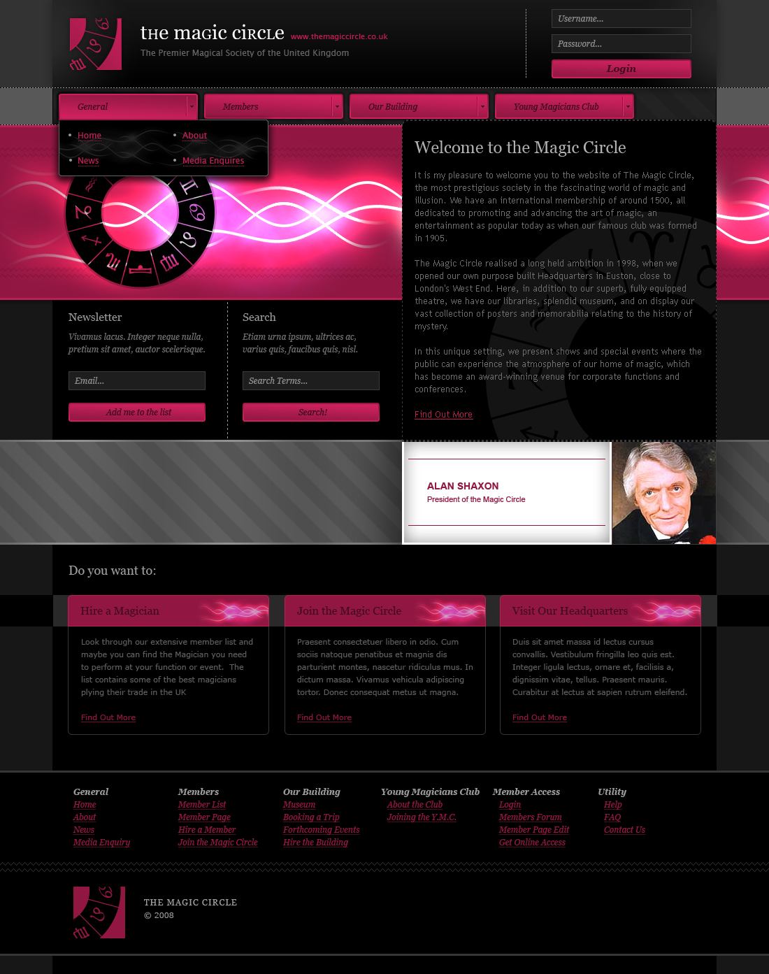
My new design of my personal webpage.. I used my new logo.. Check it, leave some comments and favs! ..© 2006 WOGYAC DESIGN
All Rights Reserved
Related content


Comments: 18

Sorry for my long-winded comment. I get yappy when looking at web design.
I love the logo. I have no idea what it means or if it says anything, but I like it; I think it's a strong design. I also don't see too many places where a drop shadow doesn't look amateur; I really like the application of it with the logo as it adds just enough depth to make it pop out even more against the background.
Colors are lovely, and the layout and navigation look fine to me. The ONLY, and I mean only things I personally may change if it were my site are the little white dots on the sides and the size of the mini headlines. IMHO, I wouldn't make them larger than the text on the navigation buttons. This is just a totally personal opinion, so don't take it too seriously - I think the dots distract attention from that central logo a little and I don't much see what purpose they serve. And the large, bold headlines kind of make you totally overlook the navigation bar,which blends in really well with the background. But that's just me, I could just be nuts in the head and maybe you really like those dots and that type.
Overall, very nice design. Very clean and professional, the color palette is nice, and it's easy to read.

 (Smile)")
👍: 0 ⏩: 0


pekny, ale trochu tam vadi ten outerglow kolem loga, kterej desne stini napis pod nim, mozna by to chtelo trochu dolu je to tam tak nacpany
👍: 0 ⏩: 1

Asi ta zklamem, ale glow som tam nedaval ani nahodou x) .. je tam perspective shadow .. ktory tieni ten podnadpis .. a o to mi slo aby bol pod nim, no ale nie kazdemu sa to musi pacit .. btw: dakujem
")
👍: 0 ⏩: 0
Tha pattern is there, you can't see it?
👍: 0 ⏩: 2

omgsh. I don't know but I didn't
")
👍: 0 ⏩: 1
arcticTransfuse In reply to wogyac [2006-12-06 20:00:07 +0000 UTC]
Lmao.
Maybe he means in the nav buttons, Or something, I dunno. Probably not though.
")
👍: 0 ⏩: 1
Sure, let him be! That stupid questions bore me!
👍: 0 ⏩: 0


arcticTransfuse [2006-12-03 18:42:52 +0000 UTC]
If the navigation was a little better I'd fave it. The navigation doesn't really have anything special about it and doesn't seem to fit in properly...
👍: 0 ⏩: 1
I'll redesign it.. I don't like it too.. btw: why you're looking only for navigation? .. anyway, thanks!
👍: 0 ⏩: 1
arcticTransfuse In reply to wogyac [2006-12-03 19:50:48 +0000 UTC]
I'm not. I love the page, I Just don't think the navigation fits in properly.
👍: 0 ⏩: 1
Sure, thanks for comment..
👍: 0 ⏩: 0