HOME | DD
 Wrale — Well That Was a Goddamn Mess

Published: 2009-08-16 02:26:32 +0000 UTC; Views: 1000; Favourites: 17; Downloads: 44
Redirect to original
Description
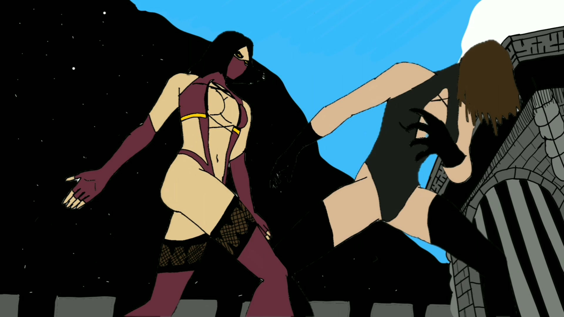
Here are a couple friends of mine and myself as Minute Men from Brian Azzarello and Eduardo Risso's 100 Bullets. That'd be me on the right.Totally sweet comic that I highly recommend. Starts off a little... slow? I guess?
Anyway, had a lot of fun with this one, too. The poses and characters were a blast, and I've never, ever drawn a car that didn't look like a pile of crap. As lazy as the background is it's still way more than I normally do.
Hope you like. Comments and critiques welcome.
*edit* Fixed the anatomy a bit.
Related content


Comments: 23

Overall


Originality
Impact
I like your comic style, it's clear and great to look at. Not too much details and falderal but all what's important. The composition is greatl, you really have an eye for that. There's nothing useless inside the image, no stuff that's just there for avoiding blank areas.
The poses of the three characters are great just like they're relaxing after a fight they've won. The different poses and facial expressions make every character unique and bring out their personality, I really can imagine what they might be like. It's not easy to create characters which have personality and are not just empty shells. So that's really a strong point of your work.
I especially like the gesture of the woman when she wanna get rid of the blood on her clothes, the facial expression really shows her mind.
To say something about the anatomy of these three, overall it's ok. But I think the hands could be better. I know that hands are tough to draw, so spend some time to improve your skills. I'm sure the results will be really great. And when I take a closer look to the angled leg of the woman I think it looks a bit gummy, like there're no bones or something. The leg of the man on the right is much more better.
The background is simple but that's ok. It's not the main part and it fits with the comic style. Just indicate some windows and doors maybe. Right now the houses look like bunkers above the ground.
Overall, I really like what you've done here. I can imagine that you put a lot of effort into this piece. I'm sure you'll improve your skills and show us some really brilliant work! e.deviantart.net/emoticons/s/s… " width="15" height="15" alt="
 (Smile)")
👍: 0 ⏩: 0


this one is nice! the poses are nice, and I like the perspective
👍: 0 ⏩: 0

the minimalistic style works great and the car is a full success, i will check out that comic
 (Wink) - ;)")
👍: 0 ⏩: 0

really great use of black for the shading its perfect
👍: 0 ⏩: 0


awesome, love this one. i can definitely see you becoming a comic book artist
👍: 0 ⏩: 0

Great scenery! I also love the expressions on all of the characters. You should definitely experiment with backgrounds more often. (you mentioned you do not usually add that much). keep it up !

👍: 0 ⏩: 0

haha love it! the blood was a nice touch. your style is very cool.
👍: 0 ⏩: 0

Oh nice poses ")
👍: 0 ⏩: 0

I really like their body language and facial expressions! the perspective is really nice too!
👍: 0 ⏩: 0

This looks pretty epic. I like the overall cinematic composition. This is like just after the end of a fight scene...
Anyways, awesome job overall on the characters and their facial expressions and poses. The characters' actions do reveal a part of their personalities.
👍: 0 ⏩: 0

This looks awesome! I like the poses and the shading is excellent. I'm not an anatomy expert, so I can't say too much about that. Though from the looks of it, I'd say the overall anatomy doesn't look too bad.
The detail and lighting on the car is vey well done by the way. Nice work!
👍: 0 ⏩: 0

Wow... this is your best yet, IMHO. Your rendering is getting better and better. I love your play with shadows. I agree with others that your hands need some work. Hands are one of those things that you need to sit down and force yourself to become an expert on. Many many studies. You are cheating yourself by simplifying them and choosing to close all the hands into fists to avoid dealing with the fingers. YOU CAN DO IT!!!
👍: 0 ⏩: 1

Mistyz! So good to hear from you!
Thank you so much. I really poured my heart into this one, and I'm glad you think it's my best. The one prior to this I'm happy with and all but I was hoping this would go over better.
I can see what you mean on the hands. The only ones I'm really unhappy with are the girls, though, but I think I was adopting fists into my style.
I've been doing a lot of anatomy practice but I'll just have to lengthen it to incorporate hands.
Thanks for the meaningful crits and praise, you damn skelly you.
👍: 0 ⏩: 0

As MizuRenkin said above, you did well on the composition. I like the poses of the characters, even though the guy on the left looks just a little stiff. The general anatomy is not bad, but some of the hands seem a little off, especially with the girl in the middle. Hands are one of the toughest things to draw, but with a lot of practise (also drawing your hands or a friends hand from real life) it comes easier. I also like the lighting and the setting of the scene with the car, but perhaps you could have done more with the background, maybe some people watching or some shops in the distance.
hope I could help
👍: 0 ⏩: 0

i like the first two characters but the 3rd is a little strange (sorry)
and the car is great .. good work ^^
👍: 0 ⏩: 1
haha No problem. What exactly don't you like about him?
👍: 0 ⏩: 1
The one of the left, right? Yeah his legs are definitely a little too short. I was hoping no one would notice
Thanks for the compliments and constructive crit. :]
👍: 0 ⏩: 1

You have a good eye for composition and direction. That's the strongest thing I see in this piece. I'd say you need more work on your anatomy. I advise that you draw through every shape of the body, and make a pre-set length for each part of the body. Your anatomy kind of goes in and out of proportion throughout the figure. You want to reach a solid consistency with your anatomy. That's the first thing to do. I'd suggest doing 30-second gesture drawings over and over again until you get a good feel for it. You're on the right track, though. You've got good style -- you've just got to apply the essentials to it!
Best of luck in your endeavors.
👍: 0 ⏩: 0

This is pretty BA, if I do say so myself : )
I really like how you did this, it's great!
👍: 0 ⏩: 0