HOME | DD
 wredwrat — Blacksash Knight Marius
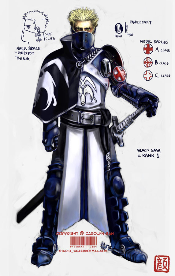
Published: 2004-08-17 10:19:42 +0000 UTC; Views: 57675; Favourites: 1000; Downloads: 2185
Redirect to original
Description
EDIT: I've fixed up his right (our left) arm; made it a little longer, and altered the medic badge system a bit. Thanks for your help and critiques everyone! ^__^Lazy me actually decided to crank out a proper colour job this time. I'm happy with how Marius the knight here turned out. ^__^ He's one of the good guys, I haven't started designing the baddies yet.
I had heaps of fun designing the armour and the insignia. I love knights, I love armour, and I love uniforms!

His armour was influenced by the uniforms of the French Imperial Guard; the footsoldiers have these cool blue jackets that have white X shaped lapels.
Marius © me.
Related content


Comments: 130

Oh dear god! you should draw paladin alexander anderson! (you know, hellsing)
👍: 0 ⏩: 1

I haven't watched Hellsing before.. ehee..
👍: 0 ⏩: 1
the horror! my heart bleads for you! it's such a great show (and there's just 13 episodes so downloading them / watching them doesn't take forever)
👍: 0 ⏩: 0

ooh he's really cool! he looks so serius and intense...and the blonde hair thing is cool cuz he's good...i've found a lot of baddies have light coloured hair: draco
👍: 0 ⏩: 0


I thought the sword was part of his arm for a bit. 
 (Wink)")
👍: 0 ⏩: 1
Yah.. I'm trying to attune myself to drawing characters with lighter coloured hair.. 
👍: 0 ⏩: 1
u mean like those friggin' Uchihaz

👍: 0 ⏩: 0

I really like what you've drawn but if I mught add a small suggestion?
I like the A and C cross but what about making the B class with a white cross in a red cyrcle instead of having a half red cross? what I mean it so paint red the spaces out of the cross. I think it would look nicer? Just throwing an idea on table! Still looks great!
👍: 0 ⏩: 1
Oh hey!! Your suggestion just gave me another idea!! I could have a tinier white cross inside the large red cross. ^O^
Thanks! ^___^
👍: 0 ⏩: 1

:9 Those are yummy details right there. I love armoury, but I wish I had the patience to actually draw it all out like you do xD And you can do it perfectly in proportion!
👍: 0 ⏩: 0

O_O Dang! This looks like its took hours to draw this! Great job!! ^__^ This dude is cool!!
👍: 0 ⏩: 0

The design is sooooo awesome!!!!! Great job this rocks!
👍: 0 ⏩: 0

Really great job, his design is incredible, complex, but smooth ")
👍: 0 ⏩: 1


Okay, I love the idea for the Medical Badges - A, B, C classes are filled according to rank! Greak work at making it look all metalic and shiney! Theres really so much fantastic detail in here, I look over the whole piece and keep finding more each time. XD Hehe and I really like those little spurs on his boots, man, I definatly need to work on trying to making my metal stuff look oh so good.

👍: 0 ⏩: 1
Thank you, glad you like him! ^_^ Yah, it was fun putting in all the little details. Had to really stop myself from making it more cluttered than it already is.
👍: 0 ⏩: 0

Whoa, coolness!
👍: 0 ⏩: 1
Yar, knights rock! ^O^ They're right up there next to the ninjas on my list! ^___^
👍: 0 ⏩: 0


Excellent work as always  (Smile)")
My only constructive criticism is that his right arm is a bit too short. By lengthening the forearm, you'd have the proper sizing. Otherwise, lovely concept, and beautiful shading and details.
👍: 0 ⏩: 1
His arm actually has a bit of a bend under that cape, but the way it's turned out it sorta does look rather short. I've gotta do something like make his elbow stick out a bit more from beneath the cape or something.. hmm..
Thanks for pointing that bit out! ^__^

👍: 0 ⏩: 0

Oh wow the shading and design are incredible! This is really really well done. Congrats

👍: 0 ⏩: 0

too bad the french never won a war! Anyway... love your stuff and covet your fame... give me some of those favs! I just need to make the front page once.... the first time has got to be the hardest.
👍: 0 ⏩: 0

Very nice! The design is simply awesome. It's very elaborate and well thought out! ^^ The high collar that covers the lower portion of his face gives Marius a type of, "Maybe I'm the good guy... maybe I'm not" kinda vibe, and the color choices are very nice, depicting that there's a difference between tools of war and righteous do-gooders. ^^. That's what I interpreted, anyway
Great job! ^^
👍: 0 ⏩: 1
Thank you, your interpretation is pretty much spot on! Woohoo!! I'm glad the design worked out! ^O^
👍: 0 ⏩: 1

SICK!!!!
👍: 0 ⏩: 0
<= Prev |