HOME | DD
 wredwrat — Blacksash Knight Marius
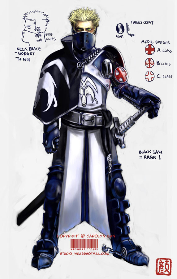
Published: 2004-08-17 10:19:42 +0000 UTC; Views: 57662; Favourites: 1000; Downloads: 2185
Redirect to original
Description
EDIT: I've fixed up his right (our left) arm; made it a little longer, and altered the medic badge system a bit. Thanks for your help and critiques everyone! ^__^Lazy me actually decided to crank out a proper colour job this time. I'm happy with how Marius the knight here turned out. ^__^ He's one of the good guys, I haven't started designing the baddies yet.
I had heaps of fun designing the armour and the insignia. I love knights, I love armour, and I love uniforms!

His armour was influenced by the uniforms of the French Imperial Guard; the footsoldiers have these cool blue jackets that have white X shaped lapels.
Marius © me.
Related content


Comments: 130

I've been meaning to favorite this for some time now.
👍: 0 ⏩: 0
This is f'in awesome dude! It looks like very subtle power armor.
👍: 0 ⏩: 0

This armor is so fucking cool, especially with that bevor. Minor nitpick, you're calling the bevor (which covers the neck and lower face) a gorget (which covers the neck and shoulder).
👍: 0 ⏩: 0

Very awesome, the spurs seem out of place though.
👍: 0 ⏩: 0

The spurs on the back of his boots are a little odd but the rest of the armor is fantastic.
👍: 0 ⏩: 1

Yes a bit off but verygood
👍: 0 ⏩: 0

The drawing looks awesome, but i don't like the hairdo that much. Just to be honest, nothing personal.
👍: 0 ⏩: 0

That's awesome, one of the better knight designs I've seen. Are you going to make any more like this?
👍: 0 ⏩: 0

Wow, I really liked your style, and the knight himlself rocks, mixing Japanese and European traits on his gear.
👍: 0 ⏩: 0

Great work, nice design. But somehow his right hand is still a bit unnatural, don't you think?Anyway, can't wait to see other member of this knight order.
PS: I love knights, armors and uniforms too
")
👍: 0 ⏩: 0

nifty. i like the use of the rank and that cape over the shoulder is a nice touch. awesome job keep it up.
👍: 0 ⏩: 0

Awwesome. Actually I like him the most, because Marius is my actual name.
 (Smile)")
👍: 0 ⏩: 0

can he turns his head? and i think his right arm is a little bit short
👍: 0 ⏩: 0


nice i love the detail u put into the crests and armour very nice
👍: 0 ⏩: 0

Very very nice, I wish I knew how to do such things. *Sighs.*
👍: 0 ⏩: 0


Wow that is amazing. I'm writing a story myself but Im not much of an artist with a pen and paper so I've been going around looking for skilled artist to try to commission in some way. Your my first. Well I hope you'll think about it. But again gorgeous armor.
👍: 0 ⏩: 1


Awesome, I love the style of uniform and the armour. The colours look really good as well.
👍: 0 ⏩: 0


I love the sorta-realistic pseudo-fantasy design you've got going here. That half-cape thing is awesome, great work!
👍: 0 ⏩: 0

Very nice design. I saw this and my attention was immediatly grabbed. The arm sash is a very nice touch!!!
👍: 0 ⏩: 0

wow cool design! i would love to work a collab with you!
👍: 0 ⏩: 0

T_T loveeeeeeee
I love all the things you listed too!! Way cool design, I hope to see more of him in the future
👍: 0 ⏩: 0

Your gallery is amazing, but this stands out as spectacular.
The colors (blue and silver) are very rich, and look like the heavy cloth that would be put over armor.
The emblems are beautifully realistic in their simplicity, especially the medic sign.
Most of all, his eyes are penetrating. They are unnerving the way they look back at me...
This is an easy Favorite, but I am not sure what the purpose of the round-thing over his left shoulder is. It looks like a small shield or buckler, but I don't think it is. What is it?
👍: 0 ⏩: 1

Thanks, glad you like him! That small thing on his shoulder is rather like an emblem kind of thing, to show the house he's from.
Cheers for the comment!
👍: 0 ⏩: 1
The accolades belong to the art and artist, not the commenter, my friend
I actually have another question now. The insignia on his front, it looks like crossed scythes, but what is in front of them? Wings?
Oh! and I just notices his spurs! Spiffy detail, spurs are.
👍: 0 ⏩: 1
Yep, crossed scythes with wings on a shield. Cheers again!
👍: 0 ⏩: 0


Amazing design, love the little detail sketches on the side. very nicely colored too, works very well
👍: 0 ⏩: 0

Mmm ... only thing to crit: the piece of cloth between his legs (forgot how you call it ... me is dumb -.-) looks very stiff. Unless its some sort of thick material, I'd add some folds. Waaah ... you're so awesome.

👍: 0 ⏩: 0


👍: 0 ⏩: 0

aghhhh so curious about him you gave all that info in the thing on barnabas but we dont even know this guy's weapon....... hold me.
👍: 0 ⏩: 0

first what program ddi u use to paint this and the anatomy looks fine now and i love how you colored it
👍: 0 ⏩: 0


yup, he's supposed to be for a school project.
👍: 0 ⏩: 0

The design along just blew me away and the foray into realism is really impressive. The colors are so dynamic albeit muted. Pure sheer pleasure to look at your art.
👍: 0 ⏩: 0

yay! I saw this today and reckon it's one of your best works yet!
👍: 0 ⏩: 0
| Next =>