HOME | DD
 xCopycat — TF2: And brotha...
Published: 2010-04-10 02:28:10 +0000 UTC; Views: 7194; Favourites: 318; Downloads: 59
Redirect to original
Description
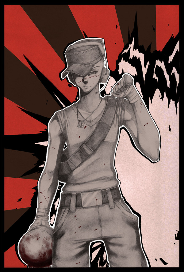
Yeah so... wanted to do some traditional work and I'm currently practicing to get better but... as I tried to draw a Scout to practice boys as well, this came out of it in the end because I couldn't stop drawing on it. I've placed it under "digital art" because of the background and some added blood and such, but da Scout is pure traditional.To believe I actually worked on a background for once... I must admit it feels nice to actually make a background.
I've been a little scared of getting back here (because of the last time I drew Scout... mehh) but I thought you should see the progress I've made and... well, it was nice to work on something else but skecthes.
I guess I should thank thank that flamer who called me a virus. She said "stop animuizing everything" and it seems TF2 fans usually don't like it if you draw TF2 in manga style. Well, you've opened my eyes, dear flamer, because I will now work on showing da TF2 fans that manga does not necessery ruin TF2. I don't like "kawaii"-lookin TF2 chars either, but manga does not have to be all "kawaii"
This description has taken way too long. Sorry.
Oh btw he's holding a Soldier's helm. Sorry if I screwed up
Scout (C) Team Fortress 2 / Valve
Related content


Comments: 127

Thank you so much, though it's not good at all XD
👍: 0 ⏩: 1

what?? D8 why would you think so?
👍: 0 ⏩: 1
NO IT'S A LIE >8(
that is one motherfucking awesome scout you got there. ù_ú end of story
👍: 0 ⏩: 1
Please don't pity me. I need to see the truth to improve :3 It's not cuz I'm being emo, it's just that I want to get better : D
👍: 0 ⏩: 1
I understand that, but really I do think that's a really awesome drawing! I wouldn't say it if I didn't mean it. To you, who is a more experienced drawer than me, might think it's a easy/bad drawing. But to me, who couldn't do such drawing, it's awesome! (to a rich man a small penny is worthless, but to a little child it might be the greatest of treasures! xD)
uh that was one long message. e_e (or at least it felt like it was) excuse me for any mistakes in my english! >_>
👍: 0 ⏩: 1
Hahahhaha aww what a kind person you are XD I wish i could give this piece to you since you like it so much but that is kind of impossible D:
👍: 0 ⏩: 0

Grass fly, birds hurt people, sun grows and brudduh, I shine.
👍: 0 ⏩: 1
Tssss XD How many times have we made fun of that sentence by now XD
👍: 0 ⏩: 1


oh man. I hate it when tf2 fans automatically think all manga style = fail, especially when you do such a lovely job with a manga style.
AND OH MAN YOUR SHADING IS BEAUTIFUL. <3 GREAT JOB.
👍: 0 ⏩: 1
Thank you so much but there's a lot of stuff wrong with it XD There's always a lot of stuff wrong with what I do. I gotta get better!!
👍: 0 ⏩: 0

Why do you have the Awesome art ever?
It awesome Art!
👍: 0 ⏩: 1

Love the vector style background and the soft traditional shading on The Scout. It contrasts well and looks badass ")
I believe you can post this in "Mixed media" because you used traditional and digital tools on this.
👍: 0 ⏩: 1
Ahh okay maybe I should edit it den. Thank you for telling me and thanks for the nice comment : D
👍: 0 ⏩: 1


I agree with CookiePenguin /points at her
The background is totally badass. And how you managed to make Scout fit into the background is something I'm clearly jealous of. It looks really good! As a few have pointed out the shades are kickass. It's nice to see how good you are both at the traditional and the digital /nods with a 'hmmhmm' sounding like an old man.
The blood looks very realistic. I had to point that out too.
When I first looked at this pic and noticed the helmet in Scout's hand I thought: "Oh god, that's not Soldier's helmet is it?" but as I read the artist comment and realized that it actually WAS his helmet I was all like: "NNNNOOOOO!"
Hahaha! 
Kick the flamers -they deserve it, and keep on postin'!

👍: 0 ⏩: 2
Thank you, nans, you are da greatest of friends D:
btw, it doesn't matter if it's Solly's helm as long as it's da red Solly (cuz he is da least pretty one XD)
👍: 0 ⏩: 1
Dat is quite true although they look slightly alike those two. But I can't disagree with your statement.
You're welcome! ^^
👍: 0 ⏩: 0

*touchs u wiv old man hands*
👍: 0 ⏩: 1
*doesn't like it* :c
👍: 0 ⏩: 0

You're getting better! The shading especially is nice. He does have one arm that looks bigger than the other though, and quite lady-like hips.
Also sonnemelzen isn't a girl.
👍: 0 ⏩: 1
I was hoping you'd take a look at this. That's why I added it to TF2slash really.
Yes, the arm bothers me too, I see what's wrong, but when I realized it was too late. If I started doing anything about it I would ruin the shading... and I think I excused myself a bit with the way the muscle is kind of... pushed against the upper part of the arm (You know your arm gets bigger if you press your fingers against it, right? Like that) but I still overdid it I think. It sucks.
Boyish hips IS something I find problematic but it used to look MUCH worse before I redid them o.o oh and do remember dat his shirt is hanging a bit around the belt. But yes, I need to work on hips.
Thank you for your crtitics. They eat me up from inside, really, but I ike them because I've realized critics really makes me wanna practice. Thank you. Please stay around me :3
👍: 0 ⏩: 1
As long as you take all of the criticism the right way, it's good.
It's not the shirt which is the problem there, that would be his waist, it's his hips, they're too wide.
On his left hand (looking from his perspective) his thumb looks a bit small, but the more pressing issue is the position, put your arm like that. [link] this is more like the position you need, remember what I said about using references?
[link]
[link]
Good use of colour and texture, though I'd love for a bit of diffusion on the blood which has gone onto fabric, as fabric absorbs liquids.
There's a bit too much definition on scout's chest, I'd suggest making the line below his pecs a bit softer. It's nice in general though, a good feeling of weight with his clothes, though they wouldn't be quite so baggy I'd think. Your shading is nice, but a bit confused again, I'd think there would be more shadow under the hat, and I'd think from the position of the hat his head is looking down? But as it stands it looks a bit like the hat is falling off.
I like the detail of the stitches on it though.
A couple of details on the trousers, scout's belt is thinner, and they're tighter, they look too baggy there, not too good for running.
His right hand I think should show a thumb ontop of the helmet, but the arm seems fine, I can't see any real problems with it, though for both arms, scout has handwraps which are thicker and go half way down his forearms.
All in all much improved on the last image, but you should still use some reference.
Also don't go on TF2chan until you lurk moar, also go into workshop if you're looking for advice.
👍: 0 ⏩: 1
Yes I've been looking at the picture after reading this and I do believe you're right with all of your critics actually D: I have a bit of a problem though when it comes to finding some references. I know it's a good idea and I will search more carefully in the future.
Thank you so much for your critisism. It helps me out a lot. I hope you'll continue to help me out in the future cause I seriously need to speed up. I've only got 2½ years left to practice before I try to enter an art school so I need all the help I can get.
The next time I post on dA I will have improved again, otherwise I will not post anything. If you've got any good ideas as what to use for practice I'd love to hear them.
And about TF2 chan, I'll keep that in mind.
Thanks again.
👍: 0 ⏩: 1
As you know of the chan, there is a place called /help/ on it. I'd suggest using it.
[link] This is anatomy and anatomical references.
[link] This is reference for almost anything TF2, and you could request others or get Gmod and do it yourself.
And there's a stock art area on deviantart where you can find all the references you need! [link]
Some of them have rules about their stock images, but you'll be fine as long as there's no tracing involved.
You have improved greatly since the last image, and your colour use is pretty awesome! So keep at it, I'd love to see your next improvement.
For practice though, one thing I'd suggest is trying to break away from your current style as much as possible. Not that it's inherently a bad style to aim for, you can do very good things in your current style, it's mostly as a practice. [link] this here is some of the practice I'm doing at the moment. The middle one on the top bit is most my style, and so I'm trying to concentrate a bit more on noses at the moment, practicing some more poses and I'm aiming at doing as little detail on eyes as possible as I really love drawing eyes. Perhaps you could try something similar?
The one thing which is a universal suggestion though, draw people from life. It may be felt to be a bit creepy so perhaps get some big sunglasses which cover your eyes, but go to a cafe, buy yourself a drink and then just look at people and draw them. People do not stay still for long most of the time, but that will help improve your speed and help you not to just focus on details.
All in all good luck!
Remember though, if you're below 18 you can lurk because we wouldn't be able to tell, but you have to be above 18 to go on the chan officially and people will try to check your age as much as possible.
👍: 0 ⏩: 1
I'm sorry for not answering but I've been busy drawing so I'll make my reply short.
Thank you for those wonderful tips. You're already a dear friend to me. If I can repay you some way please tell me.
I'm trying that "step away from your current style" thing and I'll post my attempt very soon (mostly bcuz it shows my improvement in colouring).
I'll try all those things and thanks for the links! Watch me improve, sensei D: !!
👍: 0 ⏩: 1
Just call me Cleo dude.
Also as part of stepping away from your style, why not try some characters you hate drawing?
I don't like drawing medic, I like drawing demoman, so I draw demoman when bored and draw medic when practicing
I'm unsure about repaying anything, as I just like to help really. Perhaps you can repay me by getting awesome?
👍: 0 ⏩: 1
Okay I will do that. Oh and I hate drawing demoman so... XD I've never drawn him before either.
I will do my best!! D:
👍: 0 ⏩: 1
Use the reference to check out his proportions and go for it! Demoman is always undervalued!
👍: 0 ⏩: 1
Actually I'm already working on a demo XD
👍: 0 ⏩: 1
Awesome  (Smile)")
👍: 0 ⏩: 1
Been working on him for the whole weekend too. I gotta finish him soon, otherwise I'll get tired of colouring on him o.o
👍: 0 ⏩: 1
If you get tired of colouring something, take a break for a while and do something else. Then your mind is refreshed when you come back to your picture, and sometimes glaring mistakes can stand out!
Happens to me all the time, haha.
👍: 0 ⏩: 1
That's a good idea. It's almost done though so I might be able to post it tomorrow :3
I'll keep that in mind next time though XD
👍: 0 ⏩: 1
Niiiiiice!
That background is badass n zomfg lovely shades! -w- you did gud jub. (y)
👍: 0 ⏩: 1


Sejt du addet scout!....
Jeg har jo set uden scout og der synesc jeg der skulle en eller anden for an!
men, ellers SEJT!
👍: 0 ⏩: 1
| Next =>