HOME | DD
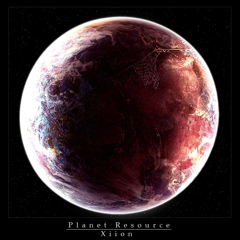
 Xiion — The Rapture: Del 1
by-nc-nd
Xiion — The Rapture: Del 1
by-nc-nd

Published: 2007-08-18 04:24:11 +0000 UTC; Views: 1508; Favourites: 19; Downloads: 0
Redirect to original
Description
well, one day of work gets me to making series of my brand new space style! I hope everyone Enjoys!! there will be a total of 4 images in the series, and anyone who can make planets, 3D space ships (High Poly and futuristic) or can do some terragen work (High quality professional work) and is willing to collaborate on it is more than welcome.Just contact me on AIM!
SPECS
------------
Time: Approx. 6 hours
Layers used: 98 (not that many)
References used (for studying the blending techniques used in them): around 12
Tools Used: Adobe Photoshop CS2, Wacom Graphire 4 4x5 Pen tablet
Related content


Comments: 21

I tried Terragen and can't find a decent tutorial. I can make ships still though.
👍: 0 ⏩: 1

ask NoScottNo for some help with Terragen.
👍: 0 ⏩: 0

love your new style dude (Wink)")
👍: 0 ⏩: 0

i love is xiion, i gotta get some tips from ya, ill msg you when i post my space art, i gotta add a few more details
+Fav
👍: 0 ⏩: 0

Here is another post of mine on it:
Alright, here are my comments on this.
I personally am a fan of the dark mentality of the piece, it adds a certain mood to the creation.
The bottom left of the larger planet is stretched in a highly noticeable way, so that is a key feature to work on. It was the second thing that drew my attention. Sorry if all that ever draws my attention is flaws
Second, the first thing that caught my eye was teh atmosphere glow around the large planet. It seems to be TOO vibrant in the darker areas, if you are getting my meaning. It conflicts completely with the dark look of the piece.
Third, the ice on the larger planet has something that I cannot place my finger on, but it lacks realism. If what you are going for is realism, then that should be something more focused on. If it is actually supposed to be clouds, then there needs to be some major changes due to clouds not being sharp. But as a good assumption of ice, I already stated my part on that.
Fourth, text IS major. Whether it be directly on the piece or not. The title that you gave it, in that red color strange font, completely flows against the smooth nature of the piece, thus causing an obscene sight. I would work on the text a lot more. The color for one, makes everything seem...so much more...how do you say? Unbalanced?
Fifth, the starscape itself (Yes there is lack of order in what I am saying, just giving opinions as I see them actively). I will give you some congradulatory words for the starscape. I like the looks, it gives a good flow and is overall great.
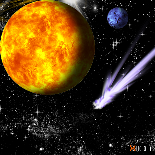
Sixth, the smaller planet. Nice look, but the atmosphere glow has a choppyness to it that really bothers me. Not that big of a deal, but it was raking to be said.
Seventh, the other little planets, are so obviously the same as the secondary main planet. If no the same then immensely similar, that caught me right off as well. Not sure if you need to bother with a change in that, but it was persistent enough to make me say something.
Eighth, the bottom left planet, same atmosphere glow problem as the other small (but larger) one, but the thing about it that bothers me most is the little light source next to it. Looks so obviously fake that it threw off that portion for me relating to realism.
Nineth, this relates to the text that sais XiionGraphix. The color clashes with the piece. Perhaps not as bad as the red in the title and such, but enough to make me think to either make just a small marker, or nothing at all stating it is XiionGraphix, due to the showing of your page anyway. Just a minor opinion.
Tenth, and final decision. Overal great job. You have improved much, and don't think that I have not been watching. Because I have, sometimes (Work, college, and girlfriend make time short for hobbies). There are just some minor and relatively major flaws I see here, so please try not to take them lightly. I was reading through the arguments on the last page and, I will agree with some, and not with others.
Please read everything everyone says. The persuit of knowledge to know yourself, those around you, and everything else in life is endless, so never skip a step and keep learning. Good luck overall and I'm as surprised as you that I actually posted on HaloMods, haha.
👍: 0 ⏩: 1
Thanks for the amazingly awesome critique!
I REALLY needed something like this to help get me to notice my flaws.
")
👍: 0 ⏩: 0

verry verry nice work m8. Specialy the 3d feeling in the planet! How did u do the 3d looks in the clouds?
👍: 0 ⏩: 1
i added an emboss filter and then faded it using the hardlight blending mode.
many thanks to Alyn Hunter for that little fade filter tip
")
👍: 0 ⏩: 1
nice work dude.. i keep it in mind!!
👍: 0 ⏩: 0


 (Smile)")

ace job on tha planet there
starfield could use some more depth but its definately a major step from the ur earlier stuff

👍: 0 ⏩: 1

Theres always one nitty gritty thing that annoys me and its the border and text >_< make it look like its part of the picture. Instead of red text with that text use a normal text and use small effects on the text. Lastly, there is something about the planets I can't get my head around and it isn't a good thing to me either...hmm. Ignore that I like the negative space
👍: 0 ⏩: 0


Very nice, man I really need to find the time to continue upgrading my skills, but alas, none.
")
👍: 0 ⏩: 1
i'll be writing a tutorial after the second one is complete on how i managed to create my new style. it will help you alot, and also get your work to be proficient.
👍: 0 ⏩: 1
That's very kind of you, I'll be sure to read over that tut when it's done.
👍: 0 ⏩: 0

...and yet, i cant do that.....you give me a lot to think about
*walks away*
👍: 0 ⏩: 1