HOME | DD
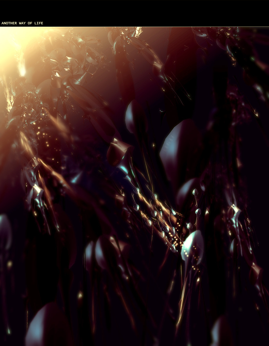
 xinus — Another way of life
Published: 2004-07-05 17:26:42 +0000 UTC; Views: 1324; Favourites: 33; Downloads: 514
Redirect to original
Description
Another way of life..
.
it was just an experiment but I think it came out quiet good
")
print is also avaible :
[link]
feel free to buy, comment , and
 it
it
Related content


Comments: 49

see those dots you did ? the glowing ones? if you can remake that but have a render thats underwater or submerged this piece would be absoloutely unbelivable
👍: 0 ⏩: 0

wow shit man, that is fucking awesome, great simplicioty and nice lighting man and the top font regardless of what that dude said is aite...
👍: 0 ⏩: 0


the depth is really impressive on this one david ^^
good color, nicely done ^^
👍: 0 ⏩: 0

Looks really nice. I like the lighting
Good job.
")
👍: 0 ⏩: 0


it's the best. the best one i've seen out of you.
👍: 0 ⏩: 0

A very different feel :d nice atmopshere, and I like the blurs :d nice job!
👍: 0 ⏩: 0

Nice work Xinus, i like very much the render and the details also the light and the brushwork

👍: 0 ⏩: 0


n schicken render haste da gebaslelt, manchmal noch ein wenig kantig aber sonst echt gut.
vorallem die farben passen gut zuasmmen ..
👍: 0 ⏩: 0


looks like somewhere in the jungle...the render is very nice...and the soft light tone at the top left looks like the sun is rising...great work xinus !!!!!!!
👍: 0 ⏩: 0


thanks for the comment .. and yeah the top part /font sucks
but I have no good fonts since i have to formate my pc
👍: 0 ⏩: 0

could've done with a better border and typo but i'm really diggin the renders and look of the image. very well done. reminds me of jelly fish kinda. many props though.
👍: 0 ⏩: 0

Oh I'm really lovin the colors here.
Very smooth and clean work. +fav
👍: 0 ⏩: 0

looks great nice original style.
i like the colors
👍: 0 ⏩: 0


nice colors and lighting.... this is so original
👍: 0 ⏩: 0


Learn me how to render like that @_______@
Fuckin amazing work
👍: 0 ⏩: 0


o im realy in love with the upper left part. That looks soooo sick! The lower and mid part look a bit strange, but that's just your style i guess  (Wink)")
👍: 0 ⏩: 1
princess not biatch  (Smile)")
👍: 0 ⏩: 1
you are the spammer
👍: 0 ⏩: 1
