HOME | DD
 xinus — IONIC

Published: 2004-06-24 20:29:52 +0000 UTC; Views: 981; Favourites: 24; Downloads: 365
Redirect to original
Description
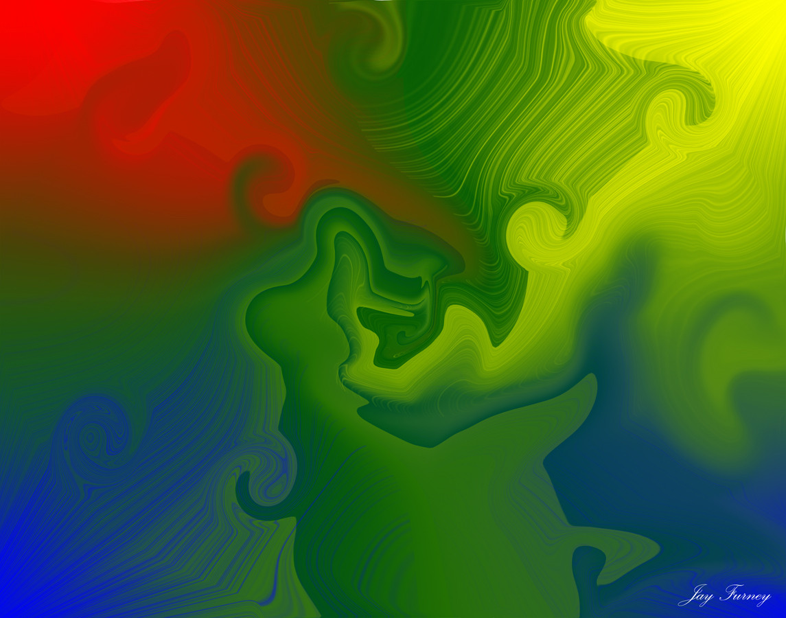
IONIC.again me and
he did the amazing render and i did the rest
hope u enjoy :]
 and comments are as always welcome
Related content


Comments: 38

Very original with the yellow reflection on the shapes.

👍: 0 ⏩: 0

Awesome job, i like the renders and brushing, maybe the 2d could use some work tho.
👍: 0 ⏩: 0


srry but i think the typo is bad... everything else is great though
👍: 0 ⏩: 0


very nice work on the brushing and render  (Smile)")
👍: 0 ⏩: 0

looks great, fantastic colors and 2d man, great job u two
👍: 0 ⏩: 0

nice piece, allthough I think the 2d is not that good. Specially the big bar with the name of it, is ruin it
👍: 0 ⏩: 0


Not too sure about the text at the bottom, if it was placed where the text was (just the name) it might be a bit more open. Im still gunna
great render too
👍: 0 ⏩: 0

ganz nice. Ich finde die postition und die Tiefe cool. Der render hat eine schlechte qualität,kommt aber vom verzerren,denke ich. na ja brushing ishe tganz gut aus. zum 2d: hm.. ehmm ich denke, weniger deckraft.. meine Meinung..^^ so sehe ich die ganze Sache...
👍: 0 ⏩: 0

")

shite man thats some fucking awesome rendering there...excellen colors adn fucking nice 2d...i lvoe hte brushing here and love the over atmosphere guiys...great work...
👍: 0 ⏩: 0


 (Wink)")

g8 job, love the render and brushing...but sry, don't like 2d, doesn't fit at all. There shouldn't be 2d in this or just very little and decent...well thats in my opinion :/
But everything else is great :]
👍: 0 ⏩: 1

deine meinung suckt :] nene schon ok aber da ist soviel platz da muss einfach 2d rein :]
👍: 0 ⏩: 1
^_^...ja, aber dann wenigstens in nem farbschema vom pic....also hier is ja grün/blau irgendwie und da oben is dann nen grauer balken...doesn't fit :/
👍: 0 ⏩: 0


the blur in this pic gives depth (like tonare said) also great colors, but the red arrow is to hard, maybe lower the opacity a bit
👍: 0 ⏩: 0


At first in the thumbnail, I thought that was a calendar lol....man, the blur in this gives it some sweet depth, and the yellow/green tentacles look great.Nice collab you guys.
👍: 0 ⏩: 0

perfect color combo, the top part is an awesome compliment to the bottom part
👍: 0 ⏩: 0

awesome work this one looks really nice clean and at the same time really datailt, i like that.
👍: 0 ⏩: 0


wow, amazing work here, that render has so much depth and the 2d and brushing are awesome.
👍: 0 ⏩: 0

2d looks kinda weird to me, maybe a bit too much, but it's still a good piece!
👍: 0 ⏩: 0

yeh the 2D stands out alot but at the same time i like how it stands out because the abstract scene didnt continue above the 2D...the rest looks really nice! ")
👍: 0 ⏩: 0

this is great but the 2d stands out too much try lowering the opacity of it
👍: 0 ⏩: 0


Quite good, like the design of the 2D on top and the render below. Render itself is pretty cool o_O
Great dept in the render and the brushing makes it really sweet =3
👍: 0 ⏩: 0