HOME | DD
 xRed-thunderDragoNx — Seep

Published: 2005-01-03 05:41:58 +0000 UTC; Views: 1768; Favourites: 20; Downloads: 259
Redirect to original
Description
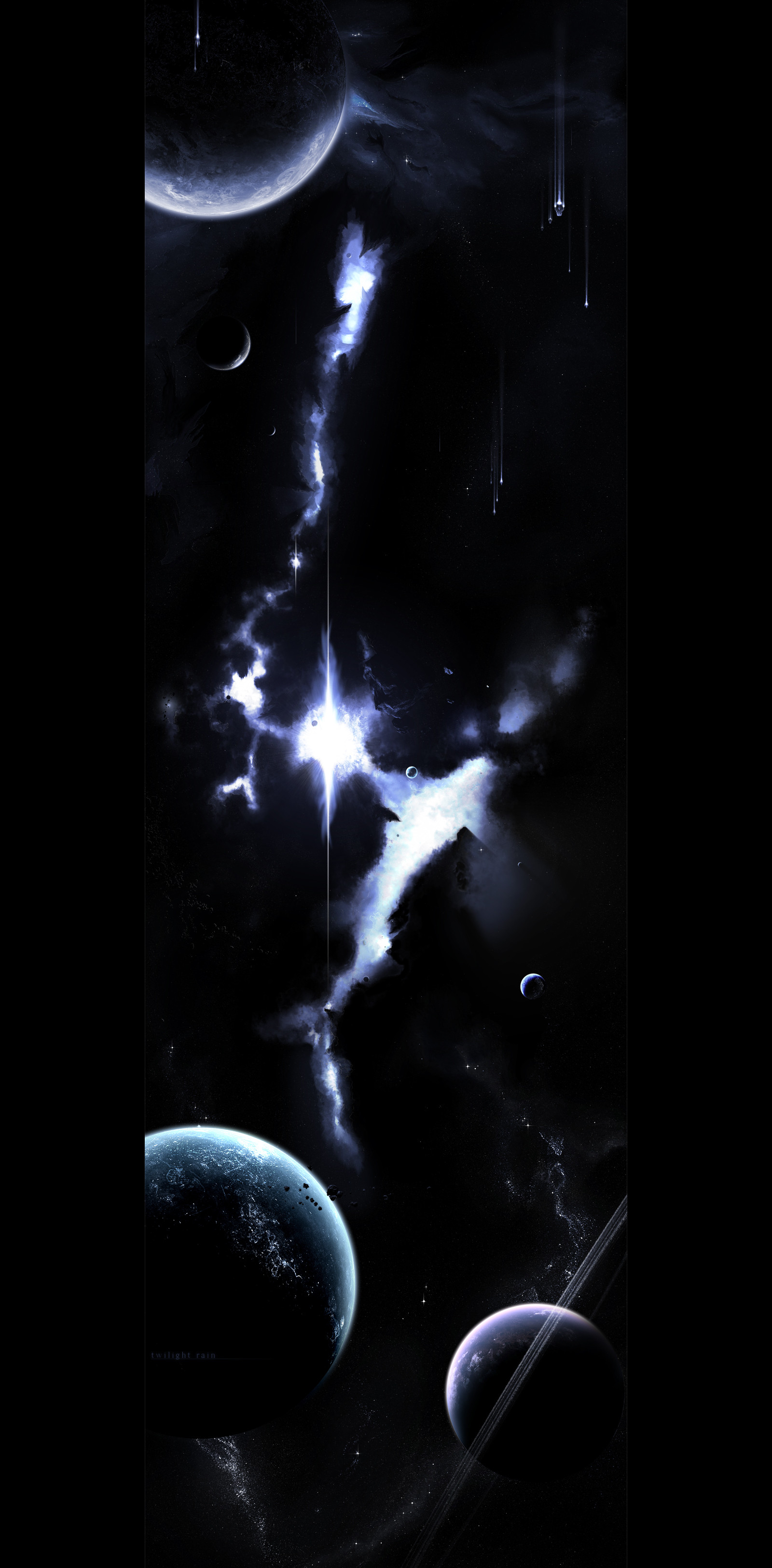
Started as just another nebula practice (bigger this time (Wink)") ) but ended up as a overall brushing practice!
) but ended up as a overall brushing practice!But also, ended up so well that maybe keeps as deviation, if it receives at least 1
 (as I do with all my submissions).
Plus, I would like to feature my pride about haven't use any textures of any kind and could brush my own asteroids and didn't need rendered ones this time.
Advanced Critique Encouraged because it's a practice and all I want is improve my skills, but if you don't have any advanced critique to give you can still come and say "wow it's so beautful I like it" but obviously leave it with a fav

Oh and many thank to ~Ov3RMinD who helped me a lot with this piece and my brushing skills, and I hope keep giving me such great tips!
")
1.EDIT (01/03/2005):
k people: changed the font and some plus effects
cmon let's comment!
 (Smile)")
2.EDIT (01/03/2005 at night):
removed sunrays, changed a bit the colour, removed at once the title and inverted vertically the image, wich I thinnk looks gorgeous now, and is my first piece that I would fav!
Related content


Comments: 54

this is amazing. looks a bit like a comic. but i like that look, very unique and special.
very good !
👍: 0 ⏩: 1


"Wow it's so beautiful I like it"!
Well it is a very nice piece indeed. I notice you like the monochromatic color scheme, which does work well here and with most space art, but I would challenge you to do some complementary and analogous ones. I think you can get more depth to the nebula using cools and warms when applied in the right fashion.
Personally the only thing I really have to complain about is the flow of the image. I think you have used too much negative space at the bottom. With the nebula being the main focal point at the top, it just doesn’t seem to work for me. I would make a really nice planet and put it in the negative space you have as a new focal point for the piece. And I think I would give the planet some nice warm colors so the blue nebula would recede in the background.
-Just my opinion though.
I’m sure you should be commended for not using any textures but if you take them out of your arsenal of tools I think you have deprived yourself, but not using rendered asteroids is something you should be proud of. Personally I don’t like seeing rendered asteroids and planets done 3ds max or the like. About the only thing I would use those programs for space ships.
")
👍: 0 ⏩: 1

xD ty very much buddy!!
I really appreciate your commend and specially the long time you took to write this comment and these constructive critiques
Well colour is something I don't master and don't even understand at all, and if there's something on space art wich I don't know and could be the part of a possible collab partner is the colours - oh how I hate then..... but at the same time I think they don't just don't work on my pieces, but with better colour schemes, they would look better, yeah....
Hmmm yeah I think it's really your personal opinion, because in mine, I like it very much.....
Just being different from the normal of the nebulae on the middle and a possible negative space around.....
I face this piece like a "space protrait", where not any part of it is specially featured, but I laso face it like a simple practice
"Deprived".... sorry I don't understand this word, what makes I don't understand the whole sentence. Also, I'm not at home so I haven't any dictionary here
👍: 0 ⏩: 1
Well you can find some interesting things on color theory and other art topics here:[link] if you want to learn about it.
Yes it was my personal opinion but not without a vallid point. In my brief study of art it is widely accepted that good art will have a focul point and ways of using negative space to it's benefit. But it has to be used wisely or the art can suffer. But again this is up to you and what you like.
When I say deprived because you don't use textures I simply mean that you are not giving yourself the benifit of the capabilities the software allows. I find the use of textures very good for having variety, otherwise nebulas(for example) are looking the same to me. I think it is best to use textures along with all the other tools that PS offers in a good mixture. But...when it comes to using the default textures it's not very good cause then people can see that and it becomes monotonously boring. Always make your own textures if you're going to use them. But agian this is up to you.
👍: 0 ⏩: 1
Thank you for the link, althought I'm a bit off from digital art right now, and have no idea when the inspiration will come back =/
👍: 0 ⏩: 0

wow, fantasric piece. I really like the various colours you've used. And the way you've brushed in the blue at the top makes the nebula look like an eeire range of mountains....erm...in space
great sense of depth to the picture, overall really good
thanks
👍: 0 ⏩: 1
Whoa thank you very much dude!
The fav is greatly appreciated!
I didn't understand what you said, so I ask you to remake the question.
I'll help you so much as I can!
👍: 0 ⏩: 0

ty!
more will come, obviosly better
👍: 0 ⏩: 0

I don't know why. I just...really like it. Great job.
-Wes
👍: 0 ⏩: 1
Among all the weird comments I did already receive on these 7 mounths of deviantArt I think the most curious one of then.
At least you passed by leavig a lil fav - wich I thank you very much!!
👍: 0 ⏩: 1

I love that style of nebula, it almost looks architectural, like old Gothic Cathedrals.
👍: 0 ⏩: 1
lol I can't understand why you think it looks like "old Gothic Cathedrals" but I 'm happy to know more people than me loves this styles
👍: 0 ⏩: 0

I'd say the asteroids are done really well... keep practicing with the nebulas though, perhaps with that syle u might wanna make the nebula smalle and more transparent.... (maybe a bit smoother too...
nice piece tho m8!
👍: 0 ⏩: 2
I mean... uh... so that you can see more of the stars in the bg of it... i don't know, just make it 'softer'...
👍: 0 ⏩: 0
What do you mean with a transparent nebula?
👍: 0 ⏩: 0

not bad!! i love the way u worked on teh asteroids on teh bottom. BEAUTIFUL lighting and composition, along with the overall piece!
👍: 0 ⏩: 1
whoa thank you!
yeah I'm really really proud of these asteroids! they ended up so well and realistic that I just can't believe they were made by me!!
but so, wich are the bad points of the piece, to focus more on my next practices??
👍: 0 ⏩: 1
mm, the bright nebula up top. it looks promising, but the colors aren't really merged. at parts it looks finished while at other parts it doesnt. just look over it, and bursh on it/practice it.
👍: 0 ⏩: 1
Much people tell me about flaws on colours, but sadly I don't see it, not even these unfinished parts
")
👍: 0 ⏩: 1
u eventaully develop the skill. i think its something subconscious when it comes to painting. i mean that after a long time of painting and being familiar with the different elements, your subconsciousness kicks in, and just puts in the colors n stuff for ya
👍: 0 ⏩: 1
what a heck of books about colours you mean??
👍: 0 ⏩: 1
go to the library. ask the librarian for books on color concepts.
👍: 0 ⏩: 1
hahaah he will laught at me
a 14 years old punk looking boy asking books about colours
are you talking serious?
👍: 0 ⏩: 1
im not talking about KID books. it's up to date books. look up books on painting. they should include concepts on color. these r mature books, for serious painters. if u think thats funny, forget it.
👍: 0 ⏩: 1
ohh it's painting books..... sorry but I just had no idea of what you were talkin about
when I take courage I'll take a look at the public library from my city......
thank you for the tip

👍: 0 ⏩: 0

can i ask a questions the center of that nebula is very very bright
shouldnt there be "light beams ?"
👍: 0 ⏩: 1
I made then and kept then but was looking much better without then
I know I'm killing the realism of it and I prefer to keep the beauty
👍: 0 ⏩: 0

Ok that is starting to look great! I'm gonna favourite this work, it looks very good. Keep practising! Well done.
👍: 0 ⏩: 1

I faved it because i think your work an this nebula without a tablet is really woth it.
👍: 0 ⏩: 1
oh.... I wouldn't like to receive favs for this kind of things.....
👍: 0 ⏩: 0
I was really needing your help but you just didn't appear on MSN
so, do you think I should remove at once it?
👍: 0 ⏩: 0

i dont know... it was done flawlessly, i think maybe i bit more color variation would make it better, but since its a test, you can save the really flashy stuff for later
👍: 0 ⏩: 1
"flawlessly"? "save really flashy stuff for later"?
sry but I didn't undertsand a word!
👍: 0 ⏩: 1
thats ok, i didnt understand what i wrote either, i was dead tired at the time, sorry
👍: 0 ⏩: 1
lol but couldn't you finally tell me your opinion about it?
👍: 0 ⏩: 1
i guess... youve done better... maybe just the blue is getting a bit old.
i have a really dark monitor, so its hard for me to see details, even with the brightness all the way up (whihc is why my own stuff is always so bright)
👍: 0 ⏩: 1
Made some changes, but the overall colour can't be changed with colour balance becuase the brush strokes were made properly with the blue
Sadly we have this issue to fight: screen settings. Sometimes people use too bright settings and see a lot of errors and bad things that the artists can't see, and sometimes it's so dark that you hate the "lack of details" of the piece. The screen resolution also do several changes about the mood of the piece and it's quality.
👍: 0 ⏩: 1

Great job, man. I love how much depth there is in the nebula.
👍: 0 ⏩: 1
Oh do you really think so??
Everybody else thinks it's not realistic and hate this "hard edges nebulae" because of the lack of realism ")
👍: 0 ⏩: 1
ok I must agree with kwy, the font REALLy destroys the pic! Try just using a semi transparent glowing white and another font for the text, it stands out too much.
Other wise the nebular could use a little bit more of a refinment to make it feel more like a cloud (well depends on what you think), but other wise it's a great peice! Really good! Well done
p.s (
👍: 0 ⏩: 1
Ok I changed the font and some effects of it!
Is it looking better and alrigh now?
Well I didn't really understand wath you meant, but I'm still developing my tecniques and as the time passes by and I get more experience with my artwork I'll improve the realism of my pics.
Oh hehe I did use then a lot in the past, but today I think they are a bit like "cheating" and I'll use then again only when it's IMPOSSIBLE to archieve the desired effect with normal brushes.
👍: 0 ⏩: 0
| Next =>