HOME | DD
 yang — Doc Ock - and we drown
Published: 2004-11-10 05:59:20 +0000 UTC; Views: 10231; Favourites: 115; Downloads: 734
Redirect to original
Description
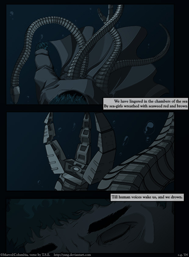
This took me for-freaking ever, least of all the month I spent pondering what I actually wanted to do with the idea I'd had behind the picture- for some reason I just can't bring myself to upload every half-assed scribble I do, and when I do make something I try to make it different from what I've done before. The big disappointment I had was that his face is barely visible.... I want to give drawing Fred's lovely face another shot, if my girlish hormones can stand the challenge.I'm still not sure if including the verse, (10 point bonus on the exam for the children who can tell me the poem it's from, I know ~washipuppy does!) made it too ham-fisted. Any thoughts? The three of you who will actually look at this, seeing as it's not SD, yaoi, or involving a dumbass joke?
Related content


Comments: 95

I wanted to say that with the poem, but now you did it.. damn :/
I love that picture it's a lot of work in it.. btw. i can't draw in such a way..
👍: 0 ⏩: 1

If it helps, after I originally came up with the idea I saw a fanfiction by someone that encorporated TSE's "Love Song" into it. 
👍: 0 ⏩: 0

Holy crap this is good. 
Daaamn.
("I have heard the mermaids singing, each to each.
I do not think that they will sing to me. ")

👍: 0 ⏩: 1
Hehe... thanks. I wanted to kind of give it a 'comic book' appearance, which is what compelled me to put the text in boxes.
It's kind of funny... my sister is actually the Eliot fan of the two of us. She's also the one who really loves octopi, too- whenever I see a toy octopuff, I have to buy it for her. Even without their current supervillian association, both are very awesome.
👍: 0 ⏩: 0

Very nice! I like the colours, and the last panel is so heart-wrenching.
👍: 0 ⏩: 0


 (Smile)")

Wow. That is indeed a most wonderful drawing you've got there. Very well drawn, and oh-so very sad. Poor Otto.
I love it!
👍: 0 ⏩: 1
Aww, thanks. Having a thumbs-up from you lot definitely makes the centuries those arms took worthwhile. XD
👍: 0 ⏩: 0

This just makes me want to see a traditionally animated Spider-man movie even more O_O It's just SO professional... that last panel especially. This is... geesh, I just dont have the words for it, ... its just so beautiful *gets all teary and sniffles* The words are perfect, I wouldnt change a thing...
👍: 0 ⏩: 1
Aww, that makes my slavish effort all worth it to know that it has your seal of approval..... I wish that I had the time and energy to devote all of my time to pictures of Ock, goodness knows he's been the biggest thing on my mind all fall. (pardon the pun) Now I spend more time considering ways to get a fictional middle-aged man to marry me than I do fantasizing about gay video game sex. It's insane, I tell you!
👍: 0 ⏩: 0

I love you.
O_O
I'm showing this picture to all my friends, who also love Doc Ock. And... just wow. Such delicious detail on the arms and the hair. wonderful, sexy details.

👍: 0 ⏩: 1
I'll admit that I have a thing for older men. And latinos. And mad scientists. And cyborgs. But I was still blown away by how indescribably dreamy Ock was in the movie. Not just pervy-fangirl-dreamy. Hormonally-charged-panty-wetting-wanna-m arry-him-dreamy. I havn't even drawn porn all fall, I've been so busy just thinking about him. *assorted sighing and drooling and all that shit*
👍: 0 ⏩: 1
It's because of the tentacles, right?  (Wink)")
👍: 0 ⏩: 1
No no no. It's because of his crooked nose and his big latin teeth. And his soulful brown eyes. And the hair.... and.... and because big, squishy guys always make me think of my father. The tentacles are definitely a "+badass" attribute, though, but I'd love him even if he was just a perfectly normal and non-homicidal man.
👍: 0 ⏩: 1
Yes, I will agree with you on that. Before he went crazy over his wife getting killed, he was a very sweet and intelligent guy.
👍: 0 ⏩: 1
*sniffle* Yeah....
*fapfapfap* God he's sexy. Uh, I mean..... bye. *runs away*
👍: 0 ⏩: 0

:: contains urge to jump up and down and scream while pointing at people above ::
:: settles for gaping ::
It's... it's perfect O_O The colouring, mood, tentacles (oh god, the tentacles) are just... awesome. It fits the poem perfectly ^_^ It really, really does.
I am awed by thee.
👍: 0 ⏩: 1
Aww, thanks! I'm glad that you approve, oh discerning, uh... person. Xp It took me a while to figure out how to do it.
👍: 0 ⏩: 0

Very beautiful. The colors and details (not to mention the mood) are wonderful ^^
👍: 0 ⏩: 1
It took me quite a while....... Xp Blue is nice.
👍: 0 ⏩: 0

Simply... Wow. This is one of the most professional and detailed works I have seen yet. You have an incredible future in the art world!
👍: 0 ⏩: 1
Thank you! I hope I do, at least.... it's what I'm working towards, as best I can. ~n_n;~
👍: 0 ⏩: 0


Amazing job! Must.....fav.....yes. Yes I must.
👍: 0 ⏩: 1
Hey! Get back in your cage and get back to writing! I wanna see more of that story, and soon!
👍: 0 ⏩: 1
Not the cage!! 

👍: 0 ⏩: 1
*sniffle* Well, I'm rooting for you!
👍: 0 ⏩: 1
")


It's too bad you used the blue effect on this picture, ya lost all the lovely details. BUT, it does give the effect of sinking downwards, so it's not a complete loss. So, lovely lineart and coloring.
Aaand I don't know what the poem is from, it's nice, but I don't know.
And I know what you mean by the "Any thoughts? The three of you who will actually look at this, seeing as it's not SD, yaoi, or involving a dumbass joke?" I did an experiment yesterday. I submitted a picture that had the EXACT same background as a picture I worked VERY hard on, but I put a half assed quicky Sonic in it and gave it a stupid dumbass discription. In one day, it recieved more favorites then the picture I was proud of. The fact that most people didn't even NOTICE it had the same background is what made it sad, apparently they don't look at anything I don't put "SONIC" in the title of.
👍: 0 ⏩: 1
I opted to use a "crosshatch" blur on what was essentially a cel-shaded picture because I wanted to blur it without it getting too mucky, which is what I feared airbrushing would do to it. The poem is, as smart children will know, "The Love Song of J. Alfred Prufrock" by T.S. Eliot. If you have the heart for modernist poetry, I'd suggest looking it up.
It really pisses me off- I know it shouldn't be about the hits, but I get so angry when I see lousy artists being slathered with jizz attention because they draw Inuyasha or whatever, while other people (like me, how about that!) are lucky to get 20 hits on their gallery a day and are only recognized for their 'gag' pictures.
👍: 0 ⏩: 0

Well, you say it's from T.S.E., so I'm guessing that's T.S. Eliot...
The Wasteland?
👍: 0 ⏩: 1
*slaps the crap out of Pom* You're only half-right! XE
👍: 0 ⏩: 0

Count me in as #5, your predictions were WRONG! ^^
Anyhow, that is a wonderfully moving one-shot. The color scheme is beautiful, as are the tentacles, bubbles, and the face! This looks incredibly professional. Nice choice of lines, although I'm not familiar with the poem. Sadly, any poetry heavier than Ogden Nash looses me. It's a character flaw, I think.
👍: 0 ⏩: 1
It just annoys the hell out of me when work I put a lot of effort into is ignored in lieu of the cute, superficial little scribbles that I do.
Also, you = ignorant swine. Look up Thomas Stearns Eliot on google and edumicate yourself!
👍: 0 ⏩: 1

Bwah-hah-hah! #4! Yay! I get to throw things off!
Seriously though... I dig it. I wish I could say I know where the verse is from... But even though i don't know I think it fits nicely with the strip.
👍: 0 ⏩: 1
Quint, Quint Quint...... why did you not do your homework? This question will be on the exam!!!
👍: 0 ⏩: 1
O.O We were being tested? Why didn't someone tell me? *falls over*
lol.. though with my brain huring from the actual tests I did have to take yesterday, I think I'm allowed some leeway... ^^
👍: 0 ⏩: 0

Wee! I am number #3 of this writing! Seriously, Chris, this is amazing! I didn't know it was going to be like a comic page. Maybe it's not fair to call it such, but honestly, this looks like it deserves a place in a well done, professional comic. I think if you showed his face in the top panel it would have spoiled the impact in the last. Plus I think that impact was strengthened by only focusing on the eyes. Very cinematic in camera use for these three frames. Plus the water pallet looks perfect! Even though it leans towards darkness I have no trouble discerning any of the forms.
Gorgeous, goreous work.
👍: 0 ⏩: 1
Aww, thank you. Xp It was the reason I was not around last night- I was damned and determined to finish this picture. I figured that airbrush-shading would muddle the lines, but I didn't want it to look too simplistic so I used the 'crosshatch' filter. And tada. Yeah.
I'll be around tonight! Honest!
👍: 0 ⏩: 0

I actually think it's some of your best work all things considering. The detail work on the arms and the coloring is very mood fitting.
👍: 0 ⏩: 0
