HOME | DD
 yangqi —
The Wheel of Fortune
yangqi —
The Wheel of Fortune

Published: 2008-07-15 09:16:54 +0000 UTC; Views: 142872; Favourites: 7153; Downloads: 0
Redirect to original
Description
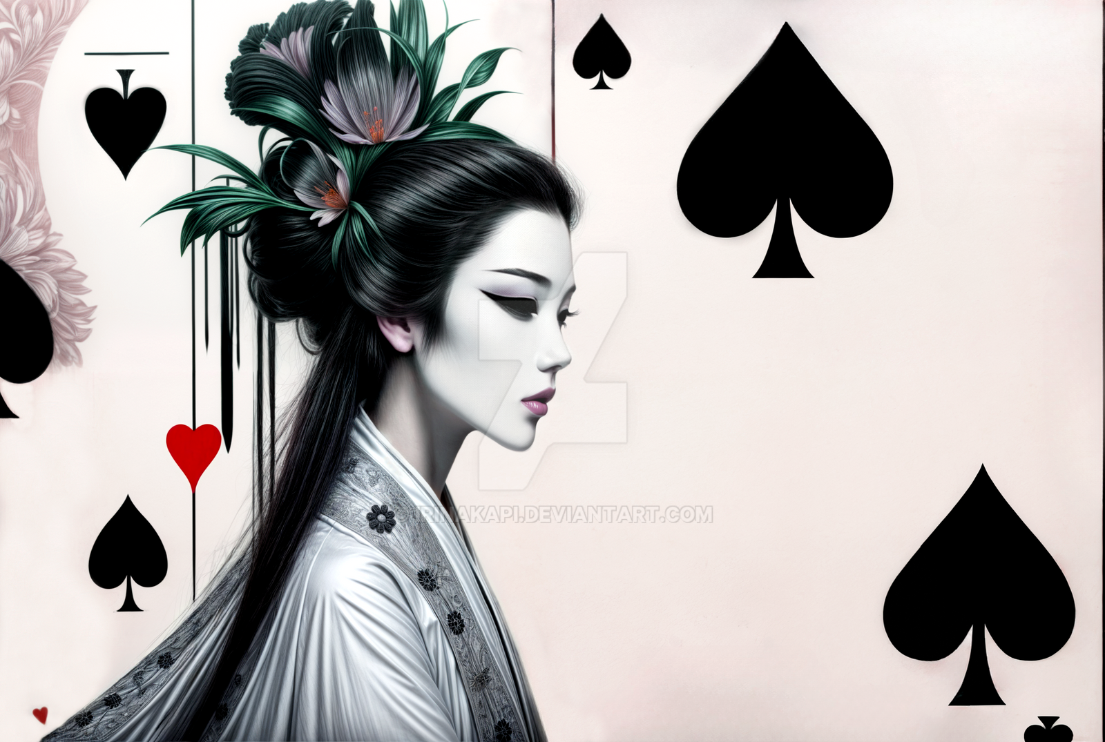
The Wheel of FortuneA novel of cover
Related content


Comments: 377


How long did you take on this?? What did you use mm?
And, this is perhaps the greatest picture I've seen in ages. I love how you coloured this and really smoothly did everything!
👍: 0 ⏩: 0


OH YAY! <3 I'm glad it got it! boogie: gosh I'm so friggin happy! <3
👍: 0 ⏩: 0

There's song wheel of fortune  (Smile)")
👍: 0 ⏩: 0


Looks great! love the colors and shades what median do you use?
👍: 0 ⏩: 0

wow, this is gorgous! I love the detail you put into her card and herself in general! The buildings and sky also look gorgeous in the background.
👍: 0 ⏩: 0


She reminds me of a female version of Vincent Valentine from Final Fantasy VII. Great art!!!!
👍: 0 ⏩: 0


Absolutely Stunning! Congrats on the DD! Amazing artwork! 
👍: 0 ⏩: 0


I love the colours and the details and the realistic look. 

👍: 0 ⏩: 0


looks like Jack Sparrow's lover
sry, fan girl...a great pic
👍: 0 ⏩: 1


Lovely pose and gesture of the hands! Grats on the DD hun!
👍: 0 ⏩: 0

I'd just like to say that I think this is fantastic! Someone mentioned it reminded them of Gambit, from X-Men, and to be honest, just for a second I thought that too. XD
I love the detail you put into the girl. And while more ambiguous, I love the backdrop...it's so...it makes me think of a world that's in ruins, that was technologically advanced, but is now grittier, dirtier, and magic has now taken over, and those who use it...
Oooh, there I go, interpreting the piece. Though I suppose that's what I'd do if I saw this in a gallery, too!
Fantastic work. And someone else asked this as well, but from your artist's note, it seems like this was for a book? Is that true, or just that you see it as a possible cover for a book?
👍: 0 ⏩: 0

It's a really good piece, but the only thing that baffles me is how thin the stone wall behind her looks

👍: 0 ⏩: 0

")


Hey I don't mean to sound stupid, but from the artist comment is this really for a book? It's these kinds of covers that catch my eye and get me to read an interesting story I probably would have missed out on if not for the cover. Very lovely. I'm actually considering buying a print. Hmm?....
👍: 0 ⏩: 0


Makes me think of Gambit, only instead of a dirty Cajun it's an attractive woman.
👍: 0 ⏩: 1
It sorta made me think of Gambit too, just for a sec... XD
👍: 0 ⏩: 0


that would definately make me want to read the book!
👍: 0 ⏩: 0


absolutely amazing, would work great as a flavor pic for a tabletop RPG campaign I run. I love it...
👍: 0 ⏩: 0


wooow thats really cool! im jealous if i tried to do something like that itd totally suck, totally unlike this, which doesnt suck! id totally pick up a book with this cover XD SO WOW fav'd
👍: 0 ⏩: 0

Although the lighting on the girl seems a little out of place compared to the background which in turn is contrasting to the drawing style (not the colors) of the girl, IMHO, I make no complain.
I like how the girl is lit, giving her a special expression, a personality (apart from the already visible attire). Anatomy is just very nice.
Made this a fav of mine.
👍: 0 ⏩: 2
I don't mean to step in here, because everyone has their opinion and I'm not the artist, but I'm curious as to what exactly is out of place about it? A few of the cards are glowing so the light coming from her left side makes sense...do you mean that there should be more of a glow from behind because of the light in the background? I don't mean to sound critical or anything, I just happened to glance at your comment, and was curious.
I do agree that the immediate background behind the girl seems a bit different, but I think it's more the texture, and lack of detail like the girl has...like her body is the only thing in focus. Which is a good thing, considering she IS the focus.
Anyhow, don't mind me...I'm just sticking my nose in where it probably doesn't belong...
")
👍: 0 ⏩: 1
<= Prev | | Next =>