HOME | DD
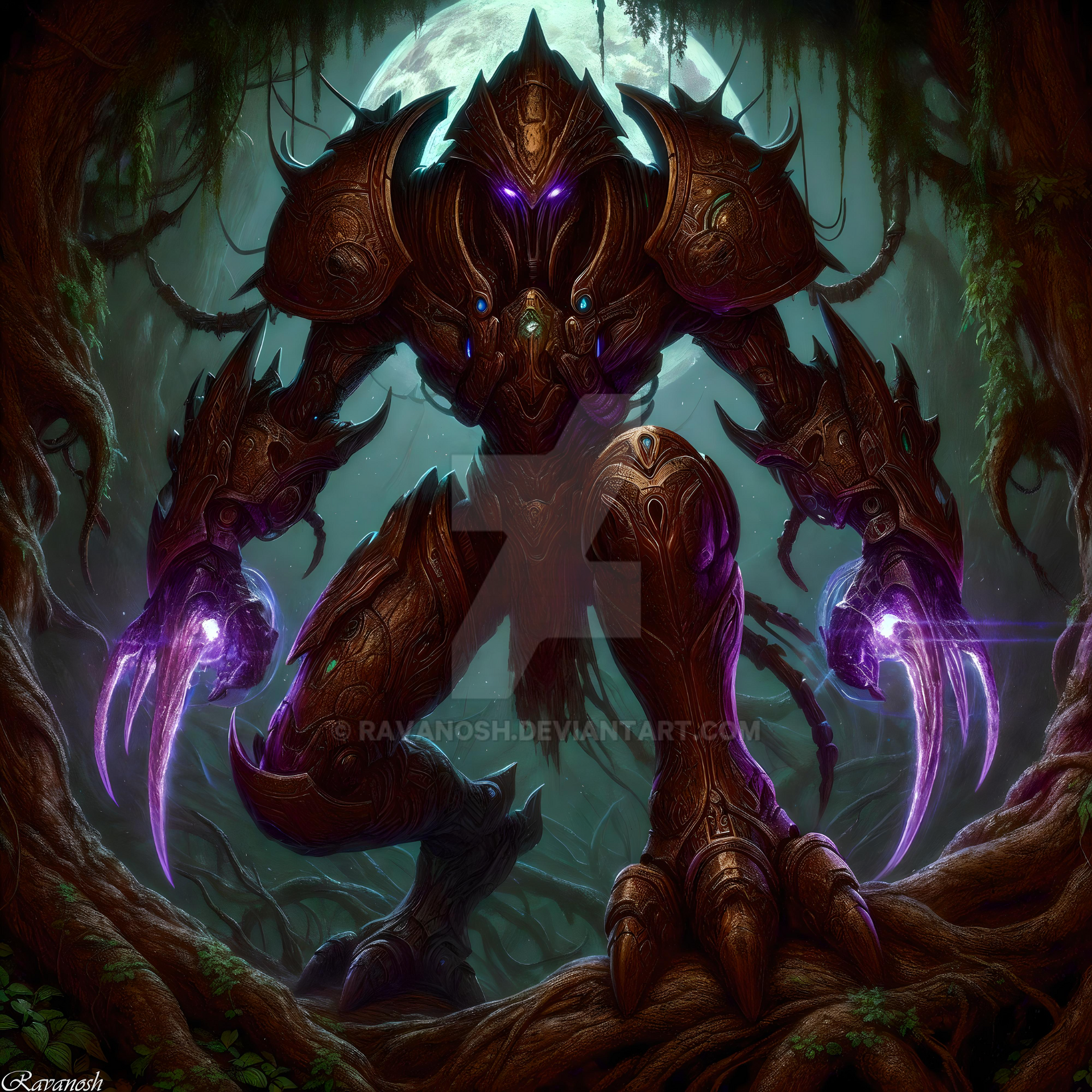
 yondoloki — Tech Priest Thule

#40k #dark #fantasy #flight #games #rouge #tech #thule #trader #warhammer #workshop #yondoloki #40000 #heresy #priest #warhammer40k
Published: 2016-08-13 23:09:20 +0000 UTC; Views: 2965; Favourites: 49; Downloads: 7
Redirect to original
Description
jasdkoijfnoadnf.adv THIS! BLOODY! TECH PRIEST!It's the last time I say yes to making a tech priest for a VERY long time. Took me two months on/off work!
So I wanted to practice more painterly style. THe same day the boyfriend asks if I want to draw him and his pnp group's characters. Sure! How hard can it be! *Boyfriend gives me a list of all the f*cking mechadendrites*
BUT I DID IT!! 4 more to go! *Sobs*
(And yes, I finally found out how to use the emoticons proberbly
") )
)
Related content


Comments: 37

Excellent job on thee attire,making the lines flow naturally.
👍: 0 ⏩: 1

AH, I love how quirky this design is!! <3 I am an especially big fan of the detailing on that weaponry, and the skulls. Hella nice work! Cx
👍: 0 ⏩: 1

Thank you!! ")
👍: 0 ⏩: 0

Hello, I’m from Project Comment!
Great work on making the folds of the robe look good, and as we all know, skulls are a mandatory ingredient in all WH40k art, and you have done them pretty well. Red is for some reason the most appropriate color for Techpriests and it is part of their canon design as well.
The gold trim looks quite fine in tone, but there isn’t so much of it, except around the hood – it would be fun of a little more of it and perhaps in a little more intricate pattern, which would fit considering how well you did with the red and the folds. One thing would be to to give the Techpriest a broad red sash with golden trim. The fabric feels soft and real.
The presence of a flesh-and-blood hand is nice reminder to how he is not a machine, but a cyborg priest of TECHNOLOGY!
I also like the variation of the things held in the Techpriest’s mechadendrites. The mask looks somewhat comical, which can be seen as both a good or a bad thing – Warhammer 40 000 at least used to be rather “tongue in cheek” but the Adeptus Mechanicus themselves tend toward a humor of the more bizarre sort, concerning things like restarting a computer by “lighting two sticks of incense to soothe its angry spirits and giving a blow to the right side of its brass casing.”
All in all: a nice piece!
👍: 0 ⏩: 1
Thank you!
I'm really glad someone who knows about WH40K likes it
👍: 0 ⏩: 0

Hi! I’m from Project Comment
This is so amazing! I love it. First of all, the textures of the metals are all very well shaded and different. Key word is different. A lot of the time I see metals that are all one colour. But this has different textures: smooth ones, rusty ones, and the best is the bottom arm, which looks more coarse and rough. You have absolutely nailed the variation! The amount of weaponry is frightening and once again is very diverse. This piece has a really post-apocalyptic vibe to it, and I think that some more depth of shading could improve on this. As an example, the large sleeves look like they should be much darker inside. This would make it look like the character has more depth to it. It would also make the lighting seem more constant, as right now it seems like there are a couple places where the lighting is a bit off. Also, a drop shadow on the floor at his feet will help with this. One other thing- his left hip (or knee?) looks far to large in proportion to the rest of his body. But overall this is amazing. Well done! Good luck on the other 4 of these!
👍: 0 ⏩: 1
Thank you!! I am working on some tweaks for it, since I forgot a bird cage he has on him. I have gone over him once more with shading, so thanks for that. I can't give him a drop shadow. The bf needs them for some sort of project, so just the characters, nothing else.
👍: 0 ⏩: 1
Glad to see you are still working on this. The drop shadow isn't really a big deal, just deepen the existing dark areas and this will be even more amazing!
👍: 0 ⏩: 1

This is intriguing. It makes me think of a meld between the Robot Devil or Roberto (of Futurama) and something I may have seen in a D&D Monster Manual. First, I like your posing of him. He is poised for action, with a believable grip on his polearm and a wide, bent-legged stance that keeps the center of gravity well supported within all the various mechanical limbs. Your choice of a castellated kind of trim detail on his hem, hood and cowl is also nice. It gives just the right amount of detail without being so tediously intricate that the artist just wishes it was over already. Your use of contour shading and shadow are also well executed, though (as I often see) a little extra darkness near the vertical edges of the robe would have helped to round it out better and make it less flat looking.
You have a great opportunity here, with the bell-cut sleeves, to show some eye-catching detail near his left knee. I think the fabric of that sleeve lays across the knee and would be pushed by it. By showing some light where the sleeve fabric goes up and then over the knee, you would add a lot of realism. That's not really a criticism, just a suggestion. Criticism comes next.
I think the blade of his halberd-type weapon should be of a brighter metal. These metals mostly look like dyed or blued steel, which is fine, but a blade's edge wouldn't be able to retain the dye or bluing when sharpened, used and cleaned. it would be shinier. In proportion to the robot's own head, the skull looks rather large. Assuming the skull came from a normal sized human, this makes the robot...maybe...four feet tall? Also, the skull looks a bit flat.
The variety of available weapons the robot has at his disposal is impressive, as is the variety in their support systems. Generally, this is a really nice piece.
 (Wink)")
👍: 0 ⏩: 1
Thank you for all the suggestions! I'm working on a secound edit, since I forgot a bird cage he ran around with too. At this point I have done the knee thing and the darker outer contour. It does give some nice details
👍: 0 ⏩: 1
How much of the blade to brighten depends on what you want. Most traditional blades are unpainted steel (modern ones being stainless steel). Sometimes in stores I see kitchen knives that are painted bright colors; their blades match their handles and only the edge is shiny. This approach (that of painting or staining the body of the blade but leaving the edge bright) could give an interesting modern look, as well as increase the stealthy element since there will be less surface to reflect light and alert enemies of his coming. but a fully shiny blade would be move obvious to the viewer as to what it is.
When I'm caught between options like this, I often look online at real weapons, or at illustrations others have done. A simple search for "combat axes" or "halberds" or even "kitchen knives" might turn up some interesting results.
Keep in mind that artistry doesn't exclusively reside in the realm of creativity ex nihilo. Artistry also consists of being inspired by what else we see, so research can be very helpful as we pick and choose what we want to imitate. And sometimes something we see will give us an entirely new idea.
👍: 0 ⏩: 1
Okay, I'll try look around. I have used tons of references from rouge trader and other tech priests for this, so I haven't been sitting in a vaccum while doing it. I guess thats what you mean by nihilo, right?
👍: 0 ⏩: 1
Yes, that's what I meant: ex nihilo means "from nothing". It's from the phrase "creation ex nihilo" which summarizes the beliefs of those who hold to a staunchly atheistic "big-bang" notion of how reality began: 0 + 0 = everything. I'm not critiquing that view, I'm only describing it.
I'm sorry if I implied you were working in a vacuum. I'm not familiar with what a tech priest is, but it sounds like it's a standard archetype, or character class, or what-have-you, probably from a game?
Anyway, I hope I didn't (don't) sound patronizing. I definitely don't mean to be. But I can ramble on sometimes, despite how much I try not to. Like, there was this one time when I couldn't stop talking...
👍: 0 ⏩: 1
Oh! The more you know
Not at all!! I was merely trying to refrase to something I new what meant because I hadn't heard that term before. And working from a vacuum is really hard, I take no offence since that was what I did in my younger years, convinced that using references was cheating xD
And yes a tech priest is a character type/occupation, something something from the world of Warhammer 40k. So there are much fanart out there to draw inspiration from.
Haha, don't you worry, you have been nothing but kind and helpful, even educating
👍: 0 ⏩: 1

ProjectComment
Deadly Mechanical Menace is what comes to my mind when I see this guy. Obviously all those skulls on his gear and robot parts let you know that this guy doesn't mess around. I also like the variety of his arsenal and how they are all attached to him. A saw? A drill? A blade? This guy sure is a force to be reckoned with! Also, the detail in his robes and his metallic parts is just awesome. Every fold in his robes and every reflection against his blades adds texture and makes the character all the more in person. I also like the color of red and gold, symbolizing royalty I suppose? I honestly don't have much issues with this piece but if you want me to nitpick... X3 I guess the eyes of this robot could stand out a little more? The blue and red are so dark, that they kind of seem muddy together. But again, that's just me trying to find something to criticize about it. I think what you drew for your boyfriend is certainly worth the effort and consideration for him.
👍: 0 ⏩: 1
Thank you for the comment!
👍: 0 ⏩: 1
Ah, I see. Well, glad to see you are working on it. ^w^ It's still a damn good picture either way.
👍: 0 ⏩: 1
Thanks
👍: 0 ⏩: 0


Thanks! I'm glad my struggles have pain off ^^
👍: 0 ⏩: 0

This is soooooo original
👍: 0 ⏩: 1
Thanks
 (Smile)")
👍: 0 ⏩: 1
No i mean the textures as, literally?... uhm you know how you worked the different materials. I didn't know about textures added in photoshop actually lol. I mean to say you made em look good xD
👍: 0 ⏩: 1
Oh! Right of cause! xD Silly me, thank you
👍: 0 ⏩: 0

YEAH ! TECH PRIEST !
Next step, an Adeptus Custodes with full armor details !
👍: 0 ⏩: 1
I'VE got for more characters to go, who is probably going to have just as many details, so Im already booked up on stuff that is in over my head xD
👍: 0 ⏩: 0