HOME | DD
 Yudhaikeledai — MLP Thinking with Portals: Delivery Service
Published: 2012-01-26 16:05:57 +0000 UTC; Views: 151144; Favourites: 4285; Downloads: 3869
Redirect to original
Description
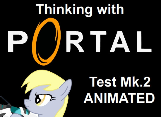
Looks like Aperture Science has started the field testing of their commercial ASHPD and Derpy decided that she would like to use it! Well... Not in ways that people often expect though, but Cave Johnson says that the way she uses the ASHPD intrigues him, he is willing to pay Derpy 60 Bits for testing it.Twi's broken bones was a continuation from the last one
 (Smile)")
I don't know how to say this, but I don't actually hate Twilight, instead she's actually my second favourite (tied with AJ). But I have this rule: the more I like a cartoon character, the bigger the chances of you becoming the butt monkey of my experiments
 Don't worry Twi, you'll get your revenge later
  (Wink)")
By the Way, I personally think that Derpy is actually a genius behind all the goofiness
Einstein much?To be honest, the idea looks much better on the planning stages; I don't know what went wrong but I'm certainly not very happy with the results... Oh well...
Speaking of which, Feedback and/or critique is most welcome. And please don't hold back, if you think I deserve some scolding and constructive criticism, go hard on me.
Next "thinking with portals" would be playing with Terminal Velocity! By the way, if you guys have any ideas, I'm welcome to hearing it
Music is "Grasswalk" from Plants VS Zombies [link]
My Little Pony: Friendship is Magic (c) Hasbro
Portal (c) Valve
Program used: Macromedia Flash 8
Other thinking with portals:
Prank: [link]
Maintenance: [link]
Rainbow Highway: [link]
Trust and Cooperation: [link]
Home Alone: [link]
Related content


Comments: 653

👍: 0 ⏩: 0


I had to watch this a few times to think of the right words this review.
I really like the part where Derpy Hooves first takes the mail out and she has a cute smile. :e.deviantart.net/emoticons/b/b… " width="15" height="15" alt="
")
There is quite a delay in after she flies away but then again it is early in the morning for the current time in the short animation. For all we know she could have been asleep and the rooster was her cue.
The fact she had a damaged leg and was able to move easily with those crutches is a little off as it would be a little hard for someone (or somepony) like that to move and it makes sense how she didnt see the whole in the ground as she was focused on simply moving and getting her mail and her attention was then focused on the mail she retrieved. Possibly could have used a better distraction considering it would be hard to miss a giant hole in the ground.
But regardless of those minor flaws, great animation overall and to the point where no one would really think about these small things cause you are too busy laughing at what is currently happening. Well done e.deviantart.net/emoticons/x/x… " width="15" height="15" alt="
👍: 0 ⏩: 0

Impact
It was very well done! I found the animation to be charming and simplistic, yet avoiding the "done in 2 seconds" kind of feel. It was a well executed animation and was very original!
Derpy's portrayal was amazing as the "idiotic genius". I felt the flow was skewed when Derpy was trying to put the mail in the box. The animation had a few glitches here and there, but they were barely noticeable.
Pros:
- Fantastic animation.
- Sound quality worked and sounded great.
- Very original.
- Sweet and short.
- Little to no animation errors.
- Creative use of Portal gun.
- Great character portrayal on Derpy's part.
Cons:
- Could be longer in some areas, shorter in others. Such as Derpy trying to put the mail in, I felt that was a little too short. Yet when she was using the portal gun, I feel like that could be made longer to some extent.
- Flow is wrecked at a couple points.
Overall I was very impressed by this, and your other animations. I look forward to seeing more. (:
👍: 0 ⏩: 0

Vision
Originality
Impact
Wow. I'm very VERY impressed. (By the way, this is for both videos, not just this one.) Most animations I see are very choppy, so I must ask how you did this. Please tell me what software you used. About the design, I think it could use some originality, but I qualify this as two fan fics rolled into one. (Portal and MPL FIM). I really hope you make more and I hope they are just as good. I think you should consider having more dialog though, but I know you probably don't have the actual voice actors so I understand. The vision, originality and impact got four stars because I have no idea what vision is for, (I assumed it was about the quality of the idea) The originality was, well, you came up with the actual animation, but both ideas were already used. The impact is because I was laughing for five minutes straight. Technique got 5 cuz it was flat out amazing. Two hoofes up. Keep it up pal!
👍: 0 ⏩: 1

Thank you Mr. Tiparium for the kind and honest feedback
My animation uses Macromedia Flash 8, and uses the vector-symbol technique in which each body part is separated as a part of the whole; like a marionette; which allows a great deal of flexibility in animating - after the painful setup
Vision basically refers to the concept of the art; how the artist project their thoughts as they work on the artwork that's my interpretation.
I am working on more, I swear that the next one will be better than before. I thank you kindly for the kindest support
(I do wish I can ask people for voice acting, but I have trouble asking people as I don't want to put a burden on them)

👍: 1 ⏩: 1
👍: 0 ⏩: 0

Originality
Impact
This is incredibly silly, because of Derpy Hooves' crazy antics!! It's funny e.deviantart.net/emoticons/l/l… " width="15" height="15" alt="

Last Sunday, I heard Deroy spoke in 'The Last Round Up' and bronies are excited about her voice; she's gonna be a mail-mare, in a canon like she looks like in the fandom.
Twilight got herself "stuck in the mailbox" after getting some letters, thanks to the portal device Derpy used! She got a broken leg when Pinkie Pie used hers and fell on top of her e.deviantart.net/emoticons/r/r… " width="29" height="27" alt="

What kind of Thinking of Portals thing will it be? Will it be Rainbow Dash or Fluttershy? Maybe the Cutie Mark Crusaders will be better e.deviantart.net/emoticons/s/s… " width="15" height="15" alt="
👍: 0 ⏩: 1

So when does Derpy speaking have anything to do this animation?
👍: 0 ⏩: 0

Overall
Vision
Technique
Impact
I liked it. It was very clever. I thought the characters were pretty spot on, and the "writing" in general was great. The animation was pretty nice, with some very good whole-body motions, very much like the original show.
I think part of the problem was the pacing. There was some very nice, very consistent escalation, but there was too much of a pause. It started with a classic Derpy moment, then it gets a little hectic as she tries harder, and then gets big as she pulls out the ASHHPD, and then it calms back down again as she finishes her job, and hits the bottom as time passes. The whole part with Twilight occurs after not only the climax, but after the falling action. My suggestion would have been to have Twilight start walking as Derpy left, possibly have that be the distraction that makes her fall in.
Try adding a little more character into the faces. It seems to be that they just move from emotion to emotion with a few reaction faces. Try adding stuff like Twilight wincing from the pain as she walked, or Derpy twisting her face about in thought.
Like I said though, as a whole it was wonderful. Very impressive, very clever, very engaging, very excited for the next one.
👍: 0 ⏩: 0

Originality
The animation is so smooth. It's flawless. It looks as if you could actually be an animator in the My Little Pony series. The expressions on Derpy's face in the beginning, when she was trying to put the mail inside the slot, is what made me laugh the most XD Which brings me to the expressions you used. They were great e.deviantart.net/emoticons/b/b… " width="15" height="15" alt="
a.deviantart.net/avatars/c/l/c… " alt=" " title="clapplz"/>
👍: 0 ⏩: 0

Overall
Vision
Originality
Technique
Impact
I'd like to start off by saying you've made a lot of improvements with this animation. The movements of the characters were a lot more natural and fluid. I applaud your ability to create a convincing walk cycle for a pony on crutches! One area you might want to work on is the connection between the different parts of the pony (I think they're called symbols? I haven't really used Flash), especially with the connection between the rump and the back of the rear legs. As you continue to improve you should strive for a constantly smooth outline for all parts of the pony.
For starters, I think the composition of the background could be improved. Even as I watch it now I'm still not quite sure what I'm looking at. If you look at the buildings on the right, our brain would like us to think that they'd continue past the tree on the left, but they don't. Right now the sky looks like a purple cutout hanging in front of the tree and buildings.
The buildings could use some work. The outlines on the roof are unnecessary, if you look at examples from the show they're simply connected areas of light and shadow. This helps give them the soft appearance of being made of hay (or whatever it is roofs are made of). The panes on some of the windows are crooked as well. The area near the bottom right (with the door) could definitely be improved. The window on the door is off-center, and the pink-magenta piece doesn't seem to serve an architectural purpose (it just kind of stops halfway up the building). The same piece doesn't quite reach all the way up the building or down the to the bushes, leading to some areas where the wall bleeds through. The area near the door is a very very dark shade of yellow, far too dark for any kind of shadow one would expect. If it's not a shadow, it still clashes with the rest of the building. Especially noticeable after the zoom-out is that the building doesn't really seem to fit one perspective. The way the roof curves above the door seems to defy the laws of reality. The same can be said for the corner that connects the two parts of the building together.
I get the feeling that the bushes and tree were strategically placed where you weren't sure how to draw the buildings. I think you're cheating yourself if you're doing this. As my choir teacher tells me, it's best to sing out and hit a wrong note than to not sing at all, because then you can learn from it. In any case, I just don't think the tree fits in very well with the scene.
The building on the left (after the "camera" zooms out) frankly looks very hastily made. The colors clash with the rest of the set and the whole thing lacks polish.
The sprig of grass near the post of the mail box doesn't connect well with the rest of the grass. I think it'd probably look just fine for both to be the same color. The post itself has a tendency to poke out from under the grass (it's also not entirely connected to the mailbox in some positions).
If you're going to emulate the style of the show, you should really try to emulate the show's clouds too. The clouds in your animation are literally two shapes with some gradients.
The magical glow of Twilight's horn is white-tipped for some reason.
The outlines on Twilight's body have inconsistent thickness and color.
The edge of Derpy's ear (where it should connect to her head) occasionally overlaps her mane.
You and I both know that portals aren't black. Anyone familiar with the game would expect to see the inside of the mail box. The slot at the front should let in enough light for the inside not to be pitch black. The other thing is that neither the blue portal nor the ASHPD should've been able to fit inside the box, and the ASHPD itself appears to disappear entirely after Derpy leaves.
------------
You were very ambitious with this animation, but in the end I think you bit off a lot more than you could chew and released it before it was really ready. It's clear to me that your forte is in animating the characters themselves, and to your credit you continue to get better and better at doing it!
I think that before you release another cartoon you should take some time to practice drawing the backgrounds themselves. The background sets the tone of the whole animation, and designing one is an art of its own. Animation studios routinely hire artists solely for this purpose! Really take some time to study the buildings and backgrounds used in the show. And when designing backgrounds, remember to keep perspective consistent, color/shadow realistic, style consistent throughout, and the layout balanced.
Again, I'm not trying to say you're a bad animator. I honestly believe that you just tried to get too much done too quickly. If you take your time with your next cartoon, I'm sure it will be great! I look forward to it!
-Chessie
P.S.
Animators make test animations all the time without backgrounds. It's perfectly reasonable to release a character animation that takes place on a white background. As you may remember, Disney had a hugely successful ad campaign for WALL-E that featured him interacting with objects in a giant white room [link] . Animations like this really allow a character's personality to shine!
👍: 0 ⏩: 2

ok PLEASE STOP shes trying her best
👍: 0 ⏩: 0
I, for one, noticed that you are one artist with an eye for detail; and I really need that perspective thank you, as I'm a person whose view is more on the whole
As people always say, an object is only as good as its weakest link, and in this case it refers to the background. To be honest, backgrounds have always been my problem, and in a way, I do noticed something amiss with the composition of the background although I cannot really point it out.
My background crafting problems is quite the reason why I decided to go push my limits and see if I can slowly improve over time. I've tried emulating the show's style, despite what you've mentioned on some aspects; however the composition does kills of all the details that points towards this so I cannot blame you for saying otherwise.
Overall, I do find the critique extremely useful, although I have to be frank that I'm a bit hesitant at first to approve the critique because in a way, I do see that you went much more in depth in the composition issue in comparison to other aspects, such as the character animation itself. But of course, I believe that these critiques are given so I can improve, and I really appreciate that you take your time writing this. I will be putting more effort on my weaknesses.
Thank you for the kind and honest critique,
Yudhaikeledai
👍: 0 ⏩: 0

Overall
Originality
Technique
Impact
Once again, a very good animation in need of just a little polish. I'm really enjoying these, and I think you're doing an excellent job of portraying the characters involved.
So what would I consider changing?
1. Just before Twilight arrives you zoom back a bit. During that zoom, the portal on the ground moves.
2. After Twilight falls in, her back-line looks a little off. Usually pony-backs are a smooth line without any bumps, but there is an offset just ahead of the hip.
3. When Derpy gets smacked by the rebounding mailbox, a little visual emphasis (a splash of light or puff of dust) at the point of impact would be good "punctuation" to emphasize the impact.
4. Chekov's Gun, literally! Derpy left behind her portal gun, and there's an expectation that it will be used as part of what follows.
5. A slightly longer fade-out after Twilight falls through would be good. It feels a little rushed as things are right now.
Keep doing these! I think they're great.
👍: 0 ⏩: 0


DON'T READ THIS. YOU WILL BE KISSED ON THE BEST DAY OF YOUR LIFE. NOW THAT YOU'VE STARTED READING, DON'T STOP. THIS IS SO FREAKY.
1)Say your name 10 times
2)Say your mom's name 5 times
3)Say your crush's name 3 times
4)Paste this onto 4 other games
If you do this, your crush will kiss you on the nearest Friday possible. But if you don't paste this, you will get bad luck. SEND THIS ON 5 DIFFERENT GAMES IN 143 MINUTES. WHEN YOUR DONE, PRESS F6 AND YOUR CRUSHES NAME WILL APPEAR IN BIG LETTERS. THIS IS SO FREAKY IT ACTUALLY WORKS
👍: 0 ⏩: 0

Holy crap, it's been a while since I've heard Plants VS Zombies soundtracks. Amazing job on the animation!
👍: 0 ⏩: 0


")


Twilight Sparkle has took the easy way out.
(LAWL GTA V.)
👍: 0 ⏩: 0


i thought she would put one portal in a muffin factory and the other over her mouthe so she could eat ALL the muffins being produced.
👍: 0 ⏩: 0


PixelPal1131 [2013-07-07 19:54:35 +0000 UTC]
Awesome! Plants vs. Zombies, classic. Anypony know how to get Mustache Mode?
👍: 0 ⏩: 0

I know you turned off critique's, and don't want to hear anything like that, but I really want to.
Vision: 5 stars
Originality: 4.5 (4 1/2 cause it was based on MLP and Portal which you didn't create, but you created the comic)
Technique: 4.5 ( because it's a little predictable, a then again, not so much.)
Impact: 5 stars Bubbles and portal guns! Perfect!
(I wanted to add this) Creativity: 6 stars
Wonderful job! Adding to favorites!
👍: 0 ⏩: 0


Derpy, you left your portal gun in Twilight's mailbox and your hat near it...
: Darnit...
👍: 0 ⏩: 0


L.O.L. PLANTS VS. ZOMBIES!! I LOVE THAT GAME!!!!
👍: 0 ⏩: 2
| Next =>