HOME | DD
 ZackF — mech game UI prototyping

Published: 2013-10-29 19:10:06 +0000 UTC; Views: 16188; Favourites: 210; Downloads: 180
Redirect to original
Description
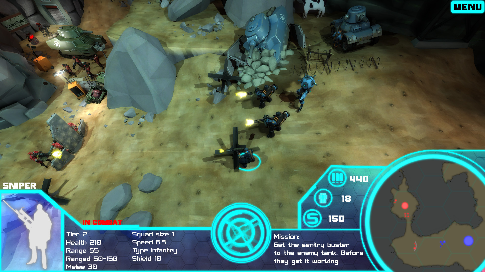
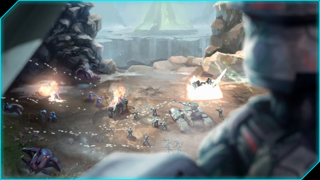
edit: Updated to draw more focus on current unit and action. Fullview if you can, it displays super blurry in non-fullview mode!A Photoshop mockup of what the user interface in my game project could look like. Currently the player has the orange mech piloted by "Mozart" selected and is giving attack orders.
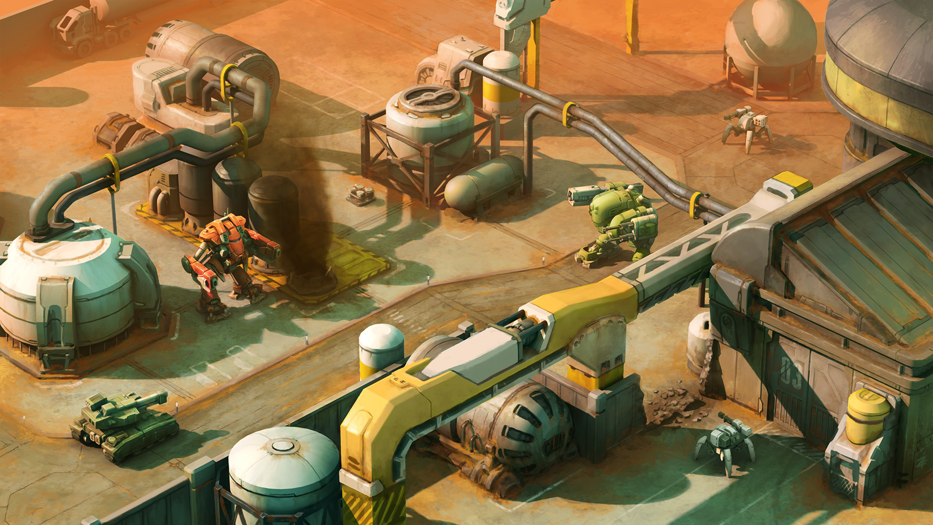
For more on this project check out the tumblr:
toasticusprime.tumblr.com/
Related content


Comments: 20

Ha! I just sent you a message, then I started reading your blog and seeing your other work. Very good.
👍: 0 ⏩: 0


I really really really want to play this game , very nice art work
👍: 0 ⏩: 0


hey this project looks really promising, what kind of game will it be? rts? turn based? pvp? pve? etc
👍: 0 ⏩: 1
nvm i checked your blog and found the answers
 (Smile)")
👍: 0 ⏩: 0

impressive its remind me to front mission one in PS .. i really hope ur game will available soon, did you was post in kickstarter ?
👍: 0 ⏩: 0

Awesome and inspired. Turn based, stats, mechs, maybe an RPG element? Sounds like a game I would play. Wonderfully detailed as always; down to the colors and shading, and the highlighting of the units.
👍: 0 ⏩: 0

Looks just like a game to me! Nice work.
I think instead of the targeting reticle displaying "Hostile Unit", it could say the name of the unit type. The red highlight is plenty of hostile information.
I'm just thinking about games like XCOM and Fire Emblem. It is just a suggestion.
👍: 0 ⏩: 1

Oh for sure, I think displaying the name of the particular model would make sense. I was thinking I might make it so it takes a turn or something before successfully identifying spotted enemies units. Maybe something like "unknown hostile" or "unidentified" would be a better caption for that.
Thematically I'm going for a more-info-than-you-need 80s-esque UI visual direction, which will be tricky to balance with making the actual important information stand out. Another thing I'm trying to keep in mind is that the UI should be usable for colorblind gamers, so I want to avoid using color alone to convey any important info.
👍: 0 ⏩: 1
That makes sense. Hostile targets can also have a unique reticle as you have designed to set them apart from friendly factions or your own units.
I like the "more than you need to know" info. Especially since it is 80's style mech walkers in a way. It has that Starcraft feel to it.
I think you could shrink the Hero Unit's portraits a bit however. You can get away with more screen space on the game than you might initially realize, and still the HUD will stand out as needed.
Again, it's just a suggestion.
If you have room for concept ideas, I'm still learning and a recent graduate of game art, but I would love to concept with you.
👍: 0 ⏩: 0

")

Wow! So nice color. Good luck with your project, Zack!
👍: 0 ⏩: 1

Hey Zach, I think you have a lot of great ideas for look, practicality, utilization, and overall style of the UI. My only comment is with the colors you chose, nothing really stands out. When you're playing a game, you need your most useful info popping right out at you with different colors to indicate different things. That's my only comment, everything else looks great
👍: 0 ⏩: 2
Just a quick update, I realized I misunderstood you at first and I get what you mean about associating different colors with different ideas. I've got a bright, glowy warm off-white for highlighted and current actions now, as well as colorizing the health bars by damage taken.
Tried switching from gold-dominant UI to a green- or blue-dominant UI but I wasn't able to find anything I liked, so I think I'll stick with gold-dominant UI for now and if it becomes a problem in the game itself I'll look into switching it around.
👍: 0 ⏩: 0
Yeah, I agree. There are so many similar colors between the environment and UI right now. I liked the idea and feel of an amber-colored UI but it just fights too much, considering yellows and oranges will show up in the environment a lot. It'll probably be better off switching to a green-dominant color scheme.
👍: 0 ⏩: 0
