HOME | DD
 zainadeel — Discoverer merged with Metro Desktop App

Published: 2012-02-10 01:15:44 +0000 UTC; Views: 43956; Favourites: 337; Downloads: 0
Redirect to original
Description
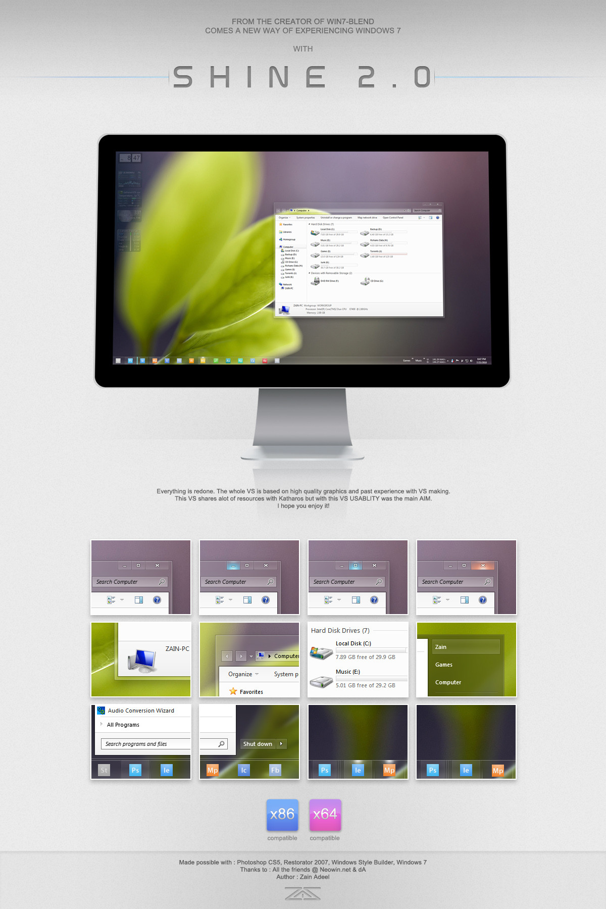
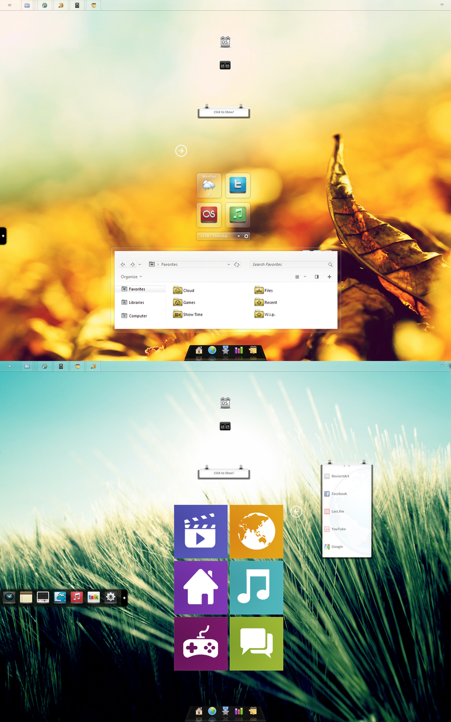
some of my friends at Neowin werent happy with the whole titlebar on left idea.But i was just stretching my arms there.
Here im merging my concept (tweaking it : squaring everything) for my earlier metro desktop app concept.
Merging the two so desktop seems like an extention of Metro. In a way Metro for mouse and keyboard.
And IMO its fresh clean minimal and more consistent than Aero.
Also no time on notification area as charms menu reveal a big time tile on the lower left as all DP users know. And no start button. This concept will have the search bar i designed some time ago to search for apps or files within the desktop area.
Related content


Comments: 100
")

don't worry this is just a concept
👍: 0 ⏩: 1

Why can't you do concepts for Mac! Apple customers have feelings to you know
👍: 0 ⏩: 1
")
👍: 0 ⏩: 0

in a nutshell, i HATE windows, but it's people like you that make
it worth using with epic user interface styles like that.
kudos to you.
👍: 0 ⏩: 1
thank u. that means something
👍: 0 ⏩: 1
no worries mate.
i'll be installing windows 7 for some gaming via bootcamp soon,
so i'll be sure to look you up for some customization needs.

👍: 0 ⏩: 1
im waiting for windows 8 to RTM so I can start theming it.
hoping they themselves polish it enough.
👍: 0 ⏩: 1
i installed it onto a virtual machine the other day and tried it
out a bit. found it a bit dull. the whole metro thing could also
confuse people. either use that or windows explorer, not both!
>.<
👍: 0 ⏩: 1
I actually don't mind both being there. What I find weird is that they have done almost nothing to change the Aero bit to match the Metro design guidelines.
👍: 0 ⏩: 1
yeah, other than no start orb, explorer looks the same as windows 7.
they miiiight change it by the time it's fully done but it looks like they
won't, at the moment.
👍: 0 ⏩: 0

yes function is very important.
👍: 0 ⏩: 0


One of the best taskbar concept I ever seen! Great!
👍: 0 ⏩: 1
thank u so much. this is really close to my heart. If its possible ill edit the default to look like this.
👍: 0 ⏩: 0

Looks impressive brother!!! I hope Microsoft sees this so they can realize how noob they are at customizing their own UI...You can do a better job!!
👍: 0 ⏩: 1

I really like that, the right hand side of the windows reminds me a lot of Adobe products, I don't see it as incredibly practical. The main window looks really good, I love the lack of a sharp border between the folder contents the menu (top) and details pane (bottom) makes it all flow.
I really like monochrome things, and this is full of it.
👍: 0 ⏩: 1
thank u
Well practically the ribbon bar can also be put on the left side.
But i believe it should only be visible when needed and should be hidden by default. And as we stack our windows on the top left side.. The ribbon on right will keep us from learning a new way to manage open windows.
👍: 0 ⏩: 0

lets pray that this will become reality! (theme)
👍: 0 ⏩: 0


sure, this should be a very impressive metro-style design for windows!
👍: 0 ⏩: 1
i myself would use this if its possible to theme a VS like this in win8
👍: 0 ⏩: 1

when will it come true?
and will you do something on win8?
👍: 0 ⏩: 1
if its this customizable then sure
👍: 0 ⏩: 0

thank u  (Smile)")
👍: 0 ⏩: 0

Okay love this. I liked the curves on the other one, but I am going though a metro phase, and square edges ftw! I quite like the interface as I said before, even the titlebar being on the side. I think its an interesting idea. How easy it would be to use... who knows. But it looks really damn nice.
👍: 0 ⏩: 1
this is exactly what that is
👍: 0 ⏩: 0


You know, it's kinda a pity that Windows 8 is nearing Consumer Preview with that ugly theme. This is totally what Microsoft needs to prove to critics that Metro is not skin deep.
👍: 0 ⏩: 1

I've always hated the metro circle shaped buttons and elements. Never really got into my head.. the taskbar looks cool and sharp. In my opinion, the style caption had in the previous version was much better from the graphic standpoint. However this one is better what usability counts.. so Im not sure..
👍: 0 ⏩: 1
that was my design if there is no Metro ..
this design is basically moulding it to look like a part of the metro side of Win8.
I personally think that the caption buttons can work without the circles. But im using those to keep in line with metro design. Also so u know the hit area for touch input. As u can see my design is far more touch friendly than Aero.
👍: 0 ⏩: 0

SHIT, thats nice,! Want to download that
👍: 0 ⏩: 0

Amazing.What are the white icons used in the taskbar?
👍: 0 ⏩: 1
thanks ")
but im thinking. If i made another theme. It wont be aero. It will have a dark grey taskbar and i will release these icons to go with that
👍: 0 ⏩: 0

")

Me too, and I'm generally against Microsoft!
👍: 0 ⏩: 0

So, no shadow on the windows ? I know it doesn't suit very well with metro, but I can't imagine windows without shadows personally.
For the rest I think it's a very good explorer for metro, I'm not so sure about the "navigation tree" but that's still a good idea and graphical like Metro.
I even think Microsoft could like it (which is something else !
I want to work on a mockup of a music player again, but you make me want to work on an explorer too
👍: 0 ⏩: 1
I cant really show it here. Because this is static. But the nav tree is animated. It will only show the location of favorite you are in. And not deeper.
Also yes no shadows. Because i wana be strictly metro. And there are no drop shadows in metro. Only end strokes or a light highlight stroke.
This is me desiging with MS metro start screen in mind. My earlier brown titlebar concept was me designing with freedom
And thanks for commenting
Also do u know that we wont be able to theme ribbon in Windows 8? Ribbon is locked, so i wont be making VS for win8
👍: 0 ⏩: 0

<= Prev |