HOME | DD
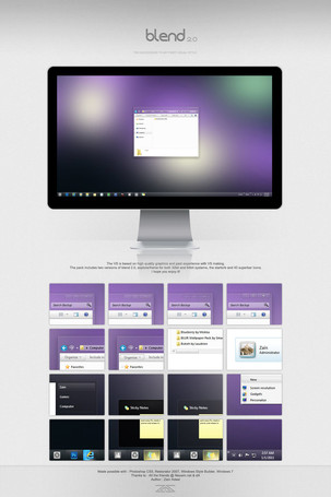
 zainadeel — Discoverer merged with Metro Desktop App

Published: 2012-02-10 01:15:44 +0000 UTC; Views: 43956; Favourites: 337; Downloads: 0
Redirect to original
Description
some of my friends at Neowin werent happy with the whole titlebar on left idea.But i was just stretching my arms there.
Here im merging my concept (tweaking it : squaring everything) for my earlier metro desktop app concept.
Merging the two so desktop seems like an extention of Metro. In a way Metro for mouse and keyboard.
And IMO its fresh clean minimal and more consistent than Aero.
Also no time on notification area as charms menu reveal a big time tile on the lower left as all DP users know. And no start button. This concept will have the search bar i designed some time ago to search for apps or files within the desktop area.
Related content
Comments: 100

The file browser idea is the best, easy to navigate and easy to the eye. Hope microsoft will go in this design. Great work
👍: 0 ⏩: 0

very minimal and sick. I want to use this desktop and have a text clock..great idea yo
👍: 0 ⏩: 0

I love the file browser idea, with the file functions on the right side in a slide-out "drawer" with tabs.
👍: 0 ⏩: 0

Nice work, especially the redesigned ribbon section.
👍: 0 ⏩: 0

Omg I love that taskbar so much. The form windows look welcoming and neat.
👍: 0 ⏩: 0

I do indeed prefer this to the other one. It's much more consistent with current design trends.
However, to a go a bit further, I would drop the circles around the nav and window control buttons. Then, I would make the window control buttons lighter. One shouldn't put emphasis on closing a window, if you know what I mean.
As for the rest, looks great!
👍: 0 ⏩: 0

This is beautiful! Have you released any kind of Discoverer application yet? Do you plan on it?
👍: 0 ⏩: 1

Wow
👍: 0 ⏩: 0

Very good use of horizontal space; we need that with the widescreen monitors and whatnot.
I wonder how that tree list looks though. For example, what if there is a New Folder in Pictures, would it show another level? How would all levels fit in that space without increasing vertically?
👍: 0 ⏩: 1

my idea was for the tree to just work for the first folders. Like in Computer it will only show drives and wont go down when you enter one. For that the top bar will work as it always does.
And Thank you
👍: 0 ⏩: 0

This is an amazing concept I wish Microsoft would take from this. The title bar being on the side is a great idea if you can hide it until you want it that would be even better!
👍: 0 ⏩: 1

well that could be added as an option. basic reason was to use the horizontal space.
👍: 0 ⏩: 1

I totally get that since monitors are wider than they are tall it seems like it would be better to add things that way than going up.
👍: 0 ⏩: 1

Like it very much.
The toolbar at the right is my favorite at this design. I think that we use should use the width of our monitors more efficintly, and thats a good start
👍: 0 ⏩: 1

that is exactly why I placed it on the side rather on top. Because monitors are wider horizontally.
👍: 0 ⏩: 0

This just looks awesome. Would happily use this ! I really like Windows 8 on touch devices, but it's not the same on a desktop with a keyboard and mouse. MS should've rather done something like this.
👍: 0 ⏩: 0

here is what i like and what i don't like
i really like menu's location on the right side and i like the look of file explorer
i don't like task-bar icons and how small they are compared to taskbar size
idon't like favorite/libraries/computers location left side more preferable
over all well done
👍: 0 ⏩: 1

they are small to have larger miss areas between theme so for a touch input there is less chance of a mistouch.
👍: 0 ⏩: 0

WOW This is amazing!
Move the same direction.
I want to know, this concept will be released?
👍: 0 ⏩: 0

Beautiful without lacking function (Hard to come by) this is what Windows 8 should look like.
👍: 0 ⏩: 1

Wow, i'm impressed, You've gotta work on this and release it, absolutely amazing concept.
👍: 0 ⏩: 1

Why aren't you working at Microsoft?! Love all the things you do!
👍: 0 ⏩: 1
| Next =>


