HOME | DD
 zakforeman — break 2 (5-4-13)

Published: 2013-05-05 02:28:12 +0000 UTC; Views: 4764; Favourites: 158; Downloads: 140
Redirect to original
Description
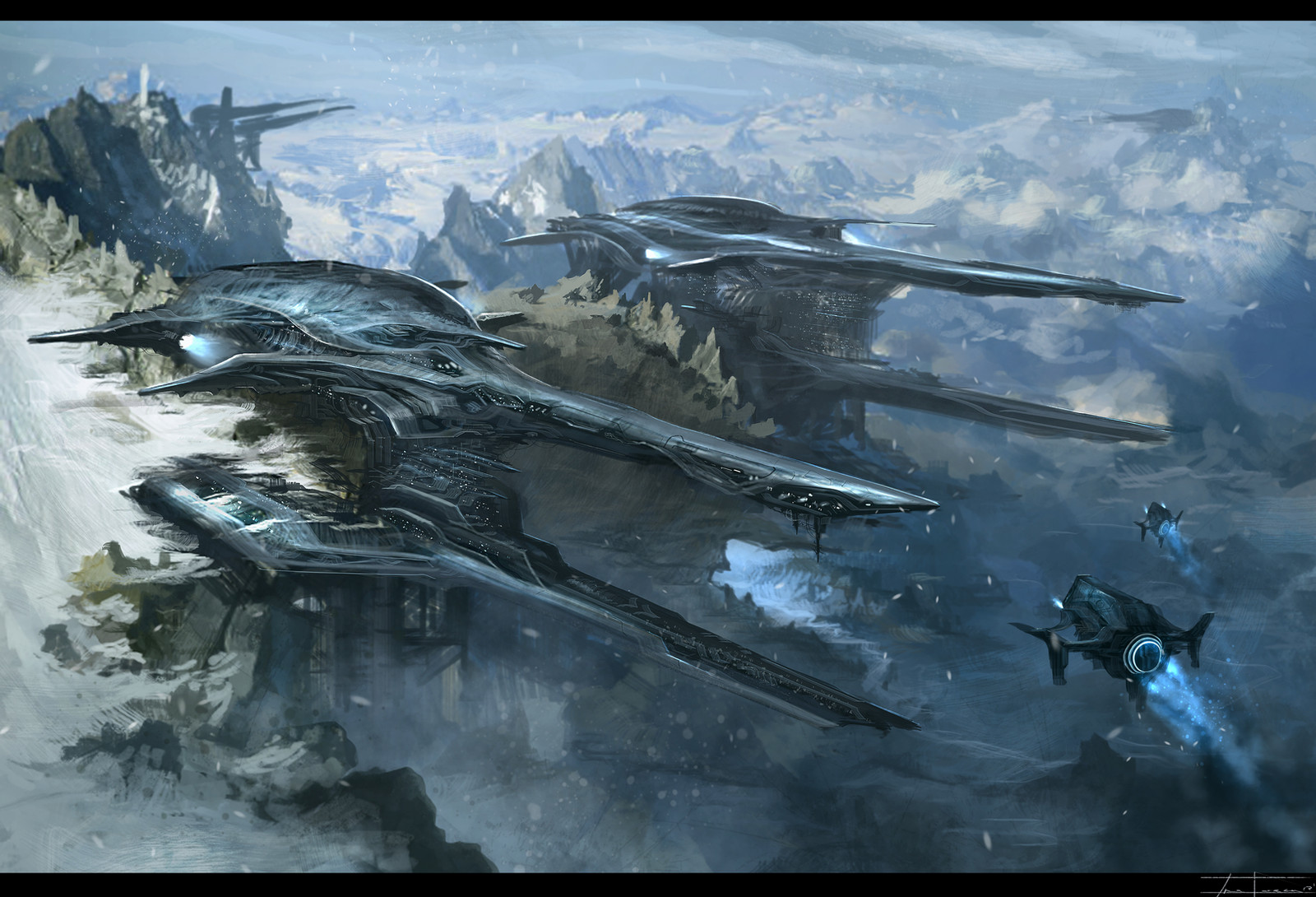
another break from some not so fun work...Related content


Comments: 21


Awesome man! I always love your sense of scale and the way you design your planes. That engine glow especially is giving me the chills.
👍: 0 ⏩: 1

I think the vehicle is great EXCEPT the brush strokes near the middle (White ones). You could have defined that part more to complete the whole thing.
Example:
[link]
Every part of the machine is defined, yours is MOSTLY defined, and the parts that are, are really awesome. But lots of the time you leave stuff as general strokes, which disappoint me because I know you can detail it, because you detail most of it well alerady.
I like the background I think it would be more awesome if it was snowing with the guys on the right with flashlights or something trying to make their way through it. Seeing the amount of fog in the background makes it look like a blizzard to me, but it's not snowing so ")
One more thing, you could define the edges of the background more, PERSONALLY myself, I don't like to do it because making it fade out means less mistakes haha. But defining it is an integral part in making a finished product.
An overview of everything I'm trying to say.
Example:
[link]
As you can see, the image is very involved, where as here, it is quite empty. Furthermore his characters are well defined where as yours are, half-defined. His background is also well defined, where as yours is kind of faded. (Specifically the left side of the background "closest" to the viewer).
I hope this all helps!! Just some stuff I personally think could be improved.
👍: 0 ⏩: 2

"Do it this way, coz I like it more that way" is not a way artist should talk to another artist.
Which part of the painting is defined and which is not is a choice artist makes for himself, based on a goal to drive his audience towards direction or another. Claiming you know better than the artist which part should be more or less defined is a claim YOU know better than the artist what he is trying to say with his work. And unless you are trying to be perceived as an arrogant asshole, it's something that should be evaded.
👍: 0 ⏩: 2
Oops that was wrong, rather "Do it this way, because Feng Zhu does it this way".
👍: 0 ⏩: 0
Actually, he is inspired by Feng Zhu, and I'm comparing his work to it to help him get some aspects of his work in correlation with it.
We both agreed that it's better to first copy the pros in how they do things, and once we have a grasp of that we can create our own style. Thus in this case "Do it this way, coz I like it more that way", IS essentially what I am trying to do. You see, I'm trying to help him achieve his goal by pointing out things in comparison to Feng Zhu's works. I've been critiquing him for sometime now to try help him, y'know?
I guess I will let you calling me an "arrogant asshole", pass this time. Maybe next time you should try look up the context before instantly assuming and insulting unless you want to be perceived as ignorant. I guess my above post did sound a little harsh. I can assure you I mean no harm.
Thank you for your concern though  (Smile)")
👍: 0 ⏩: 1
You hit the nail right on the head with this one. I'm concerned for you, coz that's the way your comments will be perceived by everyone who is not familiar with your silent agreement.
I will give you this, if you are trying to copy another artists work your points are valid, as long as there is understanding behind what you are doing. For example, general strokes are not always to be detailed despite your possible disappointment on the matter. Maximum amount of detail per object is something everyone should stay away from. Reduction of the "noise" detail is what your friend here achieved very well with his painting.
The second example you are giving is a good way to illustrate the mood or the atmosphere of a painting. Zakforeman knows (and I can tell this is not fluke) how to utilize "empty" space in his work, matter a fact - I liked the harsh contrast between the war machine and the calmness of scene so much I instantly faved. Just for the record, though I love me dynamic scene as much as the next guy, I woulnd't fave your mentors dragon killers in the mood I was in. Mood.
👍: 0 ⏩: 1
Yeah, thanks ")
As for maximum detail, personally I guess it depends on the artist, I know someone who wants to be hyperrealistic, so he puts as much detail as he can. Of course trying to detail too much has the opposite affect of detailing itself.
Yeah, I see his other works and he has got composition mostly in the bag. PERSONALLY I didn't like the contrast, but I didn't interpret it as a war machine either. I guess everyone has their own interpretation. I like the calmness too, but the space looks weird to ME, maybe I'm just weird haha.
Mm yes I love dynamic scenes too
👍: 0 ⏩: 1
On detail.
I can give you only my opinion on the matter backed up by allot of theory I red over the last few years. I look at detail as "extinction" of form. In that context detail is only needed when it serves a purpose. Detailing with the endgame to make it "detailed" is wrong in my opinion. It can be used as a tool as well, to focus the viewers attention towards a focal point in your work, that being said over-detailing can "drown" your viewers. If you look carefully the hyper realistic images you will notice even there the artist (if its a good one) used less detail on the unnecessary parts, but doing so he controlled your eye over the painting and you may never notice those rogue strokes. Example that pops in my head right away [link] It literary took me years until I noticed the ground and the undefined rocks there. Which leads me to the signal to noise ratio in every step of the painting/drawing, recognizing one from the other and removing the noise...
Understanding behind what we do is the most important thing, thus blindly copying works can often lead to dead end street in your development.
👍: 0 ⏩: 1
I know what you mean, you still need to leave parts undetailed to create a good DoF.
My friends a graphite artist, he normally does portraits, so he wants to get it all detailed of course the background can be quite vague and "blurred".
As for the signal to noise ratio, I believe it works in most situations for more of the "deep" artworks with lots of meaning. It does work for the simple stuff too, but some people don't want a specific focus. Like I know some people who just want to make a MASSIVE artwork with as much detail as possible. If you know what I mean.
As for copying, we don't "copy" the artwork per say. We just see what makes the art good and copy the aspects of that work.
👍: 0 ⏩: 1
Its not about depth or perception nor about focus. Detail is much more basic element than that. In my personal opinion it stands on equal ground with form, shape or "matter" in your work, whatever you wanna call it. In other words every element in your work is detail brought to a certain level. A much bigger artist than me once said something in those lines - When we draw something we should ask ourselves this - what am I trying to say to my audience? What amount of detail will I need to say it? If a detail says nothing, do I really need it?
If per say, I have to draw a woman's face and I need to tell you how amazing her sad eyes are, do I really need to draw every single fold on her ears? Dropping off the "noise" detail is one of the hardest things artist have to learn, and I must say, I myself am not very good at it yet. It takes years, if you decide to educate yourself on the matter you will find some artist call this process of "abstraction". As strange as this sounds, every master in his discipline has this skill no matter the medium (you just have to know where to look), even photographers use those tricks.
And lastly no matter how massive your work is and no matter if you like it or not, the attention of the viewer will be drawn to certain spot or another on your work and some areas will never be noticed, its up to you if you control that or to leave it to the chance. You only have certain amount of attention span to work with. What you do with it is up to you, but saying to me "I do massive works, thus I need not control" sounds to me like "I need no voice control when I speak to people, most people like it when I scream all the time." In my personal opinion when I scream all the time people get really tired of me, really fast.
Just an opinion.
👍: 0 ⏩: 1
Ahh okay, well for me, it definitely is important but doesn't the detail define the focus as well?
There should be a main focal point where the focus is the whole point of the art work.
As for detail saying nothing, it almost never doesn't. Putting the same amount of detail into everything is terrible though :d.
I get what you are saying, you could make the ears more "blurred" in that sense and draw most detail around the eye area.
What I meant was, they didn't want to make just a piece of artwork, it's more than just that. They wanted to kind of create something like a story as you view it left to right. Something that captures everything (in this case it was a solar system, showing the stars, orbiting planets and stuff like that). Yes, people probably won't notice much of it, but thats wasn't the point he was trying to get across :d.
👍: 0 ⏩: 1
Well thats how it works though
I also wish people would spend hour and a half observing every painting of mine, things just does not happen that way though, if you don't believe me try it out for yourself. Browse trough a random gallery or group, see how much time you spend on any given work, no matter how detail involved it is.
Detail saying nothing - you are right it always says something, the right question to ask yourself is - does it need to be said.
👍: 0 ⏩: 1
Mmm, true haha, people skip lots of the time, tool lazy to see unneeded detail.
What keeps me looking most of the time is depth, I like really "deep" artworks, best for wallpapers haha.
Talking about detail, what do you think of Adam Burn's works?, e.g
[link]
👍: 0 ⏩: 1
Masterful work in my opinion
Note how most of the lines point towards his focal point. And just to make sure your eye follows them they are highly detail-saturated than the rest of the painting, they have a task - to catch your eye and "set in on a path" (the cannon bottom right and the big ship on the left for example). As I said, and again its just an opinion based on my personal studies, detail is a tool, nothing more. Tool that serves form and the "things I wanna say with that form" and a tool to control the continuity and the order of the "things I wanna say".
👍: 0 ⏩: 1
True, the lines kind of point forward, the thing is with this one, theres lots of detail besides the focal point, just the ones in the focal point have.. more XD. Well, I guess everything is technically a tool. I mean, detail is what defines an artwork
👍: 0 ⏩: 0

yeah i totally agree with all your points, I would actually love to put the extra time in to make this more presentable, but sadly I have this asset modeling thingy im trying to learn for a possible internship this summer. which is great career wise, but as for my daily uploads, I am stuck doing mindless speed painting for pure enjoyment. maybe ill fix it up later in the week for another break. Thanks again for the crit though, keep em coming
👍: 0 ⏩: 1
Oh I see, time restraints, they are the worst xD. Well better get the main career stuff done, there will be always time later to do these things when you get the time
👍: 0 ⏩: 0

