HOME | DD
 zeruch — Daddy G v3
Published: 2007-11-24 08:25:17 +0000 UTC; Views: 1671; Favourites: 24; Downloads: 0
Redirect to original
Description
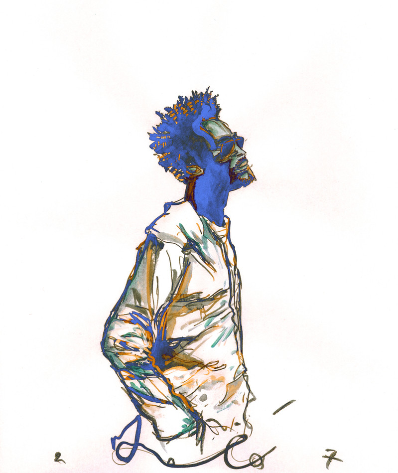
In a way, I am happier with this version, than its successor: [link]If its not apparent, while I have worked on things steadily, I am having a bit of a problem bringing things to fruition. That, or I am just too overworked to have a good handle on whether I am posting dreck or not.
This only has a little bit of digital color tweakery, the rest is pencil, paint and inks.
Related content


Comments: 12

Massive attack's music is beautiful, and this depiction of Daddy G is just as beautiful. Good work.
👍: 0 ⏩: 0

Gorgeous, I think this one really captures a mood that the other version lacks a bit. Wonderful.
👍: 0 ⏩: 0


Quick question after looking at your work, when you say "digital color tweakery", do you mean you alter the colors in a program to make it look more like the real piece, or better than the real piece?
I come up with the same dillema when I have to photograph my trad works, and wonder if it crosses the trad line when people add digital tweaks in their pictures. I can understand using something like photoshop to correct values in a work, but when it's used to add elements not in the original pic it seems more like a trad/digital hybrid.
Sorry if you've answered this question like a billion times to others, I'm just a bit curious, university students always are LOL!
BTW: I really do enjoy your work and the fact that you list media and digital enhancements, please keep it up!
👍: 0 ⏩: 1

Quick question after looking at your work, when you say "digital color tweakery", do you mean you alter the colors in a program to make it look more like the real piece, or better than the real piece?
Yes.
Or rather, some works I approach rather conventionally, and the work is small edits or color changes. Most often though, I am mixing traditional techniques with digital ones in -what is to me so far- unorthodox ways. I actually "compose" some ideas with both technique sets in mind. This include doing things like painting the 'layers' of an image seperately, then assembling them using Photoshop, or GIMP, or Inkscape, or who knows what will come to mind. Maybe I'll do acrylics, then do a fractal design, the print the fractal pattern and paint on it, then rescan and collide all the stuff together.
I consider myself functionally traditional in method and in the bulk of media and styles I employ, but digital is neither alien or infrequently used. How much or how little...or usually just *how* is the part in question. Frankly, digital was the only way to ever realize my rather skewed sense of color relationships.
There is a line where things crossover, but I kind of zig-zag more than cross over it.
And I actually answer this occasionally, but most of the times I am asked I don't bother, because its usually either a hardline traditionalist who is offended for some reason, or someone similarly irritating. You seemed to be genuinely curious, and so I think anyone who actually just wants to know is entitled to some kind of fair answer.
👍: 0 ⏩: 1
Ah I see now, so it's in the middle of a very gray area. Which would make since due to the fact that we're in a sort of cross over between traditional work to digital work. (as a societal whole I mean) I've also noticed some fantasy artists printing on canvas and then painting on top and other people using similar methods.
Speaking on hardline traditionalists, I understand what you mean. How to value computer generated work (especially when compared to traditionally made work) is a huge question of our times, and some people get upset when you blur lines LOL!
Thanks for the discussion and info, I really appreciate it.
👍: 0 ⏩: 0


I've been checking back and forth between both, trying to decide on one (as I really like the drawing in itself), and I have to agree with you. All the white around the figure adds a sense of freedom and movement to the drawing that the other version, encased by the frame and the texture, lacks.
👍: 0 ⏩: 0

I like them both a lot. I like the finish of v4, but the lightness of this, and the kind of electric vibe of the blue shadowed areas.
👍: 0 ⏩: 0