HOME | DD
 zeruch — xam v4

Published: 2004-04-13 07:21:26 +0000 UTC; Views: 1333; Favourites: 26; Downloads: 290
Redirect to original
Description
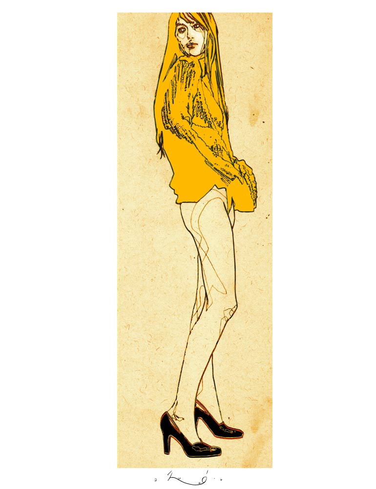
so after my little diversion with the xam1814 octet I am where I wanted to be...still squarely in the devianomicon series style, but this one has a little twist in it (my first use of edited patterns. i initially tried to take a pen-knife and exact a perfectly fitted sheet into the original, then realized I was better off doing it digitally)as the title implies, this is ~xam1814 (my apologies for forgetting to mention/link this)
pencil, pigma micron, water coluable colored pencil, gouache, acrylic ink, acrylic paint + digital
Related content


Comments: 35


wicked concept - you always see people playing with the 3-d versus the flatness but actually intermingling them so closely like this is really a brain bender.
too cool
👍: 0 ⏩: 0


")


wow. sam is looking ultimately cool here. i was just discussing with him how the pattern on the jacket is so daring. i love the hands, his face, the green and his SHIRT... love the shirt. the jacket though... i did like it at first... but now it's not really working for me. i think it's because i really like suits being black. i bought a black suit the other day, and ive done a few bits of artwork with black suits. i guess im boring... but i just like black suits. however, this is still BRILLIANT and i couldnt walk past without handing over a large +fav.
👍: 0 ⏩: 1

well, i love suits period (i own about 14 of them as well as dress vests and various others accoutrements)...and I'll take a flat black or a pinstriped black anyday over the gonzo patternm I have him in
..but visually for purposes here this actually worked best. heh.
👍: 0 ⏩: 1
heh. well said. i have +faved this but nothing seems to be working...
👍: 0 ⏩: 0

this is great! sorry i didnt respond earlier (i was away for a few days), but of course u can make a print! its nice to see that one of my photographs can be used in such an amazing way.
👍: 0 ⏩: 0
I do love Egon's linework (and in that regard, I think I am closer to that than Klimt, on which I think your observations are spot on)...its grittier and more distressed. He was a very tortured soul indeed, and in many ways much of his work was difficult for me to engage with.
👍: 0 ⏩: 0

Wonderful composition. You are a classic artist. Man your stuff rocks. How you managed the pattern is amazing. Great stuff!
👍: 0 ⏩: 0

I love this. The flat patterning mingled with the more natural use of form reminds me a lot of Klimt. And as usual, excellent sense of color--the red and green. A lot of these portraits have just been amazing. You rock.
👍: 0 ⏩: 1
you are probably the first person ever to notice anything Klimt-ish with my work (and I am very very into Klimt). Thank you.
👍: 0 ⏩: 1
I tend to prefer the work of Kokoschka and Schiele over Klimt, but I do agree, he's a great person to look at. I can see that influence in your work. Do you like Mucha as well?
👍: 0 ⏩: 1
I find Klimt's technical execution and visual cues preferable to Schiele's (as well as his subject matter in many cases), but Egon's linework really got me when I was first exposed to it [i was fresh out of high school when an art instructor said a lot o my linework looked Schiele-esque, when really I was ripping off Bill Sienkiewicz, who had been ripping off Schiele (among others)...eventually I just went to the source]
I have had only limited exposure to Koko, and Mucha I like...in doses.
👍: 0 ⏩: 1
I much prefer Schiele's lines. They are so felt. Klimt is more about the design aspects and a fluid kind of beauty, whereas Schiele sees the life and death, something deeper. In my view of it. It could just be my attraction to Expressionism.
Kokoschka's early work is similar to Schiele's, although he was a little more involved in printmaking. I like him quite a bit, although I think his paintings after Bride of the Wind are rather dodgy.
👍: 0 ⏩: 0


Great single line work on the jacket and tie and it works so well with the green. I must say i am suprised that it does not look flat due to no shadowing on the jacket but i think the ruffling of the shirt makes up for it.  (Smile)")
👍: 0 ⏩: 0

I like the pattern! and I love ur crease technique. Bravo!
👍: 0 ⏩: 0

I love how dirty your drawings are... and by that I mean textured and gritty. The face/hands with all it's little scratches and the green textured background is just fantastic. I'm glad you tried digital rather than cut out that texture by hand, that would just be brutal. Your stuff inspires me to work more creatively with my silkscreen projects.
👍: 0 ⏩: 1
1. actually I initially tried cut outs by hand...i was underwhelmed with the results (i was also trying to cut out various overlapping shapes to make the appearance of folds, but realized one big continuous pattern was more suggestive visually)
2. i used to love doing screenprinting/silkscreen. my only beef then (as it is now) is the utterly mind-numbing timesink that it is (just cleaning seemed to make me feel like I was working in an art sweatshop ")
👍: 0 ⏩: 1
Heh! Yeah, I can't stand the amount of time that silkscreen takes. I can get the same effect on the computer in a few minutes what takes days in silkscreen. It literally takes me 2-3 hours just to get started each day in class, which leaves me with less than an hour to actually print. And then cleaning up usually takes 40 minutes. Is horrible!
👍: 0 ⏩: 0


This is great!! I love the pattern . . . it makes this different from the others, but still connect.
👍: 0 ⏩: 0

This is one of my favorites you've done in a while, could it be... the red and green? Well, the fact that these complimentary colors worked well WITHOUT looking like Christmas is a feat I could never achieve..... Any way, At first the shirt really bothered me, but I realized, that if you edited that lower portion and made it all neat and smooth, it would look rather business and consequently rather stupid, I mean, considering how smooth this one is compared to the rest of them. Your use of negitive space always manages to kick my ass. I think what I really like about his is the use of pattern. Because, yes, I am construction paper whore, hear me roar.
But the best way to layer paper like that would be *gasp* to cut the area out of the original and put the pattern in the back. I know it sounds ridiculous, but transferring with something like saral paper takes too long and just isn't precise enough. I use allot of mixed media because I'm something of a technophobe when it comes to my own work, and it's so much easier (and cheaper) using solid color construction paper than paint. I'm not saying digital is bad. I'm just saying I like to get my hands messy with something other than the ice-cream my little sister left on the keyboard.
I'm gonna have get me some them thar fancy pencils. Sorry, in the morning comenting comes out like the cnn news ticker. Nice peice.
👍: 0 ⏩: 0

i absotively loooove it.
great colors and layout there
👍: 0 ⏩: 0

I don't know what it is. I can't quite put my finger on it, but I have this aberrant, kooky need to 
Love this my friend.
👍: 0 ⏩: 1
/me tips fedora (yes, I own one)
I did a batch of lineart in the same session I did this one, and one of them was you (one attempt of sevral). we'll see if I can finish this. [link]
i ended up doing lineart in a batch (7 different folks)
👍: 0 ⏩: 1


great stuff (shame i hate orange ")
👍: 0 ⏩: 1
well, the idea was for it to be more red...so I may have to do some adjustment.
👍: 0 ⏩: 0

I love it, I love the colour, the magnificent work of the jacket.
that shirt...so beautiful.
👍: 0 ⏩: 0