HOME | DD
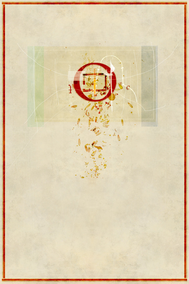
 zeruch — within rhythm v4

Published: 2006-03-31 10:01:46 +0000 UTC; Views: 2742; Favourites: 70; Downloads: 353
Redirect to original
Description
Actually the full title is within rhythm to the faint sound and it is a lyric from Giraffe's This Warm Night (a band from the 80s led by the late Kevin Gilbert). This originally ha a working title of Esoteric Cycle but that just sounded wrong to me. So I listen to some Kevin Gilbert, and he tells me its name. We have a good working relationship.acrylic paint, acrylic ink, screenprinting ink + digital (vector, fractal and raster)
Related content


Comments: 23

YES!
I love rhythm. I love mandalas. I love symmetry. I love balance. This piece has it all. Bravo!
👍: 0 ⏩: 0

i must say.. i really like this one.. but in fact, i like nearly all your stuff.. great style.

👍: 0 ⏩: 0
I like this one A LOT. Although I'm a sucker for pieces that are both mechanical and organic looking.
👍: 0 ⏩: 0


its very beatiful, very cool mix of diferent techniques
Although the rithm could have more movement, its kind of static i guess, but could be just an impression
 (Smile)")
👍: 0 ⏩: 0


fucking gorgeous movement in this. my itunes list just switched over to marilyn manson - thaeter and it suits this so well (this mechanical instrumental piece, its gorgeous) - yet again, as always, amazing mix of media, m'friend. you never cease to amaze.
👍: 0 ⏩: 0

Very nice, very flowing. Makes me think of people dancing in a circle. Or a record player.
👍: 0 ⏩: 0

wonderful!! I was just thinking...is this a print?? And lookie, it is...hmmmmm I love these textures.
👍: 0 ⏩: 0

You've certainly got a knack for this, and the title you chose is better. It flows nicer with itself and with the piece...softens it. I ove the colors an such, but the only thing that's bothering me about this is the middle circle that's black with a gray stroke. That gray... it just sticks out too much. I wouldn't mind it if it wasn't already such a bold element, being solid black and right in the middle of the design. i think if maybe the gray was fainter or the whole circle was more transparent. I dunno, it just has too much weight. Like, my eyes want to rove around but they're stuck on that black magnet. The crossing of circles and subtle texture creates a movent I really enjoy though. I don't want to be all negative...
👍: 0 ⏩: 0


VERY VERY nice. i dig the colors and the symettery that gets thrown off by the offkiltr composition and the line work.
👍: 0 ⏩: 0


Wow... that's some amazing design piece. Great work. I love the broken symmetry.
👍: 0 ⏩: 0


your portraits are really good but i like your abstract art much more then them...
👍: 0 ⏩: 0


