HOME | DD
 Zitruseis — Magic Lessons

#brightgale #alrian_feos_deras #daryl_adorys_theiren #elves #longhairedguy #magic #originalcharacters #prettyboys
Published: 2016-11-22 21:50:20 +0000 UTC; Views: 954; Favourites: 81; Downloads: 0
Redirect to original
Description
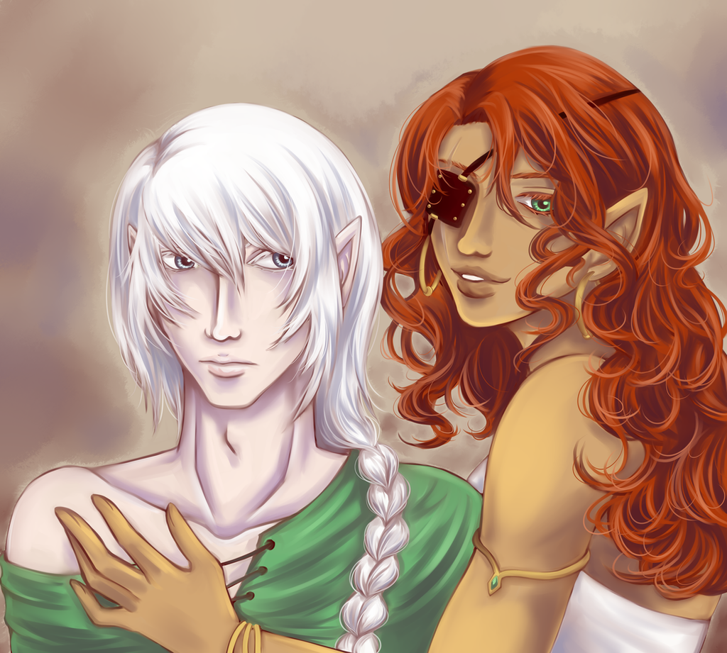
Finally got to draw my grumpy sweetheart Alrian (left) again, this time with his friend, Daryl (right). Amusingly, Daryl is muuuch younger, but since he's from a higher social class than Alrian, he had access to better education, which included magic. So he is the teacher here and Alrian the student. (Smile)")
Daryl is 's OC.
Alrian is my OC.
They are both from our original RP.
Related content


Comments: 12

Sweet scene.
You requested critique:
I would drop the left (our left) shoulder of the left character as their arm is raised in a relaxed way and they are leaning towards the other arm. This will help the look of the head sinking into the shoulders.
Hand reference is hard to find, look at your own hand, put a little mirror on your desk and look at that. It's great for facial expressions too! Get a full length mirror and strike a pose even and use yourself as a reference. Get someone to pose for you. I've had my friend hold their hand up for me to sketch when I struggle.
👍: 0 ⏩: 1

Interesting to see how the difference of social class between Alrian & Daryl is reflected on their clothing,
Daryl's attire has more vibrant colours, whereas Alrian's clothes are only coloured in dark gray.
Also, I find it very intriguing for Daryl to have two differently coloured eyes (one green, one brown).
The look on Alrian's face tells me he isn't very enthusiastic about this particular spell Daryl is teaching to him...
👍: 0 ⏩: 1

Yes, the clothes reflect their social status, though it was Alrian's conscious decision to dress the way he does. He actually had access to better clothes, because in their culture social class depends on the status of the mother and on wether the parents were married to each other - Alrian is an illegimitate child, but his mother was relatively high in the class hierarchy. However, even though she raised him and he grew up in wealth, he was always an outcast and denied privileges his (legimitately born) half brother had. So there came a time when he just decided to stop pretending to belong there and changing his clothing style was part of it. ^^
Daryls eyes are actually supposed to be green and golden, but I guess it's not quite obvious in this picture. I'm glad you like it though!
And Alrian... well, who knows? He always looks grumpy, this is basically his resting face. Or maybe he's frustrated because he can't get it right. Or, like you suggested, it really is a boring spell. We'll never know.
")
👍: 0 ⏩: 0

Hello! I'm from
I really like your vibrant colors, it's what me made click on the thumbnail. I'm still trying to figure out the sorcery of it myself, my work always end up desaturated. I have to say the way you shaded the white of the sleeves is my favorite part. I wouldn't have thought of lilac and yellow, but it works. How you rendered the hair is close second. It's detailed enough without being too much, and the loose strands here and there is what gives it the final touch of really being hair. The painterly look is great, I like work that remains a bit rough and not perfectly blended to the point that everything is smooth. It really works well with the fabric folds. The only part where it bugs me is on the legs of the blonde guy. It thinks it's too many small strokes and it doesn't convey shape as well as the rest of the picture.
Anatomy wise somebody else already pointed the toes, but I suck at drawing them myself so I won't add on to that. Otherwise the anatomy is stylized a bit, but still works fine to me. Nothing sticks out as odd.
What I think could use the most improvement is a light source. I am not sure where the light is coming from. Some parts like the faces suggest the top, but it's missing a bit of shadows to make it completely from the top. The red-haired guy is leaning forward so the area around is waist should be in shadow, as he is blocking the light with his upper body. Also, the hair of the blonde guy casts no shadow on his tunic. It's just a few things here and there mostly. I'd also add some light from the magic on the characters, as their magic seems to be made of light.
Overall a nice piece and you have a nice technique as well. The way you draw hair is absolutely gorgeous!
👍: 0 ⏩: 0

Hello! I found your artwork in 's gallery, and I'm here to help you with your art!
First off, the drawing is really cool! I love the colors you chose, they go fantastic together. And the shading is fantastic. I can't draw the wrinkles in clothing to save my life, but you do an amazing job of it! I noticed a few things about the drawing that could be fixed.
• Alrian's foot looks a little odd. The toes are bent weirdly, and the shading that would define the knuckles is off, making it look really weird. I understand feet are hard to draw, and you did really well. You could probably improve this if you zoomed in and edited the shading a bit more to define it better.
• While the colors and the style of the background are super cool, giving it a really magic-y feel to it, there's no distinct line between the ground below them and the stuff behind them. It's almost as if they're floating. Also, the rug they're sitting on appears to slant own too much, so it's like they're on a slanted surface, and not really on flat ground. This could have been intended though. To fix this, I suggest making the rug become larger as it comes toward the viewer. Adding the pillows in there was a wonderful touch though.
• Daryl's left hand is positioned oddly on the ground, which adds to the effect of the ground kind of slanting down. The hand is flat on the ground, but viewed from the side, and it doesn't really seem to connect to the ground. To make this work better, I suggest either making the hand turned down a little so that it's properly in line with the sloping ground, or making the ground a bit lighter and changing the carpet a bit so that it really looks like it's flat.
• The pillow on the left doesn't have much shading on it. It has the basic light and dark, but not really anything else. It would fit in better if you put a glow from the blue in their hands on it. That would make it look more like it fit into the scene and wasn't just cut and pasted to put it in there. In that case though, you could put a glow on the other objects around them. It would add to the cool magic feel to the artwork.
• I am in love with the way you did the hair! It's so smooth and flowy. You could probably add in a few fly-aways here and there to make it really realistic, but it's super awesome!
Overall, I really love the piece! The shading, the colors, everything is amazing! I hope you like my suggestions, and keep up the fantastic artwork!
👍: 0 ⏩: 0


daaaaaayyyyuuuum! this looks so good! your coloring just gets better and better!!
👍: 0 ⏩: 1
Thank you!
I think it pays off that I'm daring to use more vibrant colors now.

👍: 0 ⏩: 0