HOME | DD
 zuckerblau — the four elements
Published: 2004-10-27 14:35:42 +0000 UTC; Views: 26107; Favourites: 86; Downloads: 8179
Redirect to original
Description
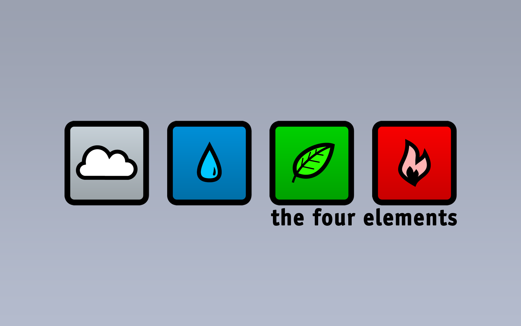
My first steps with illustrator (the symbols) and this came out")
It took me about 4 hours of work. Finishing was done with photoshop...
feel free to leave some comments
 (Wink)")
Related content


Comments: 23


Love how simple, yet awesome it is! xD
Great job man!
👍: 0 ⏩: 1


This is cool....really simple but very apposite
Great work.
👍: 0 ⏩: 1


hey man if you take out the words the four elements it'll improve the picture even more. great job tho
👍: 0 ⏩: 0
seshimeru [2006-01-02 15:08:49 +0000 UTC]
very slick.
Been using this as my wallpaper for about 5 months now
[link]
Great work!
👍: 0 ⏩: 1

I'm glad to hear that! Thank you!
👍: 0 ⏩: 0

Good choice and design of the icons, me likes!
And yeah, that'd most likely look good on a T-shirt

👍: 0 ⏩: 0

I THINK it would look nice if printed on t-shirt,, COOL print!!
👍: 0 ⏩: 1
Hey pretty cool idea! maybe i think about that
👍: 0 ⏩: 0

I think it looks really cool! But.. its a shame that you put the "the four elements" in the picture. It would have bin much more stylish with just the icons/symbols/pics/what to call them..
its nice..
 (Smile)")
👍: 0 ⏩: 0

holy moly!
i've always been intrigued and fascinated by the 4 elements.
and this is the coolest depiction of them i've evar seen.

👍: 0 ⏩: 0

Now i gotta try this! i did something of same nature with images of the four, but that just ended up being cluttered. love this however.
👍: 0 ⏩: 0


nop: wind, water, earth, fire (I know the leaf doesn't realy match..., but as long as it looks cool
👍: 0 ⏩: 0
