HOME | DD
 zyclone — Atrium - TerraSpace Practise

Published: 2005-06-11 18:45:43 +0000 UTC; Views: 1577; Favourites: 19; Downloads: 229
Redirect to original
Description
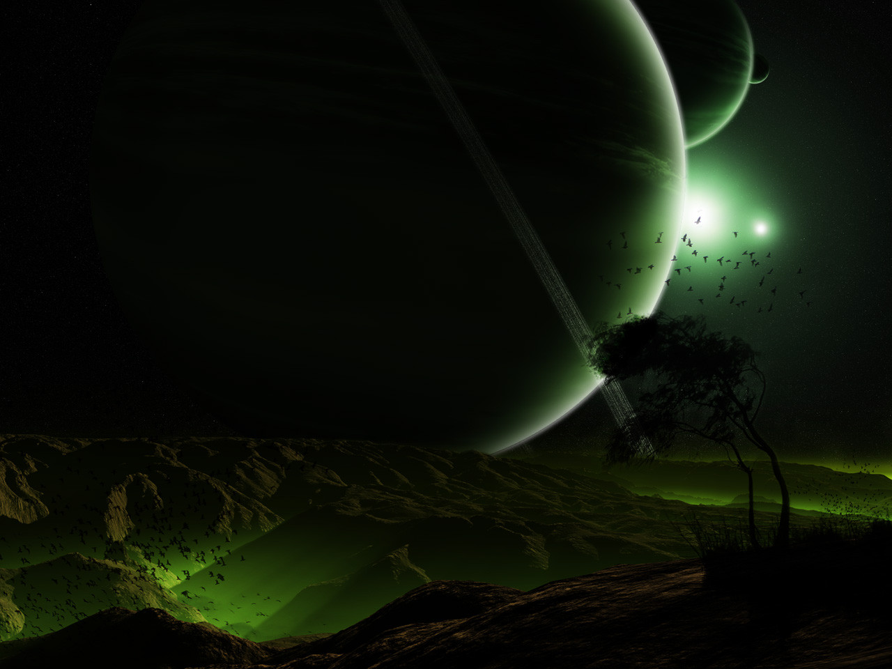
This is a TerraSpace practise piece, just playing around with nebulae techniques. The terragen render is a stock from ~TerraStock by `alyn . I've used this to try and develop my nebula technique and try and add some depth to my work. Any critique or advice on this will be greatly appreciated. Oh and my +fav button is lonely")
Related content


Comments: 24

Ohh I really like the green/yellow color scheme :3 If I had any critique at all, it would be over the fact that both nebulae seem to have a planet roughly right in the centre of them. I might have put one of them elsewhere.
Anyway... great textures on those clouds ")
👍: 0 ⏩: 0

very cool! like the yellow nebula around that small planet! nice effects (Smile)")
👍: 0 ⏩: 0

dude this is great work i love it
i agree with 19-10s comments about the stars though...another layer with a bit more variation on the stars would be a great idea...and on areas with bright stars/bright nebula glares you may want to fade out some of the stars around it as it makes it look more realistic
i always have loads of trouble giving my nebulae a real depth how do you do it!!!!!!
excelent work dude
 (Wink)")
👍: 0 ⏩: 1

Look at my new collab with =environaut for *TerraSpace (my group btw) that's got nebulae fairly sorted.
👍: 0 ⏩: 0

Very nice work overall. I see only two things that need improvement: 1.) the yellow nebula--it's just kind of there, if you know what I mean;
2.) the patch of yellow sky needs to be covered up, I think it's a bit too distracting.
I really like the terrain and the blue nebula though. They're a perfect match. And I must say, this is one of the better terraspace pieces on
deviantart. Keep it up
👍: 0 ⏩: 0

Nice, very nice visual.
I specially like the faded effect on the ¨cosmic dust¨
Beautiful, breathtaking.
👍: 0 ⏩: 0

This is awesome. the lighting on the terrain is just right, it's dark and mysterious, but the lighting picks out enough detail for you to imagine what else is there. I can't comment on the space, I'm not a stars expert. The large moon is also really effective.
👍: 0 ⏩: 0

I love the terragen-part and the space-par doesn't look bad, but I think it needs some work!
👍: 0 ⏩: 1
If I'm very honest I patched together the space part at the last moment, it's the core concept and base work for the space that I want to know about.
👍: 0 ⏩: 0

The yellowish nebula looks rather cool
Keep it up!
👍: 0 ⏩: 1
Ok, I admit there wasn't too much effort in the stars, I'll go for what you said next time, thanks!
👍: 0 ⏩: 0

Very cool! Love the colors & the planet especially!
👍: 0 ⏩: 1


It has multiple meanings, the top chambers in the heart, opening reception rooms in a roman villa. Generally something to do with opening room or chamber....I believe
👍: 0 ⏩: 0

Practice man? ..this is beautiful, better than many prints selling out there. cheers
👍: 0 ⏩: 1
Well if I had a print account....lol! Well the nebula was the effort but the composition fo the piece wasn't too good. For a non-practice piece I'd have worked more on the starfield.
👍: 0 ⏩: 1
Maybe that is why looks good, cause its not crowded its not oversatureted with space events, looks natural, maybe you intended to be practice but sometimes you get very sweet results from practice.
👍: 0 ⏩: 0


