HOME | DD
 1nimra — Drawing of Andy Roggenbuck
Published: 2010-12-28 15:03:11 +0000 UTC; Views: 17575; Favourites: 370; Downloads: 346
Redirect to original
Description
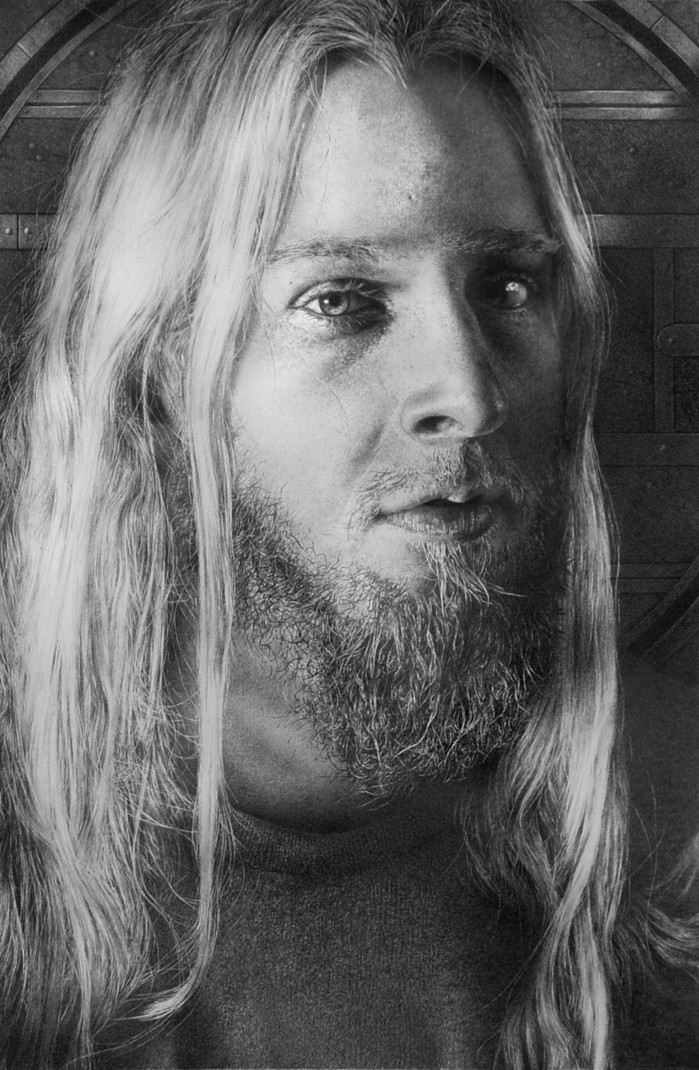
Hair study-Andy RoggenbuckPencil on board 36” x 25”
This was a real study in hair, beard hair vs. the blond hair against a dark background was a real challenge I was drawn to the model -Andy has a Northern Renaissance look almost of a young Albrecht Durer the pose heightens this, I think.
thanks for looking...../\\\
Edit....i darkened the background on the modes left (picture right) on the suggestion of Mike (Shelfcloud) it pushes it back and works better, gives it a more realistic space, thanks Mike!
Related content


Comments: 122

Again you have done a really outstanding job, I really can't believe it, you are really a master in getting so much details in a drawing
Especially the hair is great (which does not surprise me as it is an hair study as you have written), but also the eyes, they are really piercing


👍: 0 ⏩: 0


You are a professional,grea job, and amazin Details......
👍: 0 ⏩: 0

 (Smile)")

")

Armin, man, this was FAST for you. VERY interesting to see the different textures and the general mood. What could I add that had not been said already. Armin, my friend, you are THE MASTER of graphite - and not only that, but the master of the play of lights and darks as well, with some incredible texture and hair thrown in.
👍: 0 ⏩: 0

maaan them subtle tonal differences between one element and the next.
I often show my students your work, Armin. Especially when Im trying to get them to comprehend TONE.
They usually just get lost in the artwork and I cant get them to pay attention afterwards *L*
👍: 0 ⏩: 0

Armin how many hours did this one take? P.S Brilliant piece by the way!
👍: 0 ⏩: 0

Wow it looks so incredible even down to the tiny strands of hair!
👍: 0 ⏩: 0


Incredible. I bet that was a challenge, but I think you mastered it easily. Thanks for sharing it.
👍: 0 ⏩: 0


wow, I thought it was a photo at first look ")
👍: 0 ⏩: 0

Awesome hairs
I feel like I've seen that shirt in your drawings before. Hmm...it looks odd. I don't know why.
👍: 0 ⏩: 0


i think you've out done yourself again Nimra! you do truly draw with light!
👍: 0 ⏩: 0

can't be more realistic!!!
U're master for your level!!! nothing more to say

👍: 0 ⏩: 0


(sigh, this gonna be a long one LOL)
You've been a busy bee! One thing that caught my eye is the dark side eye-reflection; the highlites seems a bit strong, making a cockeyed effect at distance compared to the other eye, but I know if I look closely it is right, so that could be the scan, making it worse. Detone the eyewhite, near the center there with a 6H-10H should balance that back.
Second, drawing blond/white hair is more difficult than mid-tone and dark hair: less mistakes are permitted and the contrasting is annoying sensitive. I don't know if you appreciate, but see it as advice
Beard hair = alright, looks very natural. All randomized wild hairs looks great in place too, but I'm worrying a bit about the main toneflow. First off the light side: there at forehead hight you have this total white area. Remember, just before you go into the highlite the contrast is at its strongest; balance by makeing more contrast and a little more detailing, there where the main sight is the most visible right before the highlite. The wild hair strands indicate there should be a little more exposed in front instead of back, cause back would be less visible in real life. This brings to me that the hair strand surpassing that highlite should have more contrastial play as well. Then the part where the ear is there is an empty space: especially where the light falls, the gape-shadow that is created between the two main strands is darker! And the whole area could use in fact a little darker there with a darker push to "our" left strand, on the left side surpassing the ear left (near the edge) to make that separation very clear, cause in depth, it has a deep shadow field that is caused by the left strand. Then the whole left side has this sudden transition in tone as you go to the middle. It is a little more subtle and dark up a grade near the edge. The edge nearly only consist of wild hairs, so there is no particular hairstrand dividing such contrast; it chaoses out gently as you say hair can create a very complex shadowplay locally and altogether.
The darkside: When you go north-north-east, you see a shadow area that is not entirely dark right before the hairfold comes in: this loses exposure a little too much for my feeling. You can retouch a little lighter, making a subtle highlite there (this can exist in dark areas as well, right before you go really dark). However, there is a strong contrast in the very dark side northeast of the eye which cannot be shined upon by the lightsource, because the face was there in front. The lightsource is drawn fromout our left perspective. So the highlite on the northeastside should loose a little contrast. Then at north-north-east you have this optical deception (I have stuggled the same problem) creating a too subtle transition from head-to-hair. This is giving a little "too soon" bend of the forehead, which is only visible at distance. Your Paleo Joe was more head-on balanced there in a likewise shading. Finally next to the beard in the dark side there is this shading where I cannot tell if it is the shoulder walking behind of a cast shadow from the face. If the first case, loose it, if the second, cover a vertical larger area. The south line of the hair is a tad too light (it is as light as the other side).
Last, then you are finally rid of me  (Wink)")
Though I gave you critics which I personally think are not that daunting, I like the expression a lot! In this drawing it is your strongest point and your drawing feels alive and containing more soul. These are my observations from out my understanding.
👍: 0 ⏩: 1

As usual you have a lot to say most 95% which is critique for critiques sake without the benefit of observing the model or reference most of this is the intellectual realism brought about by knowledge not how a person sees. For instance highlight on blond hair will generally be lighter then on the skin whose local color is darker to begin with. I do see what you’re saying about the shoulder but then its doesn’t matter if all the answers are layed out some things are meant to be vague. the background carried no shadow at all it landed of shot Points like; The south line of the hair is a tad too light (it is as light as the other side). No its not to light it’s just as I observed it to be, it might be to light for you but that’s subjective as most of you points are. i did look at everything you mentioned and that's always good
👍: 0 ⏩: 1
First off: I don't like the tune you're saying: critique for critiques sake, cause it is simply not true! Look, I've clearly stated it as an advice! I estimated you could consider advice you'll never learn art completely as you said before yourself once. Sure I know I come to you and not the other way around, but then again, you don't let no one tell you if you really think your artwork is always flawless, being immune for all compliments that follows, cause I clearly said I like the expression and it feels alive!
Second: I'm just trying to help. Observation and understanding what is assumable is 2 different things. My experience (that might not be yours) is that observation to references always draw to the references, not to your actual knowledge; there is a certain balance. You know that as well as I do. I can only see the post, but if something comes up to me, I'm tending to discuss it. Not for the sake of crits as you call it, but to learn something about it since I cannot show you directly what "my problem" is as a viewer. It caught my observation eye and hell maybe I'm all wrong here, but let me learn then!
I agree with that point of intellectual realism brought by knowledge, but do not forget I'm rendering balance fromout my observations, not just fromout 0-1 digital memorized phrases you once taught me. I see the darkside is dark and suddenly as light as the light side; it isn't a match for me and frankly i would change it if the ref is telling me that. Yes that turns to subjective art perhaps, but towards a balance as well and I'm still not convinced this drawing is as well balanced than most of your work; especially if you point out a hair study. Or am I forbidden to have such opinion?
Last thing I'm gonna say about this: you're vague sometimes and very hard to estimate what to say to you: one time you appreciate honesty and crits, but the next time you feel attacked. How do you expect from me to respond to your league properly if you swap your mood everytime. I thought I could talk to you this way after all these talks, but apparently not and that is my problem then! If I want to crit your work, then I do it constructive and the problem is not simple to describe. If you don't want me to write long replies in order to help (and yes, you didn't ask) for the sake of friendship, then simply say it, then I'll say nothing and just fave the bunch if you produce a piece you've worked your ass on for many 100+ hours, even if it were worth my thoughts and feelings that were all positive.
I accept whatever you do, but don't come back to me with insinuations, cause that is really a waste of time.
👍: 0 ⏩: 1
Why does this always turn out to be flame war Mike? I took you points and I don’t agree with most of them and thank you for bringing them to me. Your theory on light fall isn’t correct, the model is not sphere without texture, duel lighting and reflected light all this has to be taken in to account and believe me I don’t slavishly follow my reference nor will I accept your points for sake of playing nice. Yes you stated some points I looked I don’t agree that’s all. One thing I must say looking again at the background I do think the Waking Edge and Blues for Mama are stronger for the shadow pushes the background back and gives it more space and you are right on there. I think ill change that, for the rest I’m fine with it.
You have always had this problem that anytime you give me a suggestion and I don’t take it, you’re pissed, dude get over it!
👍: 0 ⏩: 1
This FIRST sentence: "As usual you have a lot to say most 95% which is critique for critiques sake without the benefit of observing the model", especially the first half!"
THAT is why! and it set a tone of the discussion. As if I would critic you like "Look at me, I dare to critic the great Armin!". As if 95% of my USUAL critics is just dumb crap, and later you say it is a serious consideration? And you expect me to believe that?! C'mon, I'm not an imbecile!!! I don't expect you to follow advices otherwise they wouldn't be advices. You always tend to give some kind of stitch below the belt. It is rude and arrogant and I recognize these kind of subtle hints out of thousands. Haven't you brought up that part, then I would made short work of it and it wouldn't be such a big deal. Just imagine what if you crit one of my works and I come back at you with that opening sentence? Wouldn't you have something like "This is the last time I'll say something to Mike"? Frankly I recall doing that towards you when you were complimenting my Elven fire queen. It was stupid from me, and I did it because you were responding like that repeatedly towards me. Luckily we are both versatile on taking direct strong opinions. It is the tone that sets the music Armin.
"You have always had this problem that anytime you give me a suggestion and I don’t take it, you’re pissed, dude get over it!".
...and of course this. I mean, what reason did I really give you to suggest I desperately want you to draw the way I do? I really want to know, cause then i could solve that problem. But you never gave me that chance and You don't have understood one bit of our past conversations. I mean, this sentence doesn't make any sense to nothing! I gave many people advice with a healthy conversation, but you tend to be very cranky, even if it was all good I said. Sure "take it or leave it, that's Armin", but don't expect you'll get a normal feedback as well, cause "That's Mike" and like you I don't crawl for nobody. If you still don't believe me I'm not thronging you up my methods, then it's your problem. Don't play the victim all the time, cause I'm really not buying that and I'm getting fed up with that.
And good my advice has made you to adjust. Good you took it serious. Great! And I'm happy to be of serve... but really nothing more. If not, it was worth the chance right? But somehow you always assume that I'm jerking off to get some compliments from you or something I don't know.
A "I took you points and I don’t agree with most of them and thank you for bringing them to me. One thing I must say looking again at the background I do think the Waking Edge and Blues for Mama are stronger for the shadow pushes the background back and gives it more space and you are right on there. I think ill change that, for the rest I’m fine with it. " would have been more then enough. And sadly, I'm agreeing with you a lot more than you think; I always have. I can't help it you forget that from time to time. Sadly you definitely don't feel it that way and I'll accept it.
👍: 0 ⏩: 1
Damn it Mike enough….. I’m not in a mood to take this farther. Yes the background I’m working on now -good call the rest you’ll have to leave up to the artist.
👍: 0 ⏩: 2
I'm ending this... I'm sorry this is dragging your post down. Not meant to... The rest I've written down in PM.
👍: 0 ⏩: 0
you know what? leave it! Goodluck with your art!
👍: 0 ⏩: 1

Dude, he's the artist not you..
👍: 0 ⏩: 2
HIGH FIVE "=AIVRE. " If you know Armin for so long, then go private message him about it. Leaving critiques and comments like that on the public viewed page could give you a bad impression of being obnoxious, annoying, arrogant, and a hardass. Art is art. A few constructive criticism is okay but not a whole damn essay. He's perfect the way he is.
👍: 0 ⏩: 0
I think I know him a lot longer than you do, and you certainly do not know my artwork, so get lost! He doesn't need a puppet who speaks for him!
👍: 0 ⏩: 1

you have absolutely no work in your gallery. so your argument is rather invalid.
👍: 0 ⏩: 1
Since when I've got to prove myself? Nearly no one didn't watch my work too when I had my other account. And BTW...if I did, you would probably torn down my work even if it was as good as Armin. So I'm not posting for the sake of negativity: I had my share thanks!!!
PS: If you don't believe me, ask Armin himself; he knows what I've produced...one of the few.
👍: 0 ⏩: 1
"Since when I've got to prove myself?" obviously you feel like you do. you told ~jeffreyn "...you certainly do not know my artwork." and i could care less about what your work looks like. the point is, you've nothing to show for it, so therefore your argument is pointless.
👍: 0 ⏩: 1
What has the fact i have no artwork @ DA with the fact I'm having a discussion with Armin, and not with the rest?
👍: 0 ⏩: 1
you're not having a discussion. you're being elitist and obnoxious.
👍: 0 ⏩: 3
HIGH FIVE "=AIVRE. " If you know Armin for so long, then go private message him about it. Leaving critiques and comments like that on the public viewed page could give you a bad impression of being obnoxious, annoying, arrogant, and a hardass. Art is art. A few constructive criticism is okay but not a whole damn essay. He's perfect the way he is.
👍: 0 ⏩: 0
and so you have just one to show yourself!
👍: 0 ⏩: 1

And you should judge when you know the full story, not just here: I didn't began with beïng cynical, he did.
👍: 0 ⏩: 0


Your attention to detail is incredible - the texture of the shirt, the pores on the face...
👍: 0 ⏩: 0

This is absolutely stunning! How do you draw fair hairs over dark areas (such as over the background in the top left corner, for example)? Do you use a rubber or do you leave a light area by outlining it?
👍: 0 ⏩: 0

The beard! Quick after drawing Steve. How many DAYS please.
👍: 0 ⏩: 1
200 hours or so not as much as Steve's
👍: 0 ⏩: 1
wow! But that's great. I want to get a good shot of mine so I post it. You are welcome to comment when I do. Thanks.
👍: 0 ⏩: 0


| Next =>