HOME | DD
 7grims — CIS3design - v1
Published: 2006-06-26 00:32:46 +0000 UTC; Views: 3315; Favourites: 15; Downloads: 320
Redirect to original
Description
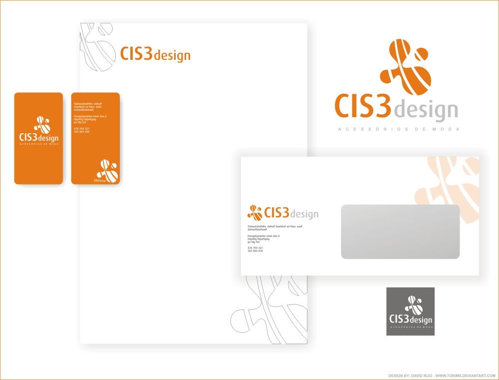
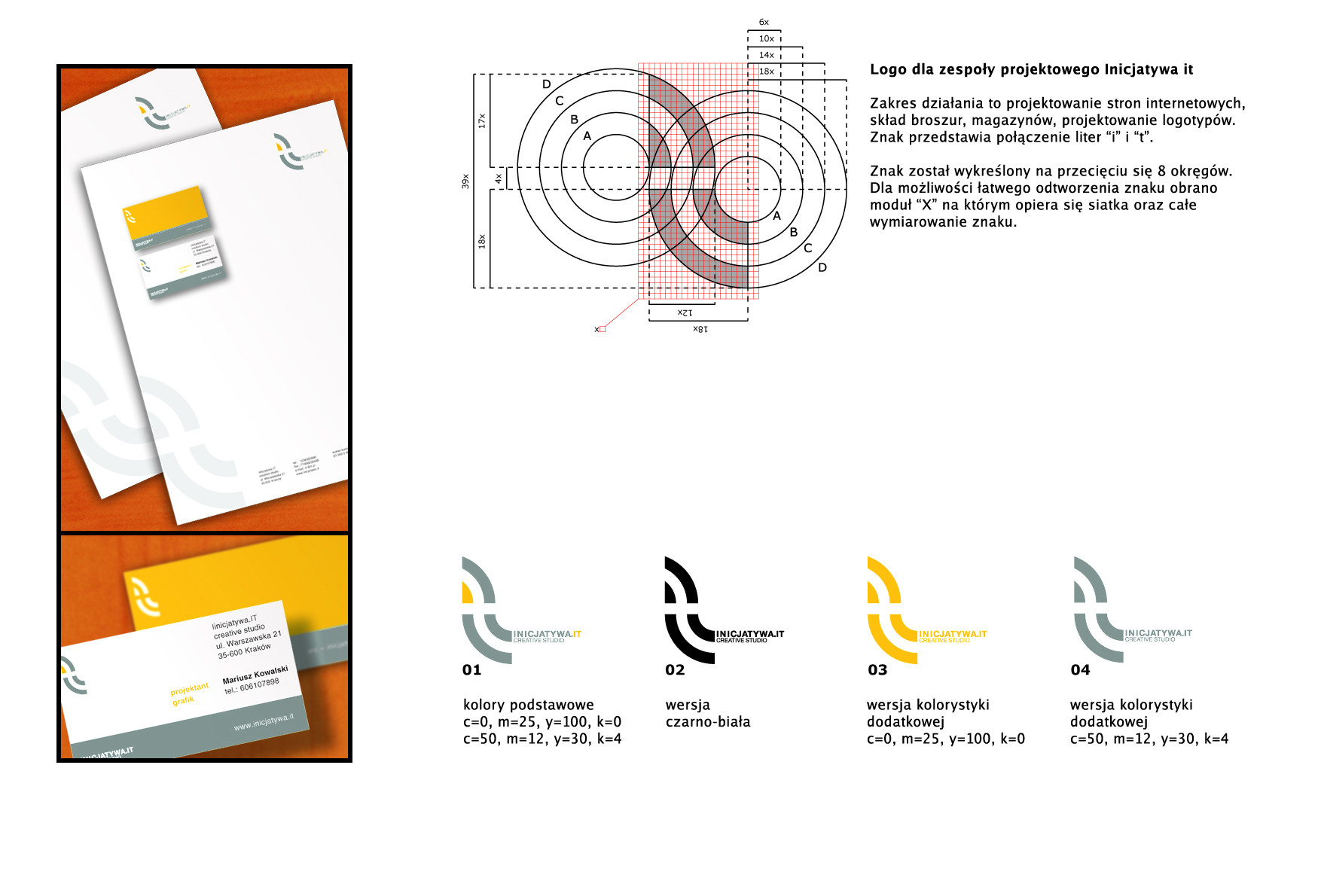
this is the elected design.3 special girls join together. They have decided to stop being innocent and shy, so they launch themselves to the corporate world of business and war. These corporate images are their best weapons against rival companies, and their ally when standing near their clients.
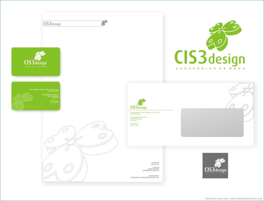
Version 2:[link]
Version3: [link]
Related content


Comments: 26


Me too, about 2 years ago I was a dangerous person to work on a design company, cause all my logotypes ended with an orange colour, good thing that fade away…
👍: 0 ⏩: 0

 (Wink)")

Gostei muito dessa cor laranja que usastes...e estava a ler o comentário de archivopep e você sobre a logo...essa foi a logo escolhida né? Eu gostei dessa logo também...creio que os traços quebraram um pouco a mesmice dos circulos.  (Smile)")
Parabéns pelo trabalho...
👍: 0 ⏩: 1
é, foi mesmo o escolhido por elas, e muito obrigado pelo comment, gostei
👍: 0 ⏩: 1
O design da papelaria ficou muito bom mesmo....e elas tem bom gosto também
👍: 0 ⏩: 1
")
👍: 0 ⏩: 1
Hahaha...sim! Chamamos de papelaria. Como vocês chamam aí?
👍: 0 ⏩: 1
chamamos simplesmente de imagem corporativa, ou I.C.
")
👍: 0 ⏩: 1
Ah sim....aqui na agência chamamos de papelaria pois fica mais fácil de assimilar o que o cliente quer...mas técnicamente chamamos de Identidade Visual hehe
👍: 0 ⏩: 1

olha e tenho ua ideia para logo...uma experiencia...dposi falams fika bm
👍: 0 ⏩: 1
sabes...eu axo k n e mt bom pores trabalhos tao bons aki no deviant..n sei s me percebes
👍: 0 ⏩: 1

Well, I don't like the logo much (I prefer the outlined one), what's the concept you wanted to show?
👍: 0 ⏩: 1
well its kind of like the 3 ball are like the 3 persons that join to made the companie, and the fouth ball its like the extra speacial thing on that companie ( whatever it isthat extra special thing) , and the cutting lines are for giving movement and dinamic to the logo, kind of like its a dinamic companie they made out.
👍: 0 ⏩: 1
Maybe for something like a logo you want to show too much information
The way you cut it to show dynamisn make the logo less pregnant in my opinion
Of course I'm not saying make two circles and everybody will remeber it xDD
It's complicated, I'm not good at all at making logos xD
👍: 0 ⏩: 1
well, it's decided, they have shosen this logo for them, gess i aint making shanges becouse they like it. and remenber i told you every ball its one of them and the 4º ball being the extra thing, well know they say im that extra part, im almost a partener of this future companie
👍: 0 ⏩: 0

vurto mais o azul ...... na sei pk ... ou então juntar mais um cor já exprimentaste ?
👍: 0 ⏩: 1
axo k é melhor manter uma so cor, assim fica essa cor como imagem de marca, é mais facil indentificar uma empresa por uma so cor k representa a mesma, de resto so uso cinzentos paara complementar
👍: 0 ⏩: 1
")