HOME | DD
 aarora — RoboScan

Published: 2004-08-05 17:01:07 +0000 UTC; Views: 1672; Favourites: 23; Downloads: 396
Redirect to original
Description
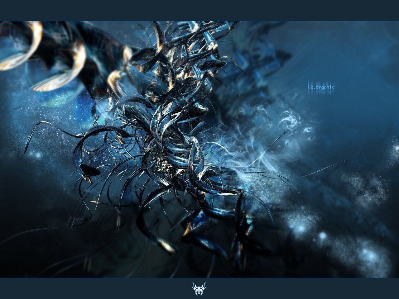
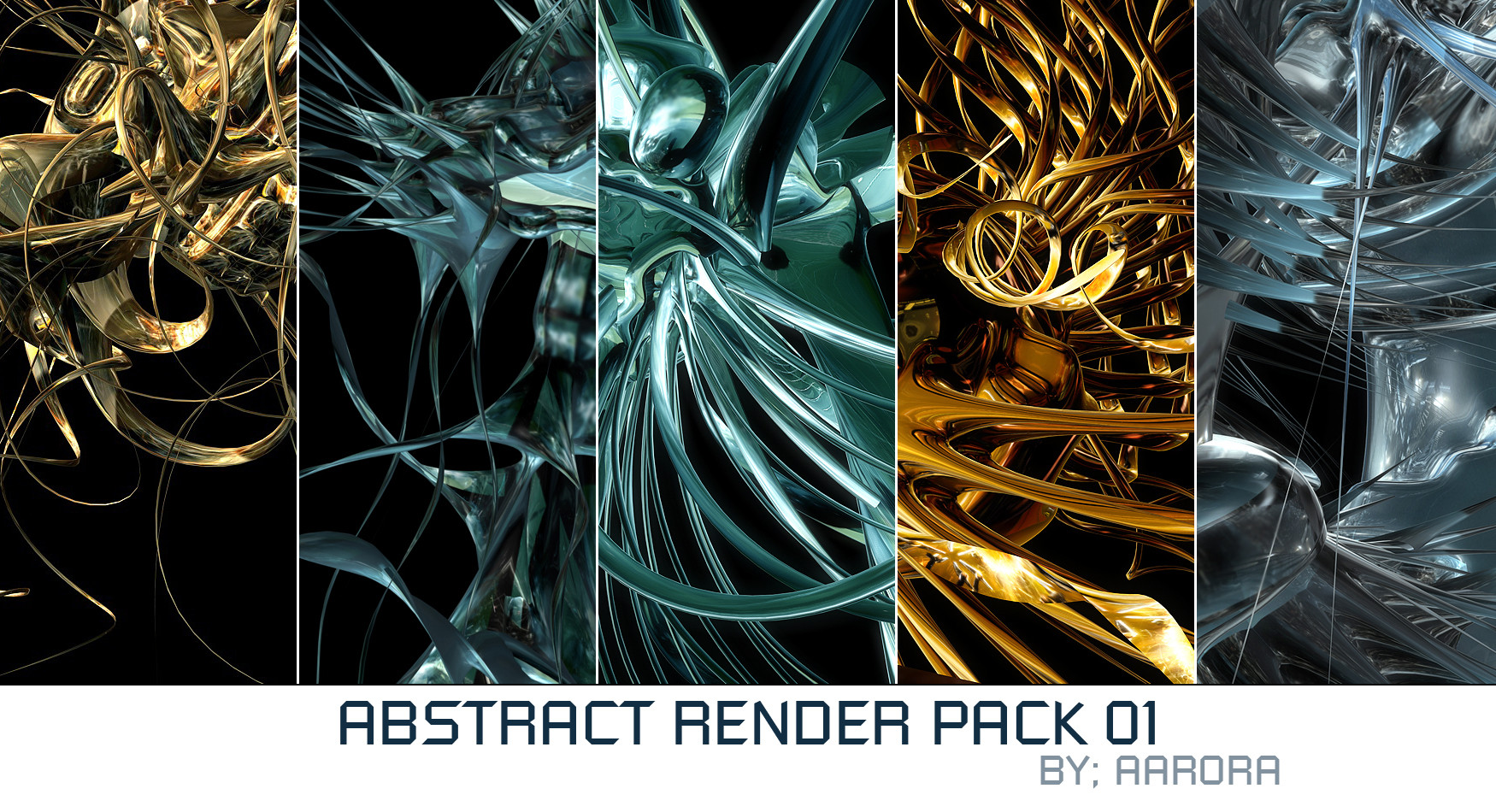
I had this lieing on my dektop for a while now, so i thought i would finish it up and submit it here, notthing new for this one really.Some credit goes to excelsium for the great renders, heres the [link] and wurklash for the brushes.
Also inspired by some of Sec's works.
As always comments and favs highly appreciated.
Related content


Comments: 43

excuse me as i dont write too much for jealousy has consumed most of my body
👍: 0 ⏩: 0


ahhhhhh this is just pure beauty
i love the colors and the style. definatley showin some great stuff here
👍: 0 ⏩: 0

good 2d and 3d..decent color theme (love that gray-blue)...nice job overall..keep it up ajay
 (Smile)")
👍: 0 ⏩: 0

Looks really good man, There is not all that much work that was done to the render but it still looks good. Mayber you could of done some more 2d but it still looks good. Nice work
 (Wink)")
👍: 0 ⏩: 0

can you make it clearer where it says that the renders were by me, brushes by wurklash and so on? like place them in bold and in seperate lines. please provide a link back to the resource file too.
anyways, nice work. the ~sec style can be seen a little. 2d can use alot more improvement though.
👍: 0 ⏩: 0


")

looking good accept the bg (blurred part), i like the 2d
nice render to
👍: 0 ⏩: 0

The bottom right of the picture seems to be stretched out. I know it is supposed to be in the original design, but it just looks awkward. The top portion of the robot is cool though, so detailed. What did you use?
👍: 0 ⏩: 0


that is real nice! it reminds me of sec, how he now makes robot lookin things, nice job! :+fave:
👍: 0 ⏩: 0

im not to fond of how the pixelstretching has been used in this one and im also not to pleased with the 2d here... im loving the 3d though ill have to give you that one... so well done on that part, work a bit more on the whole though : )
👍: 0 ⏩: 0


Killer image bro....what did you use to model it?
Nice composing and it reminds me of alphax's work.Great job man.
👍: 0 ⏩: 1
yea cool lol....I said I liked it.
👍: 0 ⏩: 0

hm.. those are really equal to vivphyd.. weird shit.
👍: 0 ⏩: 0


It looks excellent...but I see a lot of what appears to be power-sanders?
👍: 0 ⏩: 0

Looks good, I like the technique where you smear the lines a lot
👍: 0 ⏩: 0


great job...just reminds me of yeah and give some credit to wurklash ")
👍: 0 ⏩: 0


great colour awesome render, love the 2D worked on this one!
👍: 0 ⏩: 0

Not ur best, but still pretty figgin sweet man, nice rendering skillz there.
👍: 0 ⏩: 1
*shrieks* renders are by me
👍: 0 ⏩: 0


