HOME | DD
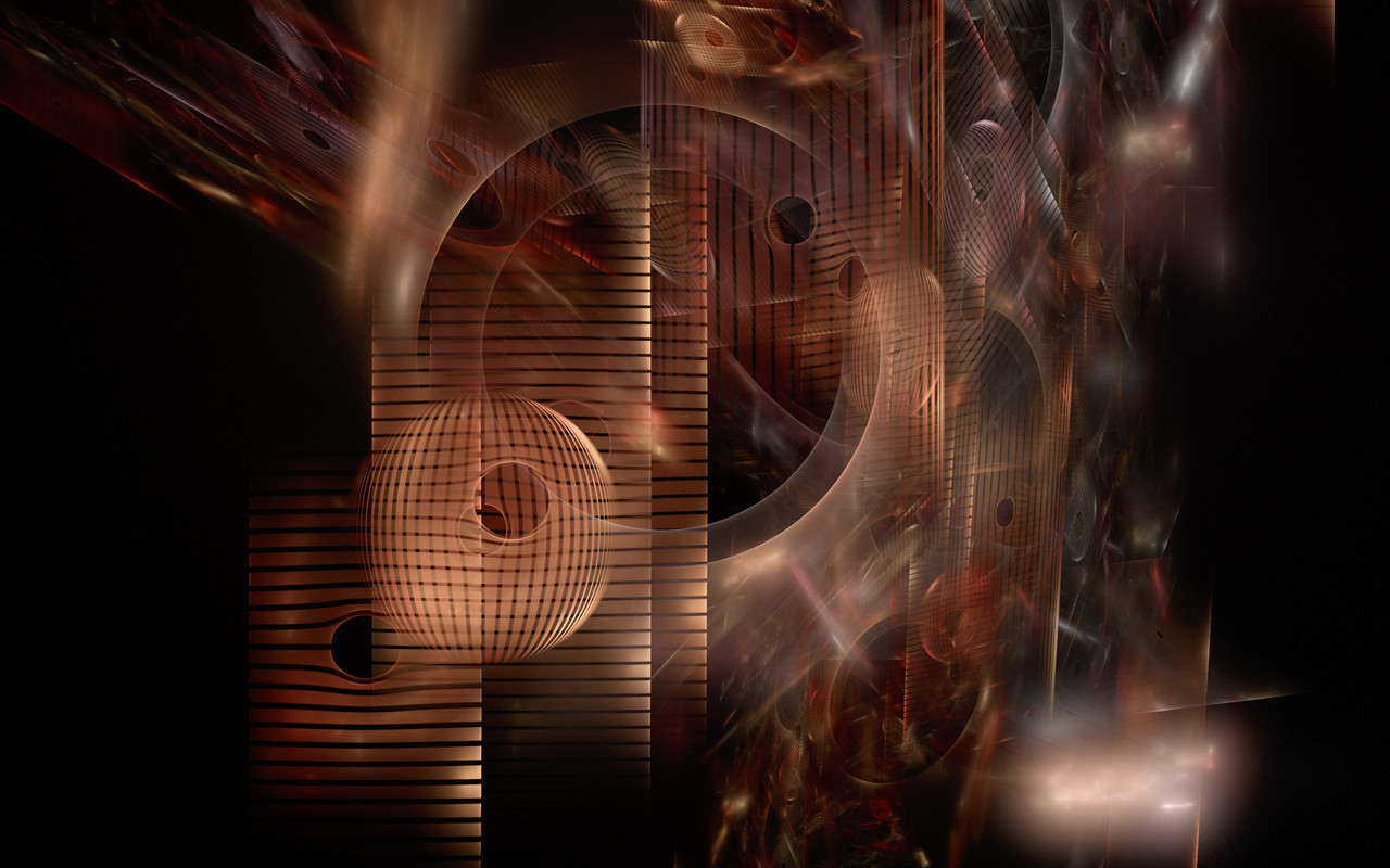
 Aeires — Cosmic Disfunction
Published: 2005-01-14 13:33:45 +0000 UTC; Views: 4586; Favourites: 61; Downloads: 1899
Redirect to original
Description
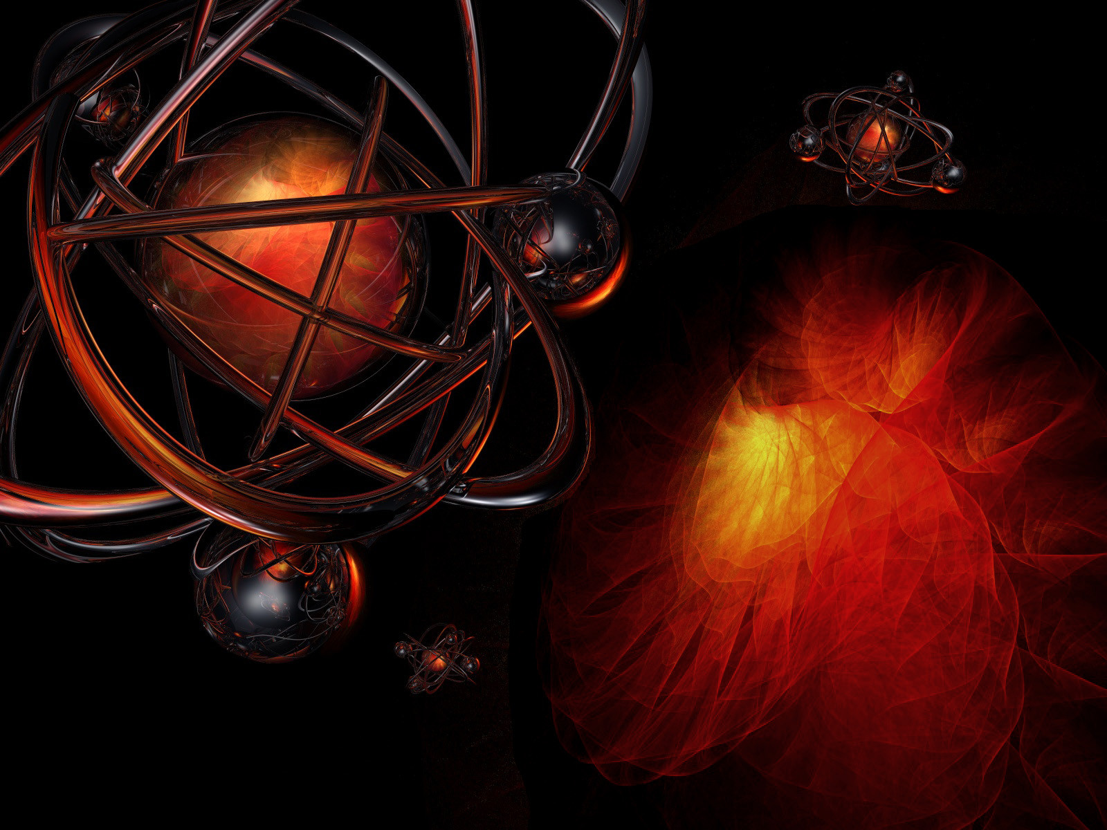
Second attempt at abstract. Took the critiques from Burning Inside and went for a more complicated image this time. Still going through tutorials and practicing techniques, so critiques welcome on this.Related content


Comments: 147

Thanks, Rick. I was aiming to get into abstract art but lacked the skills so I mixed a lot of fractal work into this one. Might revisit the process one day.
 (Smile)")
👍: 0 ⏩: 0


Thanks. I was aiming for an atom gone terribly wrong.
👍: 0 ⏩: 0

Oh wow...don't know why I didn't see this piece before...instant
👍: 0 ⏩: 1
Thanks. It was kinda a continuation of something I was working on. Haven't worked with this technique since.
👍: 0 ⏩: 0

freakin cool man, it looks like little atoms floating around,
👍: 0 ⏩: 1
Thanks. That was kinda what I was aiming for. It was a really strange trip though.
👍: 0 ⏩: 0

I love the metal work - and the flame inside the metal.. to me the flame on the lower left is almost distractingly out of place for me... does that make any sense? I LOVE it overall though!!!
👍: 0 ⏩: 1
Yeah, it was an experiment that didn't quite work properly. I was following Burning Inside when I made this and had a hard time living up to that image. Learned a lot in the processs, so it wasn't a complete loss.

👍: 0 ⏩: 0

Colors are nice. Rich tones ")
👍: 0 ⏩: 1
Thanks for the critique. I agree about the fractal. Didn't quite hit the mark with what I was trying to do. If I do more of this type of blending, I'll work a lot more with the merging process.
👍: 0 ⏩: 1
Cool. It definitely merits more contributions to DA
👍: 0 ⏩: 0

ahhh ..the human need to classify something..categorize ..label.... Drives me nutz sumtimes...
i think the word "abstract" certainly has a broader definition ( especially with computer art) that it did years ago...if not by exact words in some pompus ass's book...then certainly by the subcouncious of any living adult who has gone thru the last 30 years and been even midly aware of the manmade, decorative world around him.
While it may have some princibles or dictates of what an abstract is that i could debate with Maya Angelou over.... because of the sharpness of that fabulous bryce render ..( the crispness ) ... i dont think in my book this comes off as an abstract as much as it does a composed piece of say ..science fiction illustration work.
Due to the definability of the bryce structures... and the mere fact that they are replicated ...knocks this outta abstract for me...
i like where yer headed here... ( or at least ithink youre headed ) ...and "abstract " may just be nothing more forevermore than a DA term here to passify their continually analness to classify any and all art. Or it may be a term you are lured to ..and aspire to work towards. I would suggest you just DO what your eye tells you seems right. forget "theory" If you can enjoy and make a fractal thru software like you do ...i know you can compose one from raw elements ( pixels?
i love the use of the "space anomoly " or " blackhole fractal" for lack of a better term being reflected in the inner orbs of atom-like structures... In abstract..while colors or shapes may play off each other to catch the eye ...they are never defined beyound those simplicities...a "reflection" is a scientific property ...and the minute you add that as a thought-out process to an end desire...you are in realism...or illustration..or comic art or fantasy ...whatever...
You certainly make me want to play with bryce again since i never did anything worhtwhile in ever..
fun play Jeff...
--
👍: 0 ⏩: 1
Yeah, abstract is a really loose term. Fractals are much easier to classify because of the math behind them, but abstract is all interptreted by the artist, so some extent. What's even worse is the wallpaper gallery is even less defined because it has less categorization than the other digital galleries which adds to the mix. I know there are a lot of fractal artists that will only post there instead of the fractal gallery. Don't know why, but it's another spot to throw art into. The wallpaper abstract gets all forms of digital artwork, and possibly even photography if done right, so it's a huge melting pot.
I almost, and still debate on whether or not this should have been posted in the 3 dimensional gallery for all it's structure. The only reason I didn't was that the majority of the images in that gallery seemed like they were object oriented, instead of focusing on the overall image composition.
As for myself, I don't have any training in drawing or painting, so I won't abuse and disrespect those galleries with a faint attempt. Until I get to a point that I'm comfortable enough doing new 'abstract' art, I'm going to stick to the wallpaper gallery just because it's the melting pot. Regardless what exactly makes up abstract art, I have respect for the gallery and the artists that post there, so I'm not going to place an image in the main abstract until I feel confident that I have enough skill in whatever technique I'm using. It irritates me when people post photos, anime, and similar work in the fractal gallery, so I'm not going to do it myself.
Regardless, you know me, I'm the guy that mixes it up. Can't easily define me and even less, contain me. When I step out of fractals, my aim is to do something rarely done, or done frequently, but better. I'm sure I already freaked out a lot of people. Some of my faithful watchers have fallen completely silent since I stepped out. Oh well, gotta do what I enjoy. That's been my goal since the beginning, make art I like and hope someone else likes it also, while staying open to suggestions and critiques so that I may improve along the way.
And yes, bryce is cool. I'm finding I never really knew it, so it's really learning it for the first time right now. That means a lot of improvement for me on the horizon.
 (Wink)")
👍: 0 ⏩: 0


This is incredible.
How were you able to create such a complex image?
its very matrix-ish
kudos
👍: 0 ⏩: 1
Hey, thanks. The hearts of the main spheres and the large shape in the lower right corner is a fractal made in apophysis [link] . The rest is all bryce work. I imported the fractals into bryce and created all the 3D effects that way. It was my second attempt at doing that technique this complicated, so I'm still trying to figure out ways of improving it. It's a learning process as I try to move from pure fractals into more abstract work.
👍: 0 ⏩: 1
thanks man
Im really interested in fractal art, 'specially when it comes to quaternions.
Im trying to get the hang of it.
Thanks for the link and keep up the excellent work
👍: 0 ⏩: 0

Thanks. Another crazy experiment.
👍: 0 ⏩: 0

Thanks. Something cool about a black desktop.
👍: 0 ⏩: 0

very very nice.
good work.
i think the composition is a bit off, but i don't know how it could be fixed.
great work though.
👍: 0 ⏩: 1
I know what you mean. I'm not 100% satisfied with it myself and have been looking at it for a few days now trying to figure out a tweak to it. I'm thinking a very faint red tint along the bottom to blend the fractal in with the background?
👍: 0 ⏩: 0

wow - totally gorgeous!!! I'm not up on how this was done - but I did notice sometimes the rings or whatever you call them intersect as if a single piece (middle-ish left) and sometimes it looks like one piece just cuts through another (top-ish left). I think I much prefer the former - just my 10% of 2c... Love the reflections, love the colours, love the overall shapes you've captured -- it's excellent!!
👍: 0 ⏩: 1
Thank you for the indepth critique. I agree about the previous being better. The lower right didn't come out as 3D'ish as I had hoped, so I'm not completely satisfied with this. It's a learning process breaking into a completely new style. I found some great new tuts, so my future ones will be better.
👍: 0 ⏩: 1
..better than this? I can't wait! I still think it's a wonderful piece - so keep up the good work, and keep making us green with envy!
👍: 0 ⏩: 0

Well done , Aeires !
Your technological level grows on eyes
👍: 0 ⏩: 1
Thank you. Lot of practicing and reading tutorials.
👍: 0 ⏩: 1


👍: 0 ⏩: 1
Thanks, Aleks. Not sure what I'm going to do next, but hopefully it will be better as I practice more.
👍: 0 ⏩: 1
Yeah, practice makes the master

👍: 0 ⏩: 0

Hi Jeff,
I love it! I disagree that it's too complex but would rather see the fractal eliminated at the rt. (and then the objects repositioned accordingly). Never-the-less this deserves a FAV. Keep it up!
Tom
👍: 0 ⏩: 1
Thanks, Tom. Yeah, the more I look at this, the less I like it. The fractal on the right didn't quite come out like I had planned. I'm finding out the hard way that abstract is one tough artform. Hm, bet solidworks would work great.
👍: 0 ⏩: 1
I am really impressed with it. Solidworks could never render it as well.
Tom
👍: 0 ⏩: 0

Very good... I think is great that your style is changing and evolving, giving you a new point of view.
This image is very good, but in my opinion is too complex..., sometimes "less is more". I think you need to reduce the 3D load on the left side of the image, or add something else on the right side; to me, it looks a bit unbalanced because the left side is heavily load of 3D geometries, and the right side is almost completely 2D.
But I'm not an expert in abstract or 3D, so, it's just an opinion.
Keep evolving... The sky is the limit.

👍: 0 ⏩: 1
A lot of good points and I appreciate your honest critique. Wish more people would take the time to dissect an image and point out what needs fixing.
The more I look at this the more I see that could have been done better. A lot of it depends on the levels of my modeling skills, which is really lacking at the moment. I've been reading and practicing a lot these past few days, so with some patience, my next works should be getting better.
I'm not an expert at abstract or 3D either, but I value your opinion.
👍: 0 ⏩: 0

Lovin the nucleus of the atom. It has that wicked, unique fire look to it. Very cool!
👍: 0 ⏩: 1
Hey, thanks. I used the bigger nebula in each nucleus. I like to use larger portions as smaller elements of the image to build on the theme.
👍: 0 ⏩: 0

Dude! thats Awesome!!! hey. can i use this as a backround for a character image? 
i'd like your response before i actually use it online, just o be proper about it. ... you are the artist after all... makes sense... 

👍: 0 ⏩: 1
Glad you like it, but what do you have in mind? I have to admit requests like that make me a bit nervous.
👍: 0 ⏩: 1
its for my friend. he asked me to update his character image. so i perrused dev to find a fun backround for it. It'll be used on a web forum for x-men ^^
the pic itself will be zoomed in a bit so you just see the fire burst and a couple of the "atoms" i can send you the finished image if you would like me too.
👍: 0 ⏩: 1
Sounds okay. A link to the image would be nice also.
👍: 0 ⏩: 1
K. ^^ i'll give it to you... when i get the link. THanks a bi-jillion!! 

👍: 0 ⏩: 0

Thank you. Still working out a style, so hopefully I can improve.
👍: 0 ⏩: 0

this is truly gorgeous..the colors are hot together..awesome piece aeries
👍: 0 ⏩: 1
| Next =>