HOME | DD
 Aevix — Above the Dust [Process]

Published: 2014-03-12 00:32:13 +0000 UTC; Views: 3811; Favourites: 113; Downloads: 22
Redirect to original
Description
Full piece here:fav.me/d79tqpz
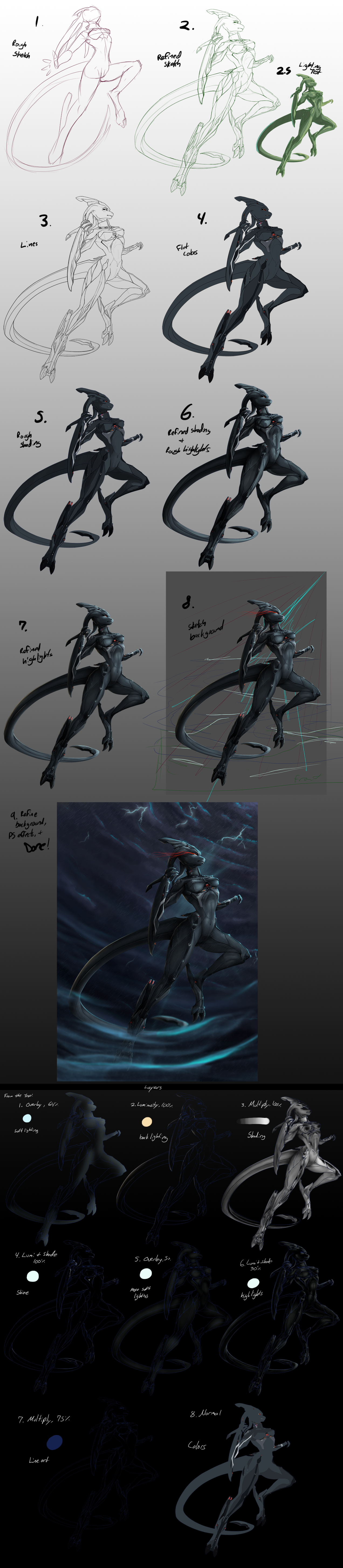
1- Thumbnail
Just a very small doodle to help get the pose out of my head and onto the canvas. I usually draw a couple of these before I make one I like
2- Sketch
A sketch, based off the thumbnail. As you can see, there's just a few changes in the pose between the large sketch and the thumbnail, as well as corrected anatomy. At this point, I also played with how I wanted the lighting to look: sta.sh/01nmxbqr6bkp I asked around for opinions on lighting, then settled on the last one, lighting from below.
3- Lines
Lines! One of my favorite parts. I use the Pen tool in Paint Tool SAI, set to 2.6 px for the main lines, and 1.0 px for the smaller detail lines. I also made further corrections to the anatomy, and changed the position of the tail.
4- Flats
Time for colors! Every color has it's own layer, just in case I need to edit or change them later.
5- Shading
I hide the colors under a base grey, and then shade on a layer above it. I use a multiply layer for my shading, and I only use shades of grey. This is just preliminary shading, to help me get a good idea of how it will look. It is rough and unrefined at this point.
6- Moar Shading
Just refining, adding value. I had to increase the contrast a little too. I tend to remove the grey base every now and again to check how the shading looks with the colors. My shading is all on one layer, but every now and again I needed to make a new layer to add more shadows. I always add new shading layers to the main shading layer, though.
7- Colorize Shading
Grey is a gross color for shading! I colorized the shading by clipping a layer of dark red/purple set to Screen mode on it. I also increased the contrast again. Adding color to the shading helps the final product look more full, I think.
8- Highlights
I have two light sources, a strong one from below, and a faint one from above. The lighting from below is yellow, above is blue. I put the yellow highlight layer under the shading, and the blue highlight layer above.
I love using yellow for highlights c: It also looks a little more natural when working with blacks on the base coloring. It's a little tricky though, it's easy to make it too bright. I had to adjust it a little bit while working.
Oh, and my highlight layer is set to 'Lumi and Shade'. I have a modded version of paint tool sai :v In photoshop, the closest to 'Lumi and Shade' you can get it Color Dodge- Lighter or something like that.
Normally I would add an overlay layer with soft white highlights, but it was unneeded here.
9- Gradient overlay
Just a nice blue-to-orange overlay to give a little mood to the colors.
10- Sketchy Background
I have no idea how to do backgrounds, but this was my starting point. It's very rough, and rather flat. Also dull. Very dull.
11- Refine
I brought it over to Photoshop to refine. There's a lot more useful variety in Photoshop's brushes than SAI's. And many more filters, including blurs~ Which I needed. Most of my 'refining' included blurring and adding more highlights/shadows to the background. I thank my boyfriend for putting up with me bothering him for help hehe
12- Refine more & Done
Brightened up and blurred the dust in the foreground, blurred and slightly darkened the clouds in the background. And that's all I felt like doing with the background 'cause I was really getting tired of working on it hah. Done!
S'it.
Related content


Comments: 7

oh wow! what an amazing process!! i definitely would have loved to watch you work!! o3o i must catch one of your livestreams <333
👍: 0 ⏩: 0

O_O this is so awesome.
Although, I am curious.
Why is it digital artists highlight and shade this way?
You started out with grey, but eventually clipped the layer and made it in screen mode.
I know how to do that... but I always shade with darker/lighter/sometimes complimentary
colors of the body's base. If that makes any sense... I am bad at describing things. xD
Just curious as to how this is any easier??
👍: 0 ⏩: 1

Hm. Not exactly sure what you're asking. Why do I bother with shading using grey, if I'm just going to change the color later? Instead of using color to shade right from the start?
Heh that's what I'm gathering, but let me know if I'm mistaken.
The answer is simply much better control over value (lightness/darkness). Shading in greyscale allows me to directly see how darkly I'm shading, without interference of the presence of hues. Color can tweak your eye into seeing darker shading than what it really is. I used to shade using a palette of purples, but I always ran into the problem of making an area too dark, and being mostly unable to fix it. I haven't run into this problem using greyscale to shade, though it can still happen.
Its also easier to fix contrast problems, since you don't have to worry about color getting messed up in the process. Additionally, it's easier to set the mood to greyscale shading when adding color to it at the end. I could have easily changed it to blue or purple for a more cool tone, or used multiple colors.
So it's a little easier to go about it this way, there's one less element to worry about while working. Of course, there are many ways to go about shading stuff, it's always good to experiment to find what's easiest for you~ Heh I came up with what I do here pretty recently. It's pretty dinky compared to other artists, but it works for me!
Hope this answered your question! I'm always happy to try to help out, so let me know if it didn't. Or if you have another question, feel free to ask~ I like to blabber about this stuff :v
👍: 0 ⏩: 1
Yes, that's what I meant. xDD I was SUPER tired when I asked the
question, but it was really nagging at me haha.
Thanks so much for the response, that totally makes sense.
I may try it out when I can... cuz I usually use colors to shade, but it
does make the process a tad longer doing that. I think I am trying to
focus too much on the 'painting' aspect. Which is a whole other story haha.
MAN ART IS SO INTENSE SOMETIMES!
But seriously, thank you for your time. You're a FANTASTIC artist.
👍: 0 ⏩: 0

Thx for this, i was looking for some betters ways to color my draws. Btw i love your style.
👍: 0 ⏩: 1
You're welcome! I hope it helps c:
And thank you~
👍: 0 ⏩: 0
