HOME | DD
 Alexx-C — Comic test panel (update)
#color #comic #fight #girls #panel #test
Published: 2014-12-06 02:14:27 +0000 UTC; Views: 7700; Favourites: 78; Downloads: 323
Redirect to original
Description
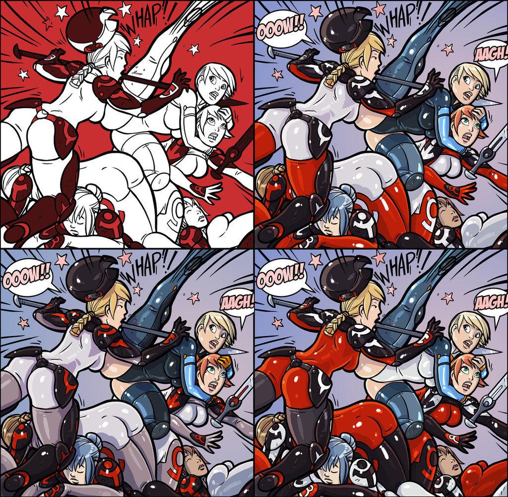
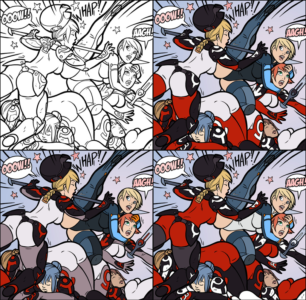
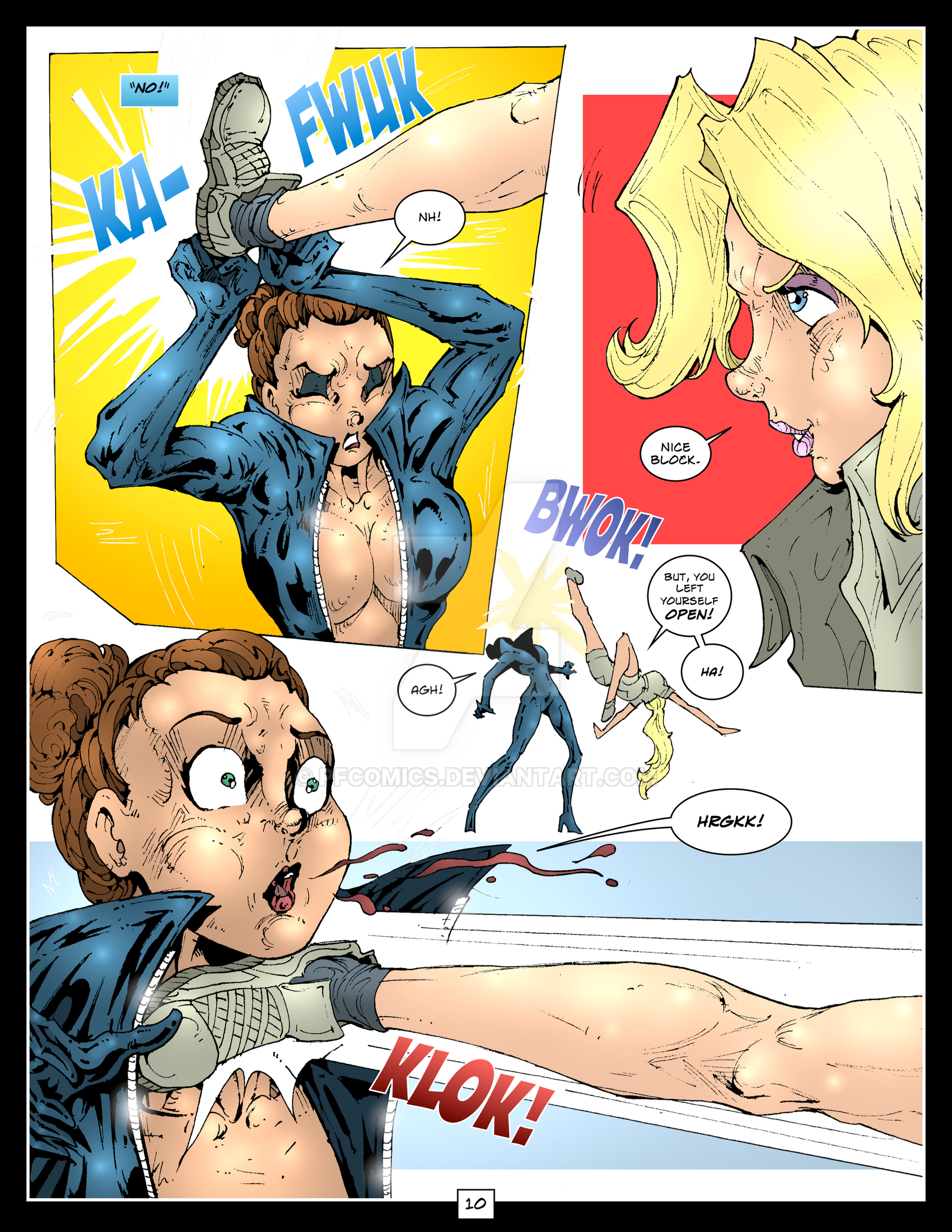
I added a light rim light, shadow and some highlights to my colored panel, (plus a bonus panel, done in the Remnant comic style") ). I am hoping to find a method of coloring the pages that looks good and does not take a crazy amount of time. This panel took over an hour ink in sai and another hour to paint in photoshop.
). I am hoping to find a method of coloring the pages that looks good and does not take a crazy amount of time. This panel took over an hour ink in sai and another hour to paint in photoshop.
Related content


Comments: 20

It may have taken time but it was worth it. Excellent piece of art!
👍: 0 ⏩: 1


Thanks! I am going to use them in the future, for sure!
👍: 0 ⏩: 0

I think the action is easiest to follow in the bottom-left panel and the heroine really stands out in that one, even though the red outfits are very becoming to the henchgirls' curves in the bottom-right.
👍: 0 ⏩: 0
looks very nie!
Personal favorite -as you may guess for the colours I used when drawing them- it's the bottom-left. I do like very much the colours used!
👍: 0 ⏩: 0

I didn't realize my cheatsy coloring warranted recognition!
It's hard to say which I like best! I'll admit, I feel the light grey doesn't work somehow, can't put my finger on it... so I have to say bottom right is my favorite. ; } But naturally, whatever you choose will be splendid, for sure.
👍: 0 ⏩: 1
Thanks for the feedback! I think I will hold off on a final choice until I get the pages finished, and pick the colors for the set and sky in the background, but the red suits seem to be the most popular. (And the highlights seem to show up best on red, and that's the most important thing
👍: 0 ⏩: 1
Oh, those highlights ;;____;; They're hypnotic.
👍: 0 ⏩: 0


I must say, I absolutely love the red shiny hineys. The highlights on the lower right, however, just make me look at the boobs and butts and ignore everything else - and I don't think that is what you are going for.
Now I'd read a comic with a color scheme like in the upper left. It's easy to see what is going on and, I'm sure, quite easy to paint.  (Smile)")
Lower left is still my favorite. I do worry about the heroine (I assume she is the heroine - the blond in blue.) She doesn't quite pop out in the way I think she should. Part of it may have to do with her dark blue against the helmet chick's charcoal glove and shoulderpads. It just all kinda mushes together. Perhaps it's just a lighting issue and some edge highlights around the glove and shoulderpad would differentiate the two figures. Or something. Like I mentioned before, I think that a light or powder blue for the heroine's suit would look good and solve that issue - but maybe that's getting too close to a Samus kinda scheme.
Anyway, awesome, awesome stuff. I dream to be able to pull something like this off.
- Ark
👍: 0 ⏩: 1
Ha, "shiny hiney" would be a funny name for this thing! Thanks for the great feedback, I agree with your comments about the hero character being too dark. My thought was to give her a stealthy outfit, but the result is she dose not stand out enough against the mass of enemies. I still have a long while till I get to the coloring phase, so I will keep playing around with it.
👍: 0 ⏩: 0

This is going to kick as much ass as your feisty heroine!!!
👍: 0 ⏩: 1
 (Wink)")

")


Joli travail dans un style dynamique et frappant ! Pour moi la meilleure
combinaison des couleurs est celle de la case en haut à droite.
👍: 0 ⏩: 0

I think I agree with an earlier viewer who said he liked the bottom-left panel best. For me, it's the easiest to follow what's going on. The bottom-right's red outfits are nice too, but the dark boots and gloves kind of make things complicated when the girls are down.
If can make one other small suggestion, you might want to try staggering the letters in the "OOOW!!" and "AAGH!" balloons. I think they're look more dynamic if they're of slightly different sizes and not all aligned on a baseline. Anyway, just my thoughts as always! Great job, I wish I could accomplish that much in two hours.
👍: 0 ⏩: 0