HOME | DD
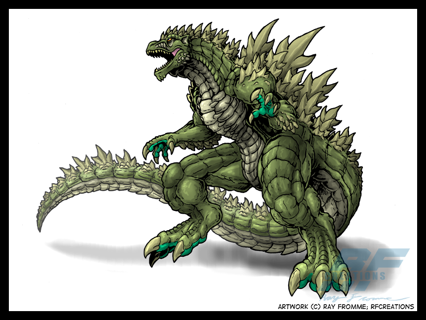
 AlmightyRayzilla — Legendary Godzilla colors

Published: 2010-04-29 13:58:10 +0000 UTC; Views: 32919; Favourites: 531; Downloads: 5934
Redirect to original
Description
Whew. This one took some effort. But I can't argue with the results.")
Critiques are welcomed!
Godzilla (C) Toho Co. Ltd.
Related content


Comments: 76


Cool. Make his head bigger and i think it would look perfect. Don't make it to big though.
👍: 0 ⏩: 0


One of my favourite takes on the character, ever. Love it.
👍: 0 ⏩: 0


This not the winged griffin crap legendary pictures rejected is what I would like to see in 2012!
👍: 0 ⏩: 0


The sad truth is, it'll probably be even worse.
👍: 0 ⏩: 0

If he looks like this, then you know it'll be good.
👍: 0 ⏩: 0
Godzilla? More like Gorgeouszilla in my book! This is truly impressive - almost a true hybridization of both the Toho and Tristar zillas, complete with a blue cayman iguana chaser! Absolutely amazing! :*)~
*will also have to keep an eye on this gallery since there's also some pretty intriguing charachter reworks in here as well!*
👍: 0 ⏩: 0

Very, very very cool. Combines dino aspects without losing Godzilla's muscles and bulk. I much prefer a black/gray to a green Godzilla, but still very nice job coloring. I especially like the spike design, as well as the legs and feet. Nice touch with the spikes on his face, too; almost like a spiked beard. Tried drawing something like that myself for G, but it never came out well. Would love to see a follow up piece of him breathing fire!
👍: 0 ⏩: 0

It's easily one of the best balances of the "Classic" look with modern features I've seen. It's either this or your G-Wars Godzilla that ranks as my favorite redesign. Any nitpicks with the colour scheme can be handled with photoshop, but this Godzilla looks colored more like he's ready for a comic book appearance then a film one.
👍: 0 ⏩: 0

Gotta say, as far as Godzilla "redesigns" go, I like this one.
👍: 0 ⏩: 0


That just says Dino-AWESOME!!! You really get that sense of saurian awe.
👍: 0 ⏩: 0

this is one of the better godzilla designs ive seen here in DA. really like it.
👍: 0 ⏩: 0


I love it but it maybe it be should darker , the skin texture is a lil more realistic and maybe give him webbed fingers for swimming.
👍: 0 ⏩: 0

Sweet, Epic, Supercali... aw screw it. It's superb.
👍: 0 ⏩: 0


awsome design,it stays truw to the original but updated,very cool
👍: 0 ⏩: 0

Hey i really like this- reminds me of matt frank, you could lighten the background so he'd pop a bit more...
👍: 0 ⏩: 0

LOL, I remember some guys talking about this design on the Toho Kingdom forum. A lot of people hated it because it was too dinosaur like. I like the design, I thought the reactions were ridiculous. Oh well, most of the people there wanted to have Godzilla to be a rubber suit again, so meh...
Anyways, I like the design
 (Smile)")
👍: 0 ⏩: 1

Wow, it got that much recognition, eh?
Well, not everyone likes cheese on their burger. There's even people who just want the meat without the bun. Hell, there's people who'd rather have a damn salad.
👍: 0 ⏩: 1
Yes, yes it did LOL
Exactly, but people don't have to be a-holes about it. Unfortunately it's their right LOL
👍: 0 ⏩: 1
Yeah, I actually found one of the threads talking about it. "Good lord, that thing is hideous." So it isn't Godzilla '54. Blow me.
Maybe the most rational critiques I've read are that the chest plate does look a little awkward (maybe I should change its color) or they'd like to see it in classic charcoal gray. It's not perfect to everyone, but even so, they still like what they see. At least there's quite a few who think that it fits what they want.
That conceptual piece from ComicCon looks great, but I think it's way too overrated. I didn't care much for it because I expected something...well, different, and it looked like fan art of Godzilla 2000 anyway.
👍: 0 ⏩: 1
Yeah, people can be VERY nit picky
I still say your design is great, though it isn't how I would have handled the LP look. A design me and a friend are working on uses the GFW design as a base and modernizes it with some more life like and dinosaurian features, looking at the Winston, Delgado, and Stout designs for reference.
I wasn't satisfied by the ComiCon preview. Where GINO was doing something unrecognizably radical, this design is doing something almost by just lazily giving us a carbon copy of the original. I would love to see LP find a middle ground...
👍: 0 ⏩: 0

Very nice.....I hope they do not do a repeat of 1998 with this one.
👍: 0 ⏩: 0

This is official. I like the mature look given to the design that gives the impression that this Godzilla is millions of years old. The dorsal fins are the standard classic style with a rough edge to it. I especially dig how the fins shorten at one point on the tail then get larger towards the end making the tail look like a deadly weapon. The head has its ups and downs imo but I learned that still shots dont always do justice. I think you combined the american version to this as most of those features stand out.
👍: 0 ⏩: 0


i said whoops because I noticed I had already left a comment and favorite-ed this and had just left another comment >.>
👍: 0 ⏩: 1


I've had some serious love for this design ever since I first seen it. I love the thickness of his arms as well as the length. However my favorite aspect is the size of his hands. Awesome work.
👍: 0 ⏩: 0

Now THAT is awesome. It's the kind of Godzilla I imagine - primeval, sinister, and almost unstoppable.
-WhiteFireRodan
👍: 0 ⏩: 0

not a bad design or coloration, but what's up with the thing on his chest?
👍: 0 ⏩: 2
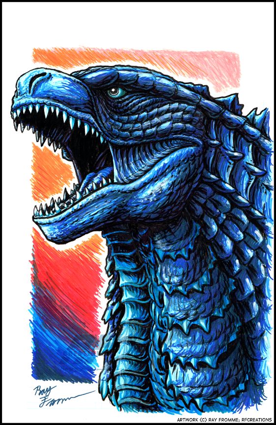
It's a chest plate, kinda like what KaijuSamurai did with his Gigantis Goji design, only I was going for a look that looks like the vertebrae that make up the spine.
👍: 0 ⏩: 1
Ok, that explains it.
Not a bad design, but why is it purple?
👍: 0 ⏩: 1
I believe the best answer I can come up with is "Why not?"
If there's one thing I've learned as an artist, being unique and different is what makes one stand out.
👍: 0 ⏩: 1

it's probably the scar he had in Tokyo S.O.S
👍: 0 ⏩: 1
| Next =>