HOME | DD
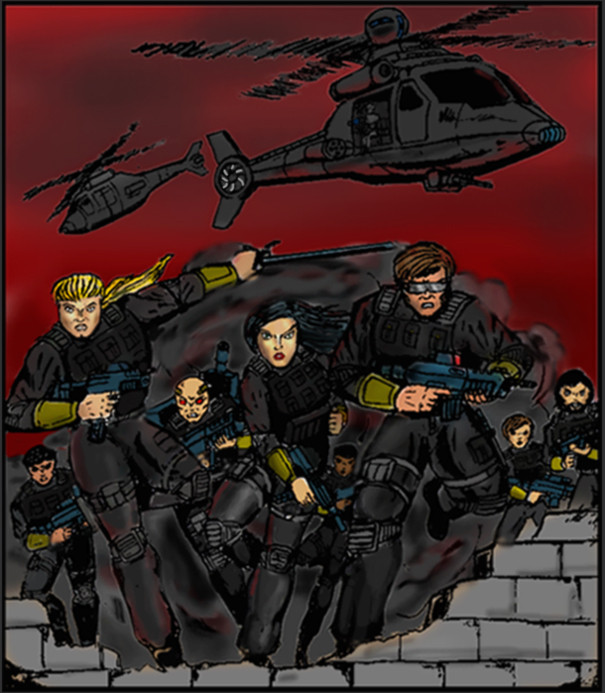
 Andared — FIRE team alpha 2012

Published: 2012-03-20 01:08:16 +0000 UTC; Views: 1314; Favourites: 26; Downloads: 34
Redirect to original
Description
Yet another depiction of my super-soldier OCs.I experimented with a more subdued color pallet on this. I Haven't decided rather or not the experiment was a success or not.
THE F.I.R.E. TEAM ALPHA SERIES
Purchase below
myBook.to/Fate-Of-Nations myBook.to/bloodAtresure myBook.to/PandoraPrinciple …
Amazon: www.amazon.com/dp/B06Y1RY5PL/r… …
Facebook: www.facebook.com/Ray-Chilensky…
Twitter: twitter.com/RChilensky
Website: rpchilensky.weebly.com/
THE F.I.R.E. TEAM ALPHA SERIES
Purchase below
myBook.to/Fate-Of-Nations myBook.to/bloodAtresure myBook.to/PandoraPrinciple …
Amazon: www.amazon.com/dp/B06Y1RY5PL/r… …
Facebook: www.facebook.com/Ray-Chilensky…
Twitter: twitter.com/RChilensky
THE F.I.R.E. TEAM ALPHA SERIES
Purchase below
myBook.to/Fate-Of-Nations myBook.to/bloodAtresure myBook.to/PandoraPrinciple …
Amazon: www.amazon.com/dp/B06Y1RY5PL/r… …
Facebook: www.facebook.com/Ray-Chilensky…
Twitter: twitter.com/RChilensky
THE F.I.R.E. TEAM ALPHA SERIES
Purchase below
myBook.to/Fate-Of-Nations myBook.to/bloodAtresure myBook.to/PandoraPrinciple …
Amazon: www.amazon.com/dp/B06Y1RY5PL/r… …
Facebook: www.facebook.com/Ray-Chilensky…
Twitter: twitter.com/RChilensky
THE F.I.R.E. TEAM ALPHA SERIES
Purchase below
myBook.to/Fate-Of-Nations myBook.to/bloodAtresure myBook.to/PandoraPrinciple …
Amazon: www.amazon.com/dp/B06Y1RY5PL/r… …
Related content


Comments: 22

Mmmm I would try to refine a little bit the shadows, but good composition
👍: 0 ⏩: 1

Yep, that seems to be the consensus. Thanks for the look.
👍: 0 ⏩: 0

 (Smile)")


Quick tip: The word is "tyrants".
Apart from that, all I can say is the faces need a bit of work, and thelead woman's hand is a bit small.
I like how you've coloured it, though, gives it a very old-timey superhero-series look.
👍: 0 ⏩: 1
I fixed that spelling error. I know I need work on faces; noses have been a particular burden lately. I shall try to improve. Thanks for the look.
👍: 0 ⏩: 1
You're welcome!
And yeah, noses suck
")
👍: 0 ⏩: 0

Interesting, but some of the colours you've chosen for the shadows give the image a murky, dirty feel. Also, the woman near the front of the large group looks like she should be placed at the back of it, since she's so much smaller than the two men surrounding her.
👍: 0 ⏩: 1
Thanks for the look. The shading thing is a problem that I try to resolve with every drawing. When I try to make the shading less "murky" (a term that has been used to my shading before) the drawing, especially the faces, seem too cluttered and indistinct to me. I'll have to do some experimenting.
👍: 0 ⏩: 1
Have you tried creating a colour palette before you start colouring? I used to run into this problem a lot when I started, and colour palettes can help you see which colours work next to each other before you start. If you work with a tablet, you can even start blending them in the palette to see if any of them will create the murky look once they're blended. Also sticking away from grey mid tones might help, as I've noticed you use nice looking peach tones around the highlights but then go for greys around the shadows. Slightly more saturated tones might help to colours look less murky too.
👍: 0 ⏩: 1
I'll give your suggestions a try with y next piece.
👍: 0 ⏩: 0

I don't really get the concept, concerning the flags. Do they represent heroes, tycoons, both, none? ...
👍: 0 ⏩: 1
They are the flags of the nations represented by the team members. Three Americans, a Canadian, a Kenyan, an Israeli, a Japanese, and a Comanche tribesman. (The American Indians have regained their national sovereignty in my novel.)
The novel this is a illustration for has to do with a war against a tyrannical world government. Nations have been abolished but patriots from countries fight to regain their freedom and nationalities.
👍: 0 ⏩: 1
Ok, I get it now. Sure that without knowing the novel it was rather ambigous for me. I like the idea of this heroes team from different nations, fighting together against the tyrannical world government.
Thank you so much for your explanation and by the way, good work
👍: 0 ⏩: 1
No problem. I suppose I should put more of an explanation on my illustrations; since Team Alpha makes up so much of my gallery.
👍: 0 ⏩: 1
Yes, I think so, it would avoid to some people to make confusion with other ideas...
👍: 0 ⏩: 0
Thanks. They cut my hours way back at work so I've had time to really work on my weak artistic areas; lemons to lemonade.
👍: 0 ⏩: 1

heh i been drawing so much less latly new relationship taking up alot of my time. but i have alot of sketches waiting to be finished
👍: 0 ⏩: 0

I think that the colours look good and work really well in this piece - it gives it a kinda military feel.
Cool picture.
👍: 0 ⏩: 1
Thanks! Military was, of course, the feel I was going for.
👍: 0 ⏩: 0