HOME | DD
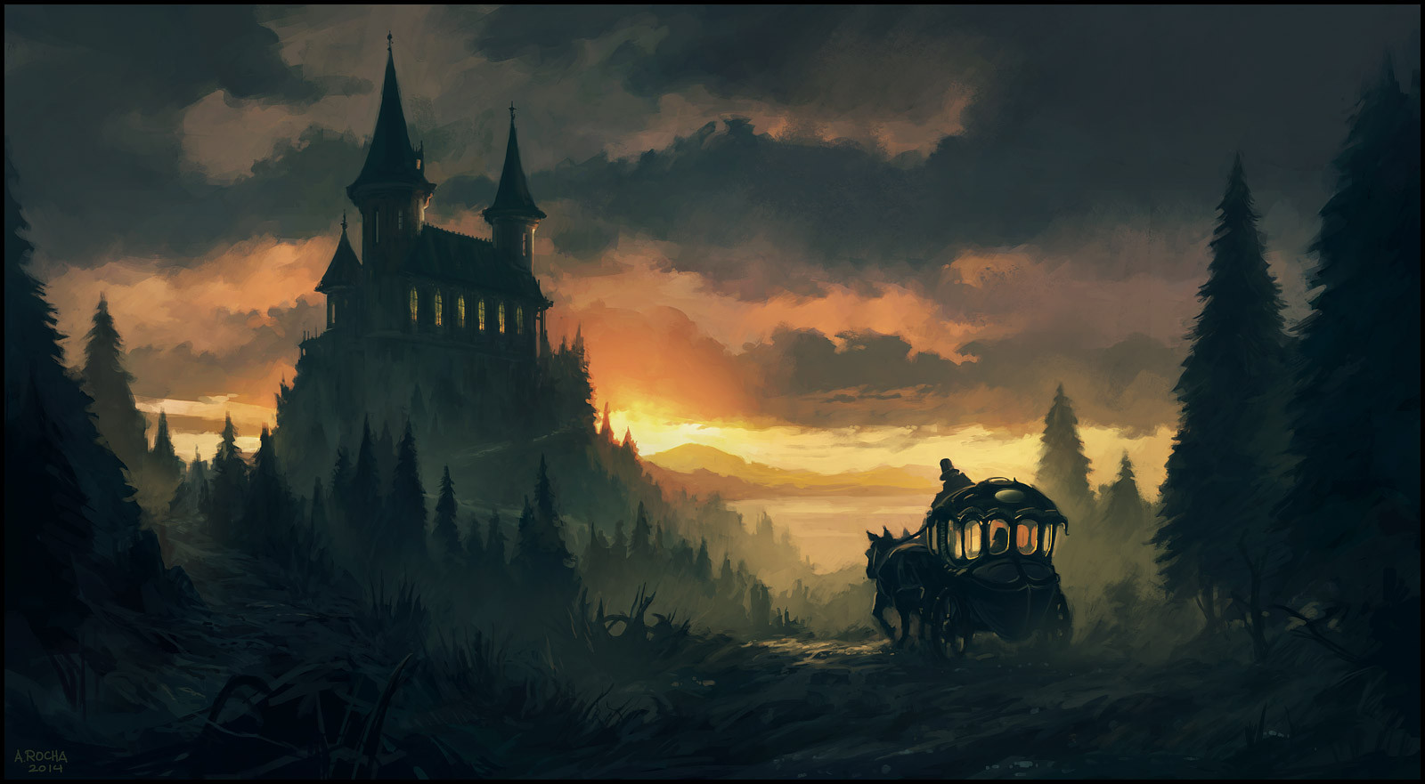
 andreasrocha — The Messenger II
Published: 2014-09-26 09:57:45 +0000 UTC; Views: 32906; Favourites: 2337; Downloads: 0
Redirect to original
Description
I've been doing a lot of reworking of paintings I did this year as I think there is always room for improvement. Unfortunately, sometimes the paintings get worse...I let the 2 versions "rest" for a while, see what people have to say and then I usually replace the old version I posted with this new one (or sometimes just delete the new version). I make a new post to let people know that I worked further on the painting. It probably looks like I am posting the same painting twice, but when you compare it to the old version (if still available) you will notice the differences. Just wanted to let you know...As always, thanks for all the support!
Related content


Comments: 90

Would love to see the view from way up there! Hopefully, love & good fortune awaits the traveler.
👍: 0 ⏩: 0

I can't get over the amazing mood and atmosphere in this picture, just can't stop looking at it. The colors and shadows, wow <3
👍: 0 ⏩: 0


I thought this was Hogwarts. I'm glad it isn't because its to awesome and eerie to be a carbon copy of the school.
👍: 0 ⏩: 0


"Et quand il eut passé le pont, les fantômes vinrent à sa rencontre."
As far as visits to long-toothed counts go, yours most certainly stands out. Perhaps due to the sunset light, often underused in thematically similar works : there is, after all, such a thing as one full moon too many. Or to a landscape which relies less heavily on the grandiose (the gloomy mountains ! the sheer drops ! the gigantic castle !...) than is usually the case. Your vision has a more "earthy" feel, which I find easier to relate to. A moody and subtle piece of art, then.
An infinitesimal suggestion, perhaps : to me, the whole scene stands by itself in the visual tension between the castle and the carriage. The sense of speed conveyed by the brush strokes around the wheels might not be necessary in such a classical composition. As I said, infinitesimal.
👍: 0 ⏩: 1

Ehilà! Nice indeed, and I agree, not too much arguments but the bare necessity and it works, it brings moods and you feel a story growing; if I may say, I perhaps need a little light, some one in the castle waiting?
seeYa
👍: 0 ⏩: 0

This so cool! Reminds me of Hogwarts from Harry Potter!
")
👍: 0 ⏩: 0


How beautiful! It reminded me castle Kobnek and forest Kaiserwald (the book of A. Pehov - Strazh ).
👍: 0 ⏩: 0

I remember seeing the old version of this a while ago and wanted to add my two cents. I think it is great you go back to your old stuff and make it better.
The perspective looks off because of how much contrast you gave the building. I know you want it as a secondary focal point, but with this composition you really don't need it as dark as the foreground trees. I think hazing more atmosphere over it would solve this. You could also scale down the steeples and windows a little bit to help this but I am not sure if it is needed or not.
Really great brush work I like how you handled the clouds and cut out some nice silhouette shapes where the environment overlaps. Dropping in the heavily saturated red behind the figure in the carriage is a good call to draw attention to your focal point but I would saturate some of the rim light around the carriage so that that splotch of saturation does not look so out of place.
👍: 0 ⏩: 0


Great piece of work!!
Thanks for sharing...
Featured in Daily Inspirations at hangaroundtheweb.com/2014/10/d…
👍: 0 ⏩: 0

 (Smile)")


Love this, makes your mind explore and captures a story in a single scene. A lot of moods with colors I love it :]
👍: 0 ⏩: 0

Looks gorgeous! I love your sharp details like in the carriage and in the house.
👍: 0 ⏩: 0

I compared old and new for like ten minutes switching between tabs and I think they are different and equally good. I liked the brightness of the background better on the old one (looked like it was much darker than here) but pretty much everything else improved. Also glowy windows on old one. I liked that.
👍: 0 ⏩: 0

I don't remember the old one, but this one is cool!
👍: 0 ⏩: 0


wow dude, this looks great!
you should post a before and after comparison!
👍: 0 ⏩: 0


Pfff...there are so many artists so much better than me...but, thanks anyway.
👍: 0 ⏩: 2
People also constantly tell me how good I am after one work they see. I don't think I'm good either, but hell, if you are good enough to make a living off it and like it... Well, I discovered Fan Ming through you, but that guy is... ughh, ughh. Fuck. Need to practice.
👍: 0 ⏩: 0

Stunning work as always, I love the type of lighting you picked, it's very very well done <3
👍: 0 ⏩: 1
You're most definitely welcome! You're one of my favourite and most idolized artists by far <3
👍: 0 ⏩: 0


wow nice drawing great background and the castle looks awesome
👍: 0 ⏩: 1

Yeah I think this one is a step up from the first version. The first one seems muddier, while this one seems more defined. And adding the yellow fog/mist helps the shapes come out.
👍: 0 ⏩: 1
Thanks. Yes...the muddier look bothered me and I really thought the painting had more to give.
👍: 0 ⏩: 0

Both versions were great, but I'm glad you're more satisfied with this version, and I see the little improvements! They look amazing!
👍: 0 ⏩: 1
Glad you agree. Thanks.
👍: 0 ⏩: 0

| Next =>