HOME | DD
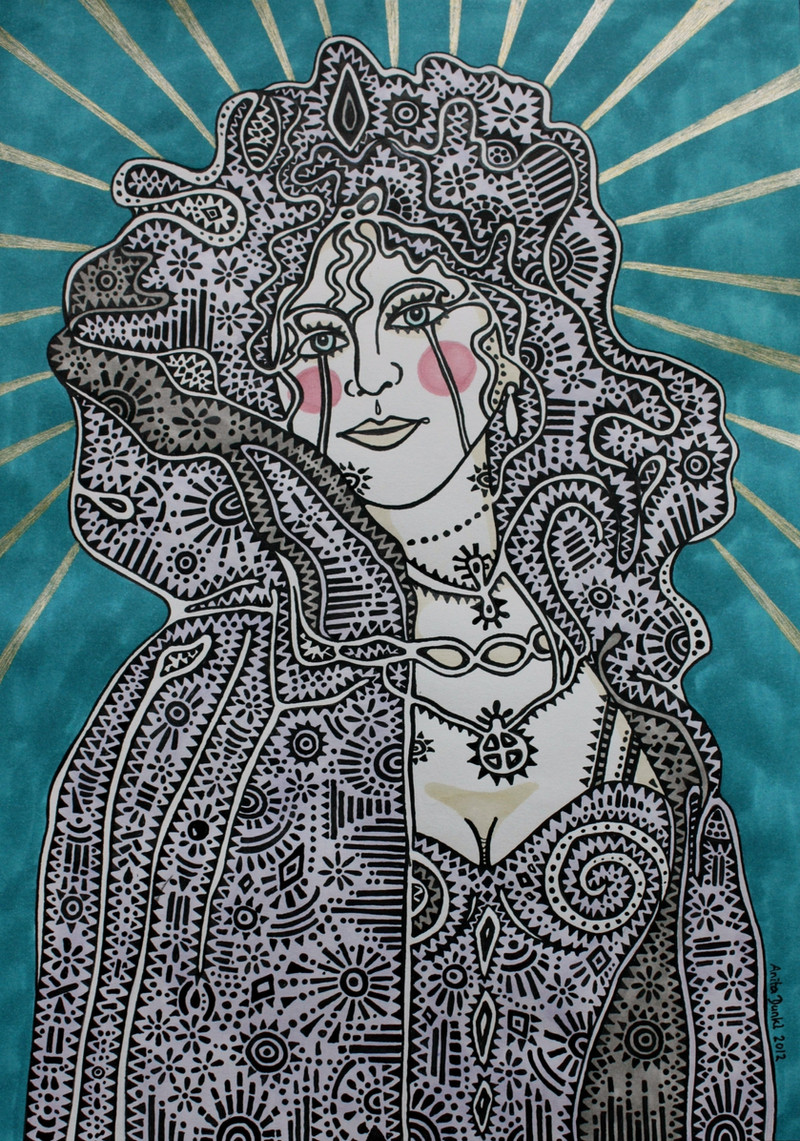
 anitadunkl — Countess
Published: 2012-05-18 17:41:00 +0000 UTC; Views: 1211; Favourites: 62; Downloads: 0
Redirect to original
Description
I'm not so fond of it, I just finished it yesterday because I was bored...ink and markers on paper, 34x24 cm
Related content


Comments: 40


My pleasure Anita they are great!
👍: 0 ⏩: 0

hey! will write you soon, got so much of work, and I want your work but I need time...cause gallery in Paris etc. is taking 300 % of my life!
Love this one!
Fabian Fischer
👍: 0 ⏩: 1

I was wondering when you will write me again. I have all the pictures in an envelope just ready to send them to you  (Smile)")
👍: 0 ⏩: 0


I think its very nice and I like your style with all of the minute details!
👍: 0 ⏩: 1

WOW Anita! The way you have the background softened it appears as if she is floating right out of the image!
👍: 0 ⏩: 1
I'm happy that you like it, thank you Cher

👍: 0 ⏩: 0

I think the foreground stands out really well because of the background- intitially I thought that the background was digitally blurred.
It's a lovely piece of work with lots of depth!
👍: 0 ⏩: 1
Thank you so much 
👍: 0 ⏩: 0

I'm not so happy with the colors ")
👍: 0 ⏩: 0

Yes, that's right
👍: 0 ⏩: 0

I like it perhaps you should just leave it on the side and have a look at it later on. Mood has a lot of influence on us so perhaps when you are in a different mood you will pin point what you don't like about it and fix it. Sometimes it is just a question of colours adding or changing a colour sometimes helps.
👍: 0 ⏩: 1
You're right, it often depends on the mood. I will take a look at it after a few weeks
👍: 0 ⏩: 0

The pains-taken amount of detail in this piece is unbelievable.
👍: 0 ⏩: 1

is klasse zu sehen das du dich auch immer verbesserst
👍: 0 ⏩: 1
Danke, freut mich, dass es dir gefällt
👍: 0 ⏩: 0

She looks very regal!!!!...I love the understated colours!!...Beautiful!
👍: 0 ⏩: 1


I absolutely think it's wonderful, Anita, and do so because it celebrates pure "graphic" information, from the stylized defining linework of her facial features (the intricacies of the eyes are fabulous), the playful "nimbus" rays of gold, and best of all, the wild patterns of her bodice, cloak, and hair! I LOVE the work you've put in on these diamonds, and swirls, and zigs, and flowers! I've studied and worked in Graphic Design all my adult life, and this, to me, is an exciting graphic artwork. Bravo, to you! Cheers, Roger
👍: 0 ⏩: 1
I am pleased with the cloak, but I'm unhappy with the background... but now it's too late ")
I'm really glad that you liked the patterns, it means a lot from an design-expert like you
👍: 0 ⏩: 1
Well, if I may, your choice of the background is steeped in design "sense", in that it contrasts with the lively work of the cloak and figure, allowing the work to really "pop", so it was a very logical decision!
👍: 0 ⏩: 1