HOME | DD
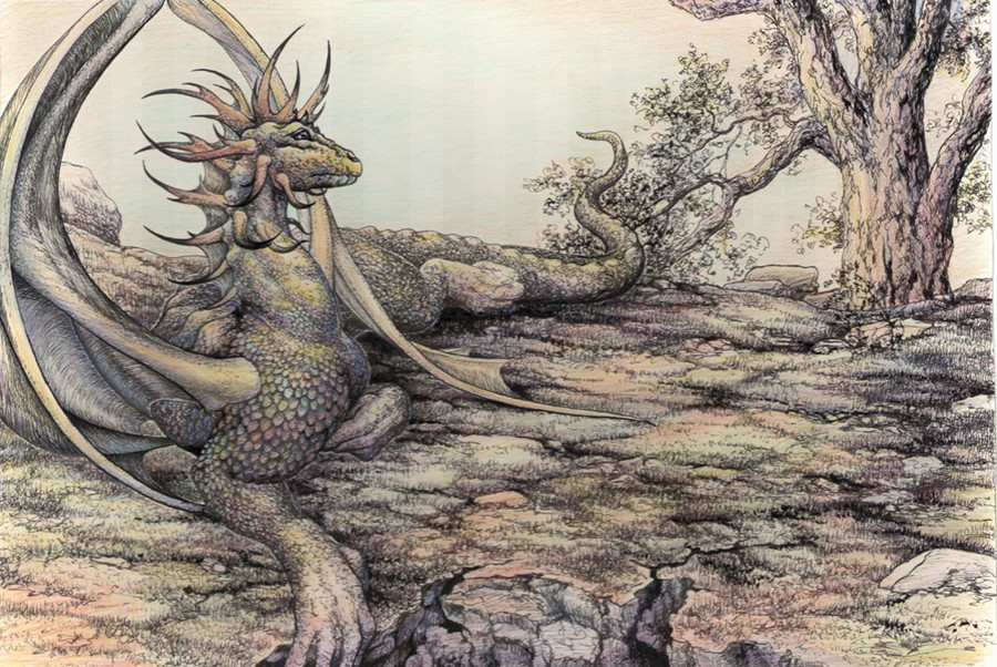
 ArtbySandiJohnson — Dragon 1
Published: 2005-08-10 17:44:00 +0000 UTC; Views: 1387; Favourites: 62; Downloads: 324
Redirect to original
Description
This has problems. I was so anxious to get back to doing art I don't think I spent enough time thinking it through. Ink and prismacolor. Originally it was meant to be ink only. There will be more dragons with scales and spikes in the future, and probably be another in this pose, but with a different tail. Taking all advice offered.")
Related content


Comments: 141

I'm trying *pant, pant* I'm trying. Life gets complicated when you get past 18 (age, that is)!
👍: 0 ⏩: 1
*hugs* don't i know it.
👍: 0 ⏩: 0

alrighty, then, what do you think is wrong with it? I looove it.
👍: 0 ⏩: 1
Thanks.
I think the tail is a little too "fat/round" looking. I had trouble with the ground, trying to decide what to do with it. It was originally supposed to be just ink, and because I was using just a fine point ball point, (I couldn't decide how much color to use in the drawing, especially on the ground) I didn't have enough flexibility with my lines with the ball point. I used to use technical pens with ink wells......... I sort of lost the thumb on the one 'hand' in the shadow, so that it looks too high and small. I like the head, neck, shoulders and wings........
After letting it rest for a few weeks, I like it better than when I had just finished it and feeling frustrated.
👍: 0 ⏩: 1
Oh! I sooo know that feeling. That portrait I did of the two boys a while back was that way, and one of the Airedales. I just dreaded both of them because the commissioner was SO picky. They turned out so-so, both of them.
And you know? I think his tail is just fine.
👍: 0 ⏩: 1
I'm starting on a commission that I thought was going to be picky, but she accepted one of the 2 offered sketches without requesting any changes, so..........I'll get started as soon as her check arrives. *rubs hands together eagerly*
So you think the tail is okay? hmmm...... Well, when I get time I'm going to take another try at something extremely close to this drawing/composition ..........I really do want to give it to our friend for helping with my sister's house.
👍: 0 ⏩: 1
Payday never hurts! - Even if you are contracted for romance novel covers. <--- Thinks this should be interesting.
And yes, the tail looks fine. It has a very fine taper on it, and isn't too wide or narrow at either end. I can't imagine that anyone would fault it.
👍: 0 ⏩: 1
LOL thanks. I'll post the drawing, maybe a WIP too, when I get started. I'll ask her first if she minds. She's a DA, too. Everything just seems to move so slowly around here. James is helping me find more time to work right now. If I could just be home on weekends.
👍: 0 ⏩: 1
That will be interesting to see.
There is no way to get home on weekends?
👍: 0 ⏩: 1
We're at my sister's/mother's on weekends. Working on her house, 3.5 hours away from home. But it's coming to an end here in a few weeks.
👍: 0 ⏩: 1
That's good, you'll have more time then, for things that need to be attended to.
👍: 0 ⏩: 1
Yes! *nods head furiously* Time indeed. Things needing attending, indeed.
👍: 0 ⏩: 0

I really like the combination of the inks and pale coloring on this. It's got a very Arthur Rackham feel, except he tends to darker colors. Well, it has a very "old world" illustration look to it. Very Nice!
👍: 0 ⏩: 1
Thanks for the comments. Read my new journal
👍: 0 ⏩: 0

anothomy is kind of funny, but the coloring and the picture is amazing ")
👍: 0 ⏩: 1
LOL I'm glad you liked it and I'm honored you faved it. I think the original of this one does look better. You know sometimes the scanned image on the computer looks better...............? but not this time, some of the color in the sky was lost, and some of the other light areas.
👍: 0 ⏩: 1
yes, scanner messes up some things

👍: 0 ⏩: 1

Og I enjoyed looking at this picture. The inking job is marvelous and I just love the effect you got witht he prismacolors. I adore the tint affect you got with it. It really adds to the environment of the picture.
I know you said you saw a few errors with your dragon, and I found a few as well that were slight, but they still irked me. Please don't take any of this harshly, as most of it is just my own style I am more used to.
First off, I will have to deal with the wings. I know this is a crazy thought, but it appears the wing closest to the viewer is coming out of the arm. If you wanted it that way, hey, its a new style and its interesting. Anatomically though, there is no way that the wing would be very effective in flight. The bone area of the wing seems to lack a bit of structure. it seems to just curve instead of bend at angles where the bones would connect. One last thing about the wings is that they dont seem to connect to the body. It might just be angle at which we are viewing it, but the body of the wing seems to lack enough area to be effective.
For the wings I would suggest *meradragon 's tutorial. It kind of helped me on folded wings. [link] She makes a few good points and show how the wing membrane should connect to the body as well.
Other than my seriously nitpicky wing hints, its an awesome picture. I can easily overlook the promlematic parts and enjoy the scene. You did an awesome job of capturing the atmosphere and that tree is just gorgeous. (I always have issues with trees. >_<
Good luck with getting back intot he art groove. I cant wait to see more.
 (Wink)")
👍: 0 ⏩: 1
Ah, a real critique! No insult taken.
I always want my wings to join the body at a higher level than the arm, as though the shoulder and shoulder blade area is extra large and heavy with an extra joint for the wing. I don't think I quite accomplished that. The way the dragon goes from scales to wing, and the way I delineated it I thought the same as you that it didn't look like it was connected, or at least not in a deep bone to joint way. It is the first time in years that I had done a dragon with scales instead of leathery skin and I hadn't thought through how to handle that transition.
Tutorial: It reminded me that when I draw dragon wings I think of bones. Bones are usually narrower in the center and expand out at the ends. That caused 2 problems with this dragon. By allowing for the extra mass and shape at the ends and not being really clear in my head how those ends were shaped and would fit together and move against each other allowed for the ambiguous curved look of the joints you mentioned. The tutorial reminded me of something that I hadn't quite dealt with before. While I'm thinking bone structure covered with fine membrane I wanted bony and delicate and was totally forgetting about showing the necessary muscle with which to move the limb and the beast.
I'm glad to see another artist who actually stops to think about anatomy and what would or wouldn't work. So many times I think people just draw shapes and don't stop to think whether it would actually make sense in nature. I suspect that a dragon with 2 legs and a pair of wings would be the only model nature would approve of..........but I do like the front legs in addition to the wings. I must admit that I have seen some dragon drawings where I was comfortable with only wings and back legs.
The thumb on the one hand ended up getting lost in the shadow and looks too small and high. That needs to be correctd, and the tail is just too 'fat' and snake looking.
Thanks so much for your help and comments.

👍: 0 ⏩: 1
Im so glad you found it useful. I do hope it helps you in the future. ^^
I love thinking about how thigns woudl work in nature. I think that it would be possible for a dragon to have four legs, wings and still be able to fly. Either the wings would be large enough to support the weight, muscular enough to support it, or move in such a way that it makes the weight less of a burdon. There is a species of bird that when it flaps its wings, it also pushes the muscles around the lungs to automatically inhale and exhale. I'm thinking something along those lines. When those muscles move, it makes it easier for the creature do to other tasks that are needed and just generally make it an easier experience.
The one thing I don't think is possible is making the dragon too buff and powerful while still expecting it to be able to fly. If their bones were too strong, that would make them too heavy to be able to lift off the ground. >.<
When I draw, I tend to think a lot about anatomy. Sometimes the picture just doesn't follow normal anatomical standards, and I just have to deal with it on those times. Recently, I have been throwing around a new wing idea. [link] Attaching the wing further along down the body allows it to have a larger surface area and therefore enables it to trap more air to keep it aloft. (Please excuse the sketchiness of the piece. It was an idea sketch ")
👍: 0 ⏩: 1
aha! Yes. I like having the wing attached to more of the body. I usually have the membrane start just in front of the hips so there is more surface to catch the air, but doesn't impact hip and leg movement. I hadn't thought about taking it back like you have. You know, so many people have this little tiny area just barely past the "arm" bone, and then spread out from that tiny area into a big broad wing span. I always frown at those.
I didn't know about the bird with the lung/muscle action. I have thought about the 'massive' issue. Mine frequently have very muscular, large boned shoulders. Birds have honeycombed bones. Dragons, I think, would have to have a massive honeycomb system in their bones, that, even though the bones appear very large there isn't actually nearly as much bone(and therefore weight) there as it seems because the chambers are so large and numerous.
Anyway, those are my ideas to date.
👍: 0 ⏩: 1
Yes. I feel dragons would have to have the honeycomb bones as well. I thought I had said something about that, but it appears I didn't. Its maeks birds aerodynamic and it would make dragons aerodynamic as well.
I keep wanting to say ti is some sort of heron or whatnot. I know it is a migrating bird. I might have to look up waht species it is. Anyways, it allows them to fly for a more extended period of time.
Oh yes. Those little ones that expand out. I wonder of how much use those are. You've prety much just added a very large gap to the wing. If you need wing in one area, it would definately be needed near the body. It would be more weight on the wings if the outsides are carrying the inside weight than if the inside were even a bit smaller and carrying the full amount of weight. >_<
👍: 0 ⏩: 1
Yep I agree about the wing.
👍: 0 ⏩: 0

Very cool - I love the detail and the colouring.
I like the old-fashioned feel you have with this colouring job - it really evokes the feel of fairy tales and wistful bygone days. I'm not sure if that was entirely what you were going for, but that is the note you've hit with me anyway
👍: 0 ⏩: 1
Well, I was trying for a subtle more old fashioned look with the color. The problem was I really wasn't sure what I was after.
👍: 0 ⏩: 0

I'm not terribly partial to dragons with spikies all over them like this, but how can I just not love this one? 
 (Smile)")

👍: 0 ⏩: 1
I've not done spikes before. It occured to me that if I start doing illustrations for books and magazines that I should be capable of depicting more fierce and typical dragons. So I decided I had better broaden my range of interpreting them.
Thanks for the comments.
👍: 0 ⏩: 1
Oooh, 'tis a good thing to do, that is! 
👍: 0 ⏩: 1
Thanks, glad you think so.
👍: 0 ⏩: 1
You're very welcome.
👍: 0 ⏩: 0

There are many great things about your drawing! I like the rainbow colors, the antlers, feet, and face of the dragon, and all those nice little details everywhere!
The sky in the background looks kind of plain next to it all and is even a little distracting. Just a little shading here in there in the sky could help.
👍: 0 ⏩: 1
Several have mentioned the sky. It does have a little more color than shows up, but not alot. I just really didn't know what to do with the landscape and sky once I added color to the dragon. Poor (or no) planning
👍: 0 ⏩: 0

So.. much... detail! Fantastic! I think the combo of ink and prismas is great, the tones give it this old, ancient feeling, like you'd imagine if you ever saw a dragon.
👍: 0 ⏩: 1
Thank you. I'm glad you liked it. But once I did the dragon that left me wondering how to handle the landscape part. ( I didn't think far enough ahead!)
👍: 0 ⏩: 0


All I could suggest is that the sky... should be sky-ee... or somethin'. O.o I'm not that great an art critic, it's just the sky should be a bit more... intense? Is that the word? Yeah, that's it! Other than that, you did great Salamander-sama! 
👍: 0 ⏩: 1
Yeah, the sky is a bit wimpy. I just wasn't sure of what I was doing. Thanks
👍: 0 ⏩: 0


By the way, I think your proportions are perfect.............that is a great pose...........
👍: 0 ⏩: 1
Thanks for all your comments. I'm glad you liked the pose, I really gave that a lot of thought.
👍: 0 ⏩: 0

I love dragons and i can draw them .....to a degree.... I looked long and hard at this picture and i seriously can not find anything wrong with this picture its done very well..... i wish mine turned out like this!!! good job
👍: 0 ⏩: 1

The only things I can even suggest improved in this picture are that the sky should possibly be a bit more intense and the nearest wing to the viewer looks a bit shorter than the other. Other than that, beautiful. I like the muted colours on the piece because it gives it a very fantasy-like look. Love the pose too
👍: 0 ⏩: 1
The sky is weak, but so is the color on the ground. I couldn't decide how dark/bright to go on those. I'll have to check the proportions of those wings out again. I really didn't take enough time thinking and planning on this one.
👍: 0 ⏩: 1
It's a beautiful picture anyways. Quite honestly, you could leave it the way it is and it would still be amzing.
👍: 0 ⏩: 1
| Next =>