HOME | DD
 ArtOfEdge — Oh Myyyy - Variations
Published: 2012-01-12 06:37:58 +0000 UTC; Views: 2354; Favourites: 109; Downloads: 72
Redirect to original
Description
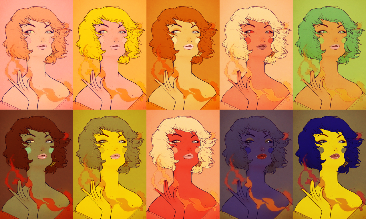
As you can see I'm having trouble deciding which colour scheme I like best u__u Hope it doesn't burn your eyes!Related content


Comments: 21

oh wow so so pretty!! my first time on diviantart and the first piece i see is this beautiful array of vibrant colors, Really beautiful indeed
👍: 0 ⏩: 0

Awesome! I like the green hair, blond red eyes and the first with the blush pink ♥ Good choice color
👍: 0 ⏩: 0

Choosing colors can be so hard sometimes! These are all gorgeous. (:
👍: 0 ⏩: 0

I love this! ")
👍: 0 ⏩: 0

Well in this case everything seems to work fine. But when she needs to appear in a scene, then a choice gets more relevant I think. Anyway, great art!
 (Wink)")
👍: 0 ⏩: 1


Interesting! I guess it kinda does hahaha xD

👍: 0 ⏩: 0

Lol no matter what color it's in they're all still beautiful :3
👍: 0 ⏩: 1

I like some of the pop art ones, but I think that needs a different figure, or maybe heavier lines. The green one is probably my favourite hehe.
👍: 0 ⏩: 1
Haha, yeah I like the green one quite a bit too! thanks
👍: 0 ⏩: 0

I think i like the two on the left the most..
👍: 0 ⏩: 1
Interesting! I was going to post the top left one before I decided on the current version ^w^ I still like it though.
👍: 0 ⏩: 1
yeah, they're both quite nice
 (Smile)")
👍: 0 ⏩: 0

Wow! You've chosen a plethora of colors! They all work, I can see why you have a dilemma. XD I like the bottom right one actually. It's a different scheme than I usually see and it's more bold compared to the others. I also like the one above it; lovely earthy tones. C:
👍: 0 ⏩: 1
Thank you :D I was actually considering posting the bottom right one instead at one point! I really liked the odd colours ^w^ I think I may use them in a different painting sometime :3 I love the green one also.
👍: 0 ⏩: 0

you ended up picking the most eyecatching one, though the ones on bottom left and top right are quite nice too imo. Top center has some nice analogous colours but I guess its a bit 'normal'
good job
👍: 0 ⏩: 1