HOME | DD
 atobgraphics — :Plugin

Published: 2006-06-30 07:45:51 +0000 UTC; Views: 2700; Favourites: 23; Downloads: 368
Redirect to original
Description
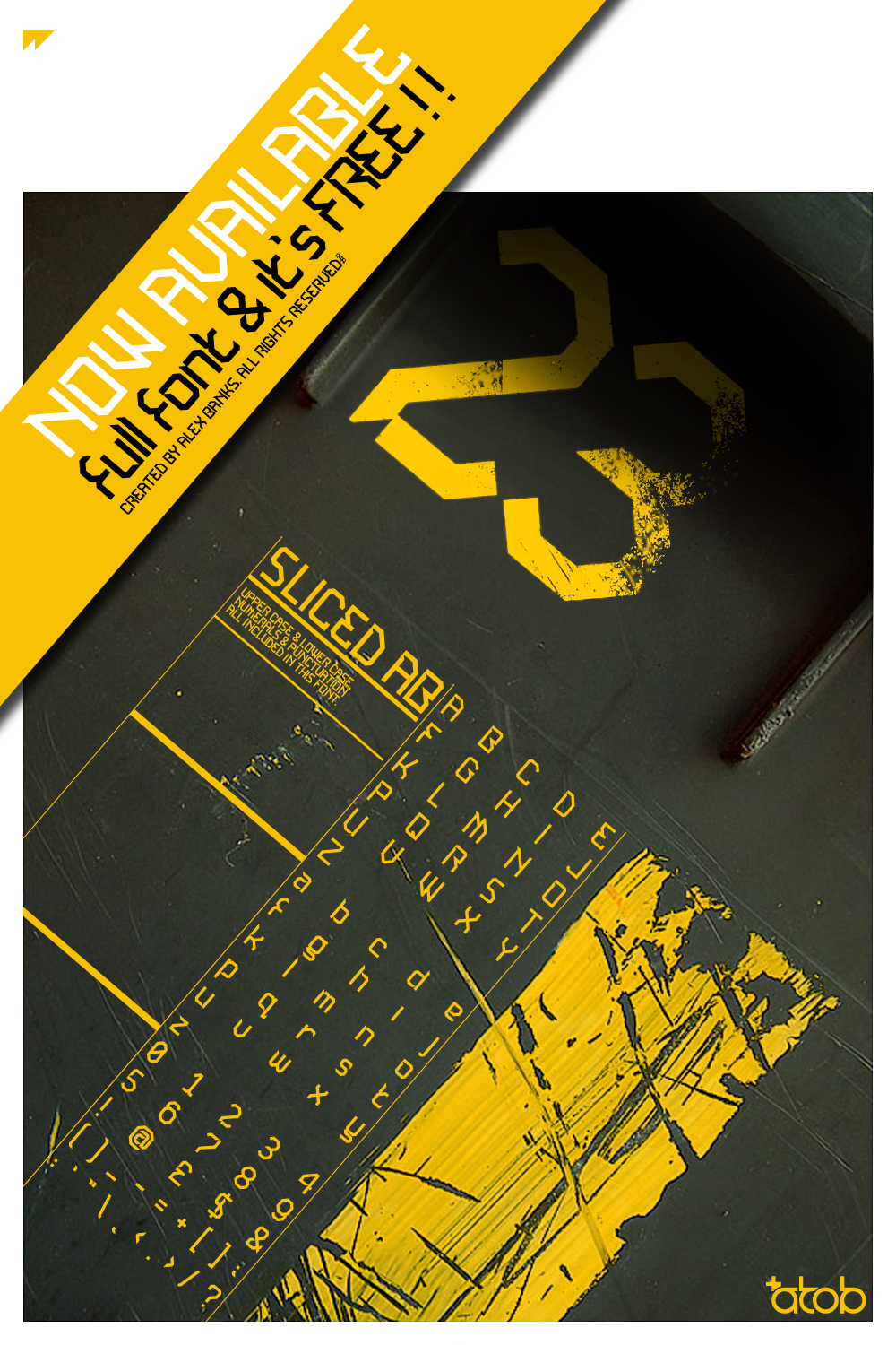
Nothing special, just started drawing a new style crest and turned into what you see.Program: Illustrator CS2
Time: 3hrs
Related content


Comments: 25


fantastic concept....., and gr8 composition.......
👍: 0 ⏩: 0


 (Wink)")

One thing, your logo in the bottom left is a little poor quality.
👍: 0 ⏩: 1

it has a stroke around it doesnt look the best, but cudnt be bothered fixing it, n reuploading it. been too busy bombing around in my new car !")
👍: 0 ⏩: 1
It arrived! Good on ya! Other than that though it's a great dev, I think one or two simlar deviations could be good too.
👍: 0 ⏩: 0


 (Smile)")


This is look GreaTT... are u gonna make a T-Shirt out of it??? it might look KEWL for sure
👍: 0 ⏩: 0

only objection would go oagainst the typo PLUG IN TURN ON TURN UP. I know it is aligned, but the IN goes too much into the gap, it looks wierd .)
👍: 0 ⏩: 0


haha u fking random. nice work. dunt liek lines at bottom taht vary in weight tho. feels like hte should be constatn.... organic doesnt fit with teh mechanical theme
👍: 0 ⏩: 0


