HOME | DD
 AutodidactArtAcademy — Hush Color Study

Published: 2014-05-26 10:49:13 +0000 UTC; Views: 2952; Favourites: 52; Downloads: 14
Redirect to original
Description
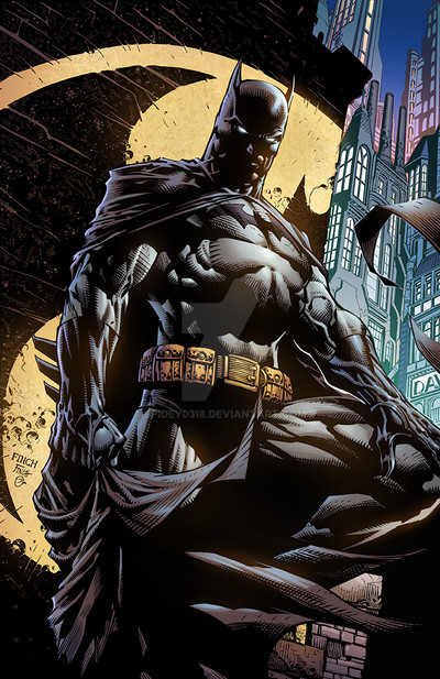
Originally submitted: September 22, 2013Original on the right, my study on the left (using Jim Lee's pencils, uninked).
Related content


Comments: 4

Hmmm. To be honest I think the one on the right is the better of the two, at first impact. To be fair, it's an inked picture vs. a penciled picture, so of course inks feel more complete, and that makes a fair comparison difficult. Pencils put an additional level of difficulty on the colouring.
The thing I feel needs some work on the one to the left is readability. Sure, it has a lot more details, but it's more difficult to make out where the background ends and where Batman's head and cape begins. The rocks in the background are a bit overdetailed and therefore confusing to the eye. Catwoman and Albert are also much more readable in the image to the right. But again, we're comparing pencils with inks. I can only compare the two images on a first impact basis.
The best artists in the industry always told me (when I had the luck and honor to interact with them) that storytelling should come first. One of them went as far as telling me "you're agood artist, but your job is not to be an artist. You're a storyteller. Stop overdetailing, shut the artist up and listen to the storyteller". I think that improved my work greatly, best advice I ever got.
👍: 0 ⏩: 0


")