HOME | DD
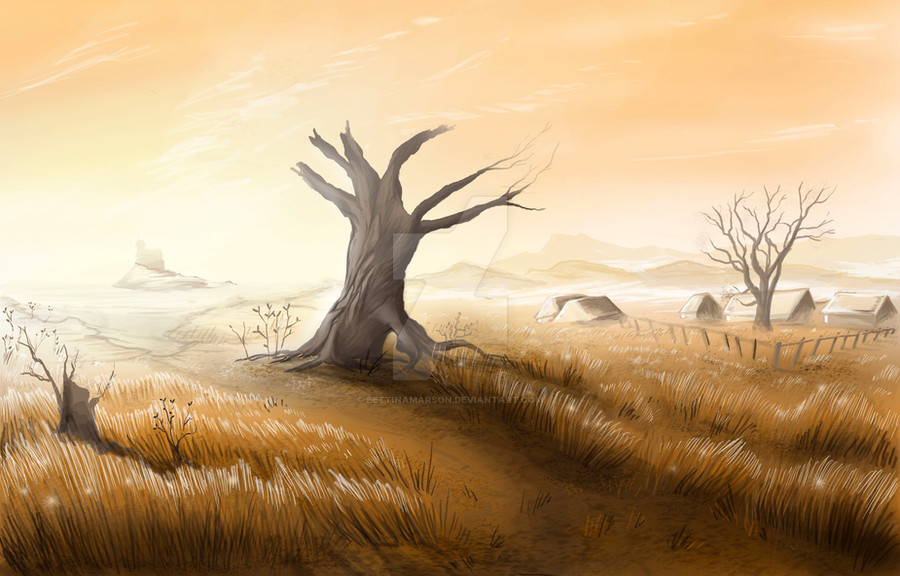
 BettinaMarson — Tabernacle Concept: Fields
Published: 2009-08-10 11:13:58 +0000 UTC; Views: 1193; Favourites: 20; Downloads: 0
Redirect to original
Description
"Tabernacle". A 6th century Northumberland re-creation and emersive experience project, 2009.Hamlet fields concept. Painted in Photoshop CS3.
Also my first time digitally painting.
 (Smile)")
________________________________________ ___
This artwork is individually registered under copyright laws with MyFreeCopyright.com, and action will be taken should you plagiarise, illegally copy, post, or steal this work. Viewing is Free, but stealing is very costly. For proof, please visit my account here: [link]
Related content


Comments: 14

Kinda reminds me of the barren desert in the Lion King after Scar took over 
👍: 0 ⏩: 1

Ah! I hadn't considered the Lion King but now you mention it I see what you mean! It was meant to be an autumn scene but I feel I might have ended up dehydrating the landscape too much.  - :P")
👍: 0 ⏩: 1
When you say dehydrating do you mean literally or figuratively?
👍: 0 ⏩: 1
Oh! Figuratively I guess - I didn't expect it to turn out so brown. Apparently that part of the world is drenched in Autumn, so I would have to take it back into Photoshop and alter the colours a bit.
👍: 0 ⏩: 0


I will try being critic for once. I believe I will be wrong in some points, but I hope to keep it fair, straight, and directly related to how I think of it.
This painting, to me, looks a bit like traditional art. I think it is great that this piece doesn't look too digital, it gives a more realistic feeling to the environment. This piece reminds me of your other painting “The colours of freedom”, you seem to apply similar style and technique, but in digital with more detail and control. The colour is more subtle in this, and monochromatic, which quickly sets the overall mood.
Overall, I think the piece got a surreal, dream like, quality to it because of the light and the colour. The environment here is simple, but has deeper ideas or stories behind it as suggested by the mood and the smartly arranged composition of each elements in the painting. I think you can improve on it if you want to make the piece looks more realistic and finish, by adding more detail on the roof of the houses, blurring the mountain in the background on the left a bit more to make it appear more in distance and make the tree on the left look more like it is behind the grass. You should experiment with custom brushes for which I think you might find that interesting.
👍: 0 ⏩: 1
Thank you so much for your insightful critique. I cannot express how much I truly appreciate your advice and thoughts. I have never painted in Photoshop before, so this painting took an excrutiatingly long time to do; this would have taken someone with greater skills only a couple of hours to do. I wasn't sure if it would be good enough to post up here because of this.
I am glad you like this, first of all! Until you mentioned it resembles 'The Colours of Freedom' I hadn't actually considered I have my style of painting, haha!
Also, thank you so much for your tips on improving this! I am definitely going to attempt to follow these tips for this painting! I also really want to make custom brushes, but I think I may have to follow a tutorial on how to do this, as I have no clue how to make my own.
Again, a massive thanks for taking the time to critique!
👍: 0 ⏩: 1

Beautiful light here and the shadow of the tree is really well done!

👍: 0 ⏩: 1
Thank you so much! I felt nervous posting it as it is a media I have never used before.
👍: 0 ⏩: 1
 (Wink)")
Thank you! I shall be practicing a lot!
👍: 0 ⏩: 1
You're welcome and you deserve it! Practice is the only way for the success!
👍: 0 ⏩: 0