HOME | DD
 bigdavec — Misty
Published: 2004-03-04 17:45:16 +0000 UTC; Views: 309; Favourites: 4; Downloads: 194
Redirect to original
Description
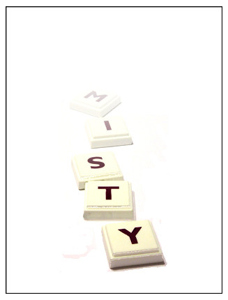
I have seen this done a few times now, playing with the letter tiles from games such as Scrabble, so I wanted to give it a go, with my own perspective, and here is the result.Related content


Comments: 43

I'm pretty sure you faked the mist effect in PS, but it's still pretty good. What does bother me though is the half circle (bleak reddish thingie) next to the Y. Kinda kills the entire image for me. Comp's good, concept too...shame about the thing - you can easily remove that in PS. Do it and I'll comment again later
 (Smile)")
👍: 0 ⏩: 1

Thanks for your insight. I se what your talking about now. I hadn't seen that before now. I suppose I'll get round to sorting that at some time.

👍: 0 ⏩: 0

So simple yet so clever! Are those word up tiles, my gram had that game back in the day before i could even spell, i would just build towers...back on topic...It is very white, but i dunno i tihnk it the tiles were more of a white it might work, mabey even a black bored instead might help all the white. But either way, great job
👍: 0 ⏩: 1
Thanks for your recommendations, and yes, they are Word Up Tiles

👍: 0 ⏩: 0


Great concept, I haven't really seen this done before so you get a full reaction.
👍: 0 ⏩: 0

if you want the deep balck colour in the tiles then you shoudl goto Image=> adjustments=>Levels and drag the black trigangle on the left side of the top graph further towards the right, this is the blackpoint it defines the level at which a pixel is defined as being perfectly black the further to the right it is the more pixels will be classified as 'Black' it will show up some minor imperfections in how you have masked out the backgound so i will need touching up.
👍: 0 ⏩: 0

you did it really good ... nice idea for a movie entry ..
👍: 0 ⏩: 1
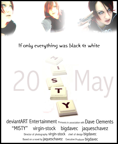
Thanks. Yeah. Good idea. It might work well as the main background to a movie poster. Hmm. In fact, I may even have to work with that.....Thanks for that. If I do submit something, you'll get a mention
👍: 0 ⏩: 1
thanks
also for your comment!
do you know the trailer of catch me if you can?
THATS ART !!!!
and with your style, you could do something similar, but also unique ...
👍: 0 ⏩: 1
Yeah, I know the one. I have been trying to think of something, but nothing yet. Will let you know
👍: 0 ⏩: 1

The way you laid them out and the fading fit this image just right. Good job man.
👍: 0 ⏩: 1
Thank you. Glad it worked well
👍: 0 ⏩: 0

*blinks*
People say more contrast, but the title itself should tell you that there's not going to be much in the way of definite figures.
Even though you can clearly make out the tiles, it still fits the title. It looks nice, the tiles spell Misty... and it gets mistier as it goes to the back... yup, cleverness.
I like it
👍: 0 ⏩: 1
Hehe. aye. Thanks for your in-depth analysis. Much appreciated ")
👍: 0 ⏩: 0


maybe a little contrast would have been nice?but again, one could interpret the picture as being done this way.
👍: 0 ⏩: 1
Yeah, personally I like it like this, gives it the atmosphere I was looking for. Thanks for commenting though. I appreciate your honesty.
👍: 0 ⏩: 0


ooooohhhh.... i might just steal that idea and incorporate it into something i was thinking of doing... very much enjoying this though!!
👍: 0 ⏩: 1
Hehe, why not. I can't say i was an original idea of my own anyway, so permission to steal someone elses idea given. Thanks anyway for the comments
👍: 0 ⏩: 1
oh yay!! i don't have scrabble though....

👍: 0 ⏩: 0

I likes, a lot! +fav!
was this a series of multiple exposures, or faded in photoshop?
👍: 0 ⏩: 1
Thanks for the 
👍: 0 ⏩: 0


Oooh, very nice indeed.
👍: 0 ⏩: 1

i'm like: oh my god!! this is awesome, so simple i love it love it and can't stop lovin it!!! really! it's so simple and yet so beautiful. all the clear tones and the composition. really amazing work here 
just something a noticed, there's a little red stain in the left of the 'y', is that on purpose, unnoticed or just because of my screen??

👍: 0 ⏩: 1
I'm REALLY glad you loved it so much. REALLY GLAD, and I mean that, bought a smile to my face.

👍: 0 ⏩: 0


Cheers. Glad you liked it
👍: 0 ⏩: 0

Awesome, man!
Sorta like they're trying to tempt you into following them through the viel of mist.  (Wink)")
👍: 0 ⏩: 1
Hehe. Well thank you. I always appreciate your incessant kindness
👍: 0 ⏩: 0

That's very cool...I love the tiles and how they fade into the "mist"
👍: 0 ⏩: 1

Misty hmm? Interesting. I think it needs more contrast..
👍: 0 ⏩: 1
Yeah, it does, agreed. But the thing is, it wasn't giving me blackish tones, but more like Creamy ugly grey tones, when i turned up the contrast. I'm going to keep playing and see what happens
👍: 0 ⏩: 1
Well good luck. Hopefully it'll work out. I've been playing lately with new things in ps7.. Layers. yay me! hehe.
👍: 0 ⏩: 0