HOME | DD
 BigJimmyC — xx and then smile

Published: 2007-01-13 22:53:06 +0000 UTC; Views: 2269; Favourites: 24; Downloads: 36
Redirect to original
Description
Brushes: Miss M missm.paperlilies.com/Related content


Comments: 43

Short and to the point. Like this one a lot. Like the way you do montages
👍: 0 ⏩: 0

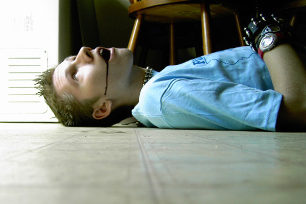
An image like this actually would have had commercial possibilities, but it is so blown and burned that it is unusable.
I hesitated to say anything because I have noticed that you like to push the Dynamic Range very high in most of your work. So I assume that you like the look of it. I also understand the pushing the Dynamic Range so high could be part of your artistic aesthetic, in which case, please just ignore this entire comment.
I really like your creative ideas and how you use your imagination, as well your sense of color. But i think all of that gets lost to blowout and burnout. The problem with this kind of technique is that it renders the photos unusable in any commercial application. This is not an issue if you never plan on Rights Managing your work, or selling the work, or ever having it published which is of course, perfectly fine.
But I thought I should talk about it a little just in case you are not aware of what happens when DR is pushed too far. When DR is pushed too far, most of the available tones in the image blowout and burnout, leaving the tonal quality rock bottom. If this is then screened for press, plus inherent ink bleed, you end up with a mess.
The downside of blowout and burnout is that you loose details in the shadows and highlights. Since there is no pixel information in these area, it cannot be fixed either in the darkroom, or digitally, except by creating pixels that were never there.
The other problem with excessive blowout and burnout is that it narrows the available tonal range, so that all of the remaining pixels representing the rest of the image, have to be expressed in a narrower tonal range, thereby decreasing tonal quality, resulting is a poorer quality of image.
Blowout and Burnout do not translate to Print Media well. Due to the ink absorption properties of papers, photos with a lot of blowout are generally not acceptable for commercial use. This is because tones closest to Blowout drop-out, which can cause the Blowout regions to enlarge considerably. Tones closest to the Burnout drop-in, which can cause the Burnout regions to enlarge considerably. It gives a splotchy look with very poor overall Tonal Quality.
Highly engineered papers greatly reduce absorption, but at great cost, and often with higher acidity of the paper.
There are 256 available tones in an 8 bit color or grayscale image, including black and white. It can be a good challenge to see if you can get the effects you want, short of actual blowout and burnout.
👍: 0 ⏩: 0

lmao
your stuff always puts a smile on my face
")
👍: 0 ⏩: 0

i am in love with this print. in love great work. *favortes and *watch for you=]
👍: 0 ⏩: 0

Haha love it Jimmy. How are you doing? Haven't talked to you on msn in a long while. I hope you are doing good.
👍: 0 ⏩: 0

YAY FOR BEING A SHAMELESS WHORE!!!! I'M ONE!!!!
👍: 0 ⏩: 0
YAY FOR BEING A SHAMELESS WHORE!!!! I'M ONE!!!!
👍: 0 ⏩: 0
YAY FOR BEING A SHAMELESS WHORE!!!! I'M ONE!!!!
👍: 0 ⏩: 0
YAY FOR BEING A SHAMELESS WHORE!!!! I'M ONE!!!!
👍: 0 ⏩: 0

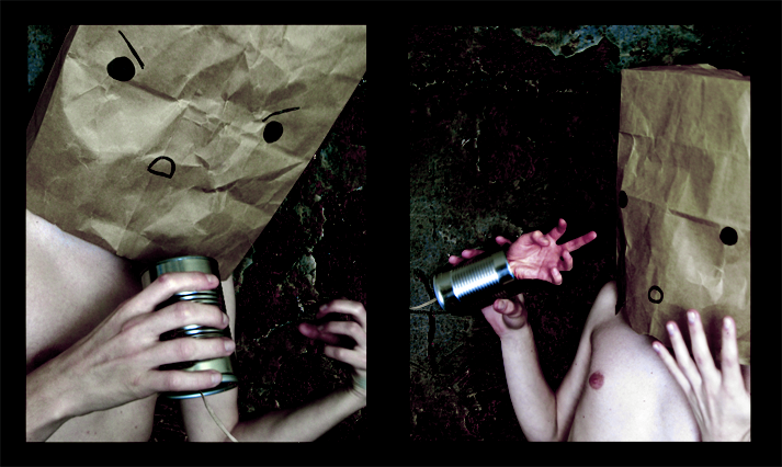
I like the little blotch stamp thing in the bottom right corner.
Let's get married again
👍: 0 ⏩: 0

NIce work good to see you posting again. Really Fresh and fun. hell and the model is kind a cute too!
👍: 0 ⏩: 1

Naw, the model has bad acne and if we don't get a good angle his nose is huge. So I'm working on finding a new one.
👍: 0 ⏩: 1
you nose is not huge and hell at my age I still have acne just takes a second to make it go away in photoshop
👍: 0 ⏩: 1
Hahaha! I love my nose, it's my most masculine feature. When I commented that I was like, "Lets see if he remembers that's me in that photo!" Usually you cant see my acne in photos anyway but if I have to I edit it out. Moles and scars are the only things I dont edit out.
👍: 0 ⏩: 0
NIce work good to see you posting again. Really Fresh and fun. hell and the model is kind a cut too!
👍: 0 ⏩: 0


Your work amuses me so much.. I love the one of your backside. it was very unexpected...
👍: 0 ⏩: 0


Not as much as I love your face :-*
👍: 0 ⏩: 1

I'm in love with the angle/posing and colours in the fourth panel especially.
👍: 0 ⏩: 0


Hahahahaha! my sister just came in and said "what are you looking at Fernando!!!???"
HAHAHAHA! I love you!!
 (Smile)")
👍: 0 ⏩: 1
I'm glad! I fear it growing stale.
👍: 0 ⏩: 1

definitely not.
All you work simply amazes me.
👍: 0 ⏩: 0


Hahaha, nope. They're those mini cookies. Cookie Crisp. I love them so much.
👍: 0 ⏩: 1

Oh my Moses! I love Cookie Crisp!
👍: 0 ⏩: 0

i like it,
i like your style
i always like seeing what have next

👍: 0 ⏩: 1
Thank you. I actually think this is too light for me but I didn't want images to be too dark in color so I made it lighter before I posted it.
👍: 0 ⏩: 1
Yeah actualy i think the lighting i noticed first about this
but still makes it still stand out
even with the rest of your work
im a pretty big fan of your gallery
i love the images you capture
and that light is a important facter to your pictures
noticing that picture might be to dark
or using light to enhance a part of your work
is such a strong resource
once again a huge fan of your work haha
👍: 0 ⏩: 0

This is just awesome!
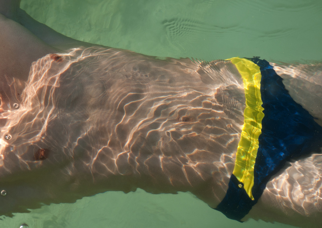
The only thing I would suggest is to some how get rid of the glare in the first picture.
👍: 0 ⏩: 1
yeah, that glare bugs me too, but I can't do a whole lot. I can see what I can do though. I just kept kind of ignorning it when I was editing the images together, hahaha.
👍: 0 ⏩: 1
S'll good though. Still really like it!
👍: 0 ⏩: 0

I'm in <3 with the upper left quad.
No matter how hard you try, you could never be a shameless whore. lol
Anyway, I wish that I had some constructive feedback to give you because I know you like that but I'm afraid I suck at that sort of thing.
")
👍: 0 ⏩: 1
Meh, don't worry. I didn't really want any one to critique this piece though, I was almost sure I'd get some weird comments on it anyway.
👍: 0 ⏩: 0