HOME | DD
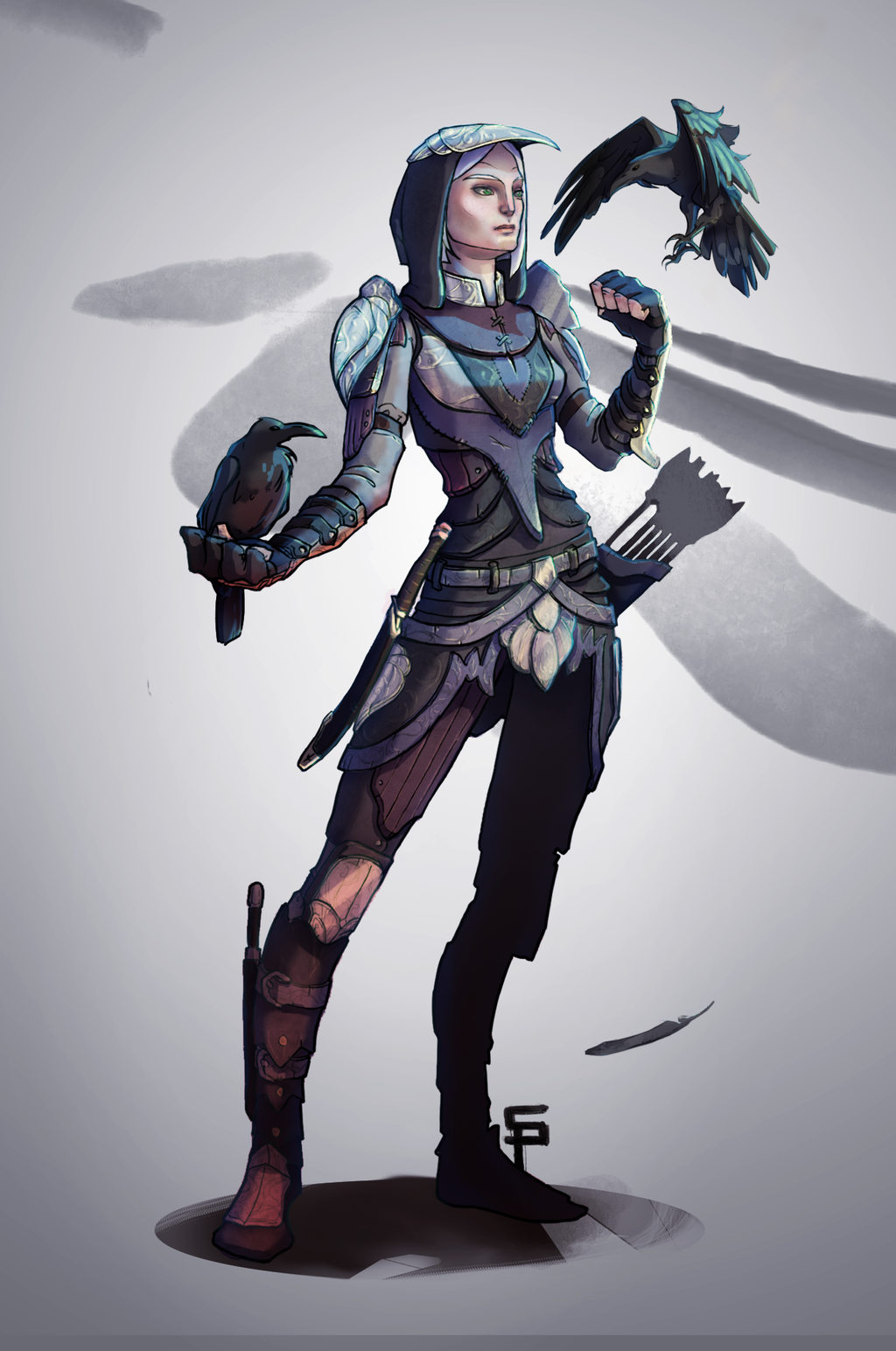
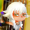
 bioniclop18 — Armored Hasu

#armor #oc #sword #rabbit #womanwarrior
Published: 2020-01-24 15:16:35 +0000 UTC; Views: 477; Favourites: 102; Downloads: 1
Redirect to original
Description
So because Hasu is a warrior priestess I can't keep her half nude all the time and even if she is inspired by aztec warrior I can't give her aztec armor considering the world she live in. First because she live in world where people are smelting iron (contrary to the aztec) and therefore Iron armor and the like should exist.
As she is not noble I didn't want to give her full plate armor either so I compromised with chainmail, and some plate where she would need them the most. To remind of the aztec origin of her design, I wanted the helmet to have the shappe of an animal and...
I choose the rabbit.
I mean how can a rabbit knight be taken seriously, right ? Surely it is a joke ? And then she slash their throat while they laught it off.
Honestly I don't think it is the perfect design for her and I will continute to try and experiment about her armored chara design but I wanted to make a more detailed illustration of this armor to see how I feel about it.
Lastly unlike recent work with Postquam terrae where I did exeriment erasing the line, I decided to try again line work. I think it complement well the armor but note the clothe so I may mix the two next time.
Commission Open !, My Website , My Facebook , My Youtube
May you have a nice day !
Related content


Comments: 15

I like your inspiration for Hatsu
Rachel is similar to her in a lot of ways
Rachel is a robot who is considered “weak” like Hatsu is considered weak
Rachel wasn’t inspired by Hatsu
I like that we had similar ideas
How about you come back to my profile soon
I may be doing a girl with a bear mask in your honor
👍: 1 ⏩: 1

👍: 0 ⏩: 1
So true about the rabbits can be a pain
And I respect your ideas for my artwork and yours too
I’ll start the bear tomorrow or Monday
I have drawings and school work to do
👍: 0 ⏩: 0
👍: 1 ⏩: 1
👍: 1 ⏩: 1
👍: 1 ⏩: 0

I really like this design. I think the bunny helmet looks very imaginative and provides a nice little detail on otherwise simple armor. It’s nice to see the metal parts and their straps and I think the mail really ties everything together. The armor looks practical and easy to move in.
This image is a bit of a mix and match of textures – which breaks the illusion of coherency. The hair is thickly outlined and simply shaded, the sword barely has any shading at all, the armor is filled with lovely textures yet the fabrics are all smooth and evenly colored. It’s fine to add texture to the artwork and even mix different shading styles together but they need to work seamlessly. For example the braid wouldn’t stand out so much if all of the character had a darker outline. If you’re going for a more towards collage –style the parts should be even more further apart from each other, right now it’s kinda in the midway. You have a lovely way of using brush stroke textures so I’d advice on using them in all of the image, but just varying the style, direction and hardness of the strokes – so that different materials can be told apart yet everything works together.
Also this is apparently supposed to be a portrait – however why is the hair flying? If there were wind the other fabrics should float accordingly too or there should be more hints of it elsewhere (e.g flying leaves on the background). As a still pose this image works so I would rather have the hair laying down normally.
Colors however look great. You have a very good even palette with lots of lovely hues of red and brown and you’ve efficiently accented it all with that bright blue. The image looks pleasing to the eye and it has an interesting atmosphere.
All in all – this is a very nice piece!
👍: 0 ⏩: 1
👍: 0 ⏩: 1
Yes - your texture work itself looks amazing and those lively lines really make the image feel rougher
I think you have a great start for mixing things up - it just needs a bit more balancing up so that one part doesn't stand out too much.
I don't mind the floating hair per say ")
perhaps just add another hints of wind so it makes more sense.
👍: 0 ⏩: 0

👍: 0 ⏩: 1

Excellent work with this piece!
The anatomy here is quite well done.
The ambient lighting of the scene seen in this illustration is fabulous, as is the work with the shadows.
The rabbit mask I admit is a pretty nice detail and it is a bit hilarious.
👍: 0 ⏩: 1
👍: 0 ⏩: 1
No problem!.
And sup, that rabbit mask was a nice touch of originality on your part.
👍: 0 ⏩: 0