HOME | DD
 blackzer0 — I Promise To Be There
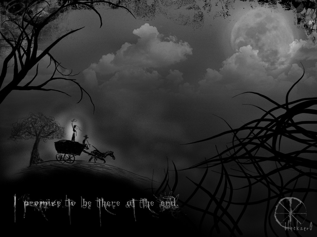
Published: 2004-01-09 15:16:19 +0000 UTC; Views: 8010; Favourites: 64; Downloads: 4150
Redirect to original
Description
Freehand, vector and photo manipulation.I made a white" version but I like this one better.
Comments are welcome
Related content


Comments: 113


really like this one.
just one thought though; am i the only one to see the clouds forming a man's face? by tilting my head a bit to the right, i can see a perfect image of a man in profile, especially in the thumb version. you've got the nose, mouth, chin and what looks like a sideburn. even the shades are a part of it..
if you don't see it, take a step back and look at the big cloud in the middle and imagine the small lighter "peak" as a nose with a clear nostril. makes more sense than it should, doesn't it?
..and once again, nice work!
👍: 0 ⏩: 1

hmm, i thinnnnk i can see something but i'm not sure. can you take a printscreen of the thumb and trace over it for me?
that's interesting, heh. i didn't intend to have a face there, that's for sure. i love it when other people see stuff in my work that I don't think of. and thanks!
👍: 0 ⏩: 1
of course i could do that, if only i knew how to send you a file in here... (Wink)")
guess i'm not very familiar with d.a. yet. which is the easist way to get you to see it?
👍: 0 ⏩: 1
you can post it to imageshack.us and send me the link  (Smile)")
👍: 0 ⏩: 1
here you go: [link]
hopefully this will show you what i mean, even though i know i could have done it more carefully. the original face looks much more stern than my version for example. but i just tried to highlight some of the main features so..
i asked a couple of my friends if they could see the face. even when i pointed it out, they were doubtful, like "eeeeh, yeah...perhaps. could be a face or something"...
the thing is i find it crystal clear; it looks like a face just as much as my avatar does..
by the way, how did you create the clouds? have you copied them or have you actually made them yourself?
👍: 0 ⏩: 1
ooooh. i see what you mean! cool, hehe. this was a 'mixed media' digital piee, with stock photos and vector and freehand, and the coulds were a stock photo that i altered before using.
👍: 0 ⏩: 1
glad you can see it. i was kinda sursprised no one else had commented upon it before..but efter having showed it to my neighbours i thought it was just me..
gotta go back now and scour the rest of DA for hidden thingies..
tacke care!
/johan

👍: 0 ⏩: 0


Wow haven't seen this one before. A few things to say as usual even though it's quite an old piece I feel obliged
Nice theme and the black/white suits the DARK AND EVIL nature of it 
The thing I love the most about this - REALLY love - is that crazy wiggly wheel on the cart and the mashed up little horsey pulling it (it's only got 3 legs, have some pity! hehe). Of course, i'm joking: a very atmospheric piece that is more about the thought that has gone into it than the actual drawing itself (although the dude on the cart looks awesome and the glow around him rools 


👍: 0 ⏩: 0

I wonder what font you used..??
all in all wonderful piece of work
👍: 0 ⏩: 1
I think I used Times New Roman, or another serif font, but the thing is that I painted over it and removed some bits here and there.
👍: 0 ⏩: 1
oh - wonderful work there then!

👍: 0 ⏩: 0

Noir...One of my two most favourite colours... Now, to the actual topic: the menacing atmosphere is quite impressive! Deep.
And...maybe the sky should be a shade darker?
👍: 0 ⏩: 0

This is bloody brilliant!!! So much detail... I have looked at it a dozen times and caught new deatil every time. I quite like the combination of hand work and photo! Lovely combination of textures.
Well done, you.
~D
👍: 0 ⏩: 1


I really like this, the whole mood of it. Somehow it reminds me of the "Sleepy Hollow" .. don't know why.. is that Johnny Depp there?
(I think if the moon, the clouds, and the writing had just a tiny bit more glow the whole piece would speak even more~ )
👍: 0 ⏩: 1
sleepy hollow! that does make sense.
good suggestion, I'll keep it in mind when I rework this piece
good to hear from you! 
👍: 0 ⏩: 1
Been good, uni is gonna start soon, and I need to finish a project by September, but somehow the Photoshop program pops up more instead of Word. hehe
How about you? How are you?
👍: 0 ⏩: 1
i'm okay.. quitting my current gig soon, some other projects in mind. big year ahead.
hehe.. i know what you mean with Photoshop!
👍: 0 ⏩: 0

It does, really.
He has done only a couple of animated movies. But if you're interested, you could always check "Nightmare before Christmas" (He only produced it, but his touch shows), and there's a new one that's supposed to be good. It's called "Corpse bride", and the drawings have the same feeling as "I promise to be there"
👍: 0 ⏩: 1
Nightmare before Christmas, people are like obsessed with it here on dA. jack skellington, right? the skeleton looking guy... actually i think i've watched part of it when i was a kid. this morning a deviant friend linked to the corpse bride website, true it looks a bit like this piece, heh.
cheers
👍: 0 ⏩: 0
*bows in respect*
One hell of a piece. Tim Burton would drool.
👍: 0 ⏩: 1
i've not seen any of his works, but a large part of the people who saw this thought it looked similar.

👍: 0 ⏩: 0

i love ur way of drawing the carriage and the ppl in it!.. love the shades... althought if i may say.. the tree on the right side look a bit fake.. if the were done free hand then okay.. but if it was done with brushes.. id be more than happy to share some awesome dark tree brushes
👍: 0 ⏩: 1
thanks for the comments
the tree was done freehand, and I agree it can be improved. if you don't mind, could you send me brushes to blackzer0@hotmail.com ?
👍: 0 ⏩: 1

i've fallen in love with this ^^
the smoothness of the whisps of grass and the tree at the front, then the textures and shadows of the clouds ^^ great contrasts! also the 'glow' around the person in the cart kind of represents that they are keeping their promise to me

👍: 0 ⏩: 0


Hey,
Just thought Id say that I love this. So much so that I had the "I promise to be there at the end" printed and its likness is not on my forarm in ink. Thank you.
Kody
👍: 0 ⏩: 1
Whoa that means a lot to hear this mate, thanks!
👍: 0 ⏩: 1
I have a pic posted in my gallery check it out
👍: 0 ⏩: 0

this one has a beautiful ambience and great detail.
i love how you managed to give it the sense of depth with those several planes, just like and old disney movie.
👍: 0 ⏩: 0

P.S. Randomthought Inc. accepts NO RESPONSIBILTY for the lack of sense-making in her previous comment. Thankyou.
👍: 0 ⏩: 1
I'm gonna reply to that comment when I have more time. Let me just say up front, that you are something else, girl. 
👍: 0 ⏩: 1
awww shux....
")
again, TRULY well done on 'noir'- you have an amazing gift and I (among many I'm sure) am always grateful that you share your gift with all of us

👍: 0 ⏩: 0
Unfortunately I did not see the "white version" 
Watching these people,headed toward the dark & twisted unknown,the sense of forboding is ever-present and yet,eerily inviting...not unlike depression...the surprising part is that,sure,it looks dark where you are but as you keep moving forward you realise that where you were was actually the 'lighter'("easier" even,in some respects) part of the journey and you haven't even broken the surface of all that misery & pain. Depression is all-encompassing & ongoing and it takes your entire being, all that you possess within yourself to "get out of it" (so to speak..because it's never really gone.)and that's if you are one of the lucky ones...those without hope,sadly, never find that and they continue down that darkened path until all their energy is spent.darkness is forever.
There is actually a wonderful Tim Burton-esque quality here...perhaps it's the lighting, he(and you) have a knack for shining light on the darker things in life...which is interesting...not shining light in that "spiritual revelation/headed toward light & purity" sense of the word but rather,in that "light of truth"(or dark truth...) it contradicts itself in that sense. I love the withered and gnarly textures you have created here- in the trees and even with the people and the horse 'n' buggy- its funny coz even though they are continuing on their journey into the darkness, by the same token or in the same moment they are actually frozen in time...and that 'bleakness' and/or inaction has caused them to age and wither to the point of near death so that all they are is hollowed out shells of their former selves. They are suspended in time but their bodies continue to age.
You paint a rather grim picture here my friend...but you know what...I like it! I also love the role the moon plays here, hiding behind the clouds, watching rather than helping or guiding/lighting the way...it almost mocks them actually...its odd because all the inanimate objects in this, somehow you have given them life! or at least: a voice. They speak volumes with their silence. I get the sense that they are mocking the people really, taunting them...like they are merely voyeurs- presiding over some social science experiment- it's like throwing a grenade in to the circle and then stepping back to see what happens...interesting...This is rather fabulous- you never cease to impress me blackzero
I apologise for not having seen the other half to this ("white") as I don't feel I am getting the whole picture and thus could never give your work the full and total "appraisal" it deserves from within its originally intended context...nevertheless, these are my thoughts, do with them as you will and congratulations on another thought-provoking and visually intriguing piece 


👍: 0 ⏩: 1
you lost me a few times in there - but I saw your points, and they were GOOD! I especially like what you said about the moon and trees.
As for the white version, never mind it - it was a more "hopeful" version and looked very inferior to this one.
Tim Burton you say? I've never really seen any art of his. I should look it up. Isn't Burton a movie maker, though?
Anyway. Thanks for a great comment again, Errol dear 
👍: 0 ⏩: 1
I lose myself most of the time...I guess that's why I'm "randomthought"
and yes, Tim Burton is a movie maker, but he has a very distinct visual style, not unlike yourself...so yah, there were elements of your work that were slightly similar to his...it's a compliment! I promise!


👍: 0 ⏩: 0

Oooh. 08.12.04 - featured deviation. At least, or so I've noticed >_>
I was curious as to what the white version looks like, so I simply inverted the image :P Although of course it would've been different, as you've mentioned this one took more work. I can't exactly comment on how the changes you made effectively changed the mood of the piece , but it's mighty interesting, how colour can make such a difference.
You say you can't paint/draw. I beg to differ :) I love your sketchy style, and how its adequate rawness can convey such intriguing stories. I used to sketch in much the same way, before I decided details was more my thing. I still love this style though, its implications. Here, the few strands of long hair and the hankerchief indicating the possibility of the figure being female; and the general sense of pressure I get just from how the horse's neck is craned forward, creating a sense of rush, and being pressed for time.
I get a mixed sensation from the grass and branches. Perhaps intended? They seem to be reaching out, either menacingly (kind of like the foliage in Disney's "Snow White"), or with dread and worry, begging her to stay. At the same time they seem to be making 'hurrying' gestures, waving her off. From that, and her glow, I get that sense of doom. That glow, and how I can just make out a some sort of cheerfulness in her wave, create a sense of false hope. A light that's meant to dim and diminish. A promise meant to be broken (depending on how you see it, and how you're to define "the end").
I noticed "Sleepy Hollow" in previous comments ;] It's pretty much the first thing that came to mind. I suppose it's everything in this piece - the typography, the general style, the moonlight. And the overall darkness.
Love depressing stuff like this. And this took me way too long to type. I'm so out of it.
👍: 0 ⏩: 1
The white version had been removed in one of my earlier gallery cleanings, cause its quality doesn't even compare to this. Not inverted either =/
false hope... a promise meant to be broken
*nods appreciatively*
This 'noir' version has been so successful among my friends irl, and I've heard all sorts of interpretations - some optimistic, some pessimistic. This is what I love best, to hear what others see in my work.
Your comment was unexpected and marvelous. +r5 of course, beautiful interpretation. A FINE COMMENT.

👍: 0 ⏩: 1
... I probably shouldn't be saying this here but it's not totally unrelated so I'll just say it .
When I read the last three words you typed, "A fine comment"... I imagined it coming out in an Irish accent >_> ... and I laughed... coz... I... imagined... you... doing... that.
uh :|

👍: 0 ⏩: 1
| Next =>