HOME | DD
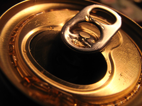
 bluespeed9 — Generic 12oz. - WIP
Published: 2005-01-10 07:33:42 +0000 UTC; Views: 5463; Favourites: 41; Downloads: 1003
Redirect to original
Description
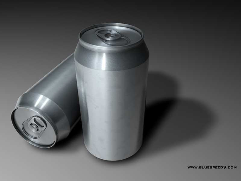
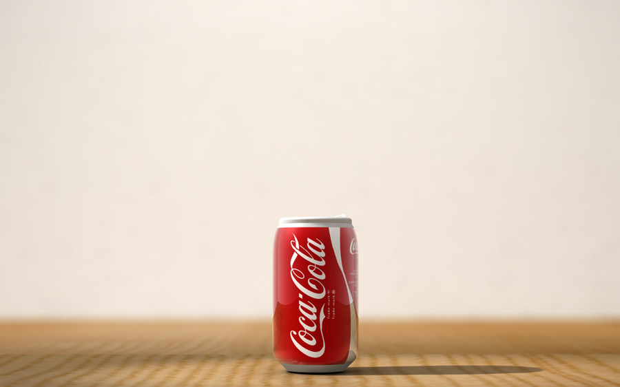
Well, this was supposed to be a Coca-Cola can but since I can't find a decent scan of a Coke label, I am posting this minus a label. Still, when I get back to school, I resolve to break into the art building and make myself a good scan. Also, the modelling isn't fully done, I'm not all that happy with the tab. Anyway, until I get around to finishing this, please give me some good criticism on this bad boy, I always appreciate it. Still a work in progress.Here's the link to the Coca-Cola render.
 Scene rendered in Cinema 4D.All models and textures created by me.
Related content


Comments: 68

hella nice
the only thing making it less real are the shadow and grey background, which basically is any other than the cans

👍: 0 ⏩: 0

Me likes...really nice work with Cinema!
Keep it up!
👍: 0 ⏩: 0

Great modeling...why dont u make your own drink with your own textures...you can find the needed logos and fonts and create somethig like Coca Cola Melon ")
👍: 0 ⏩: 0

with or without a lable, it's awesome anyway >.<

👍: 0 ⏩: 0

'Tis great! I really like the grey on grey, and really amazing details *goes to look through the rest of your gallery*
👍: 0 ⏩: 0

Wow....sweet looking cans! The opening looks friggin' real..
p.s
IKEA Addict... HAHA....that made my day
d.s
👍: 0 ⏩: 0

this one's really kool, i like it because it has no decals.
👍: 0 ⏩: 0

Oh wow!
I'm really impressed! The modelling on this is really great, but what got my attention was the material you have on there (I don't know what they call it in C4D... a shader?)
Anyway, I wouldn't mind getting some info in the setting you used to make that material - a kind of tutorial maybe?
By the way, check my message on the labelled one to see my preference
Great job man!
👍: 0 ⏩: 0

That little section between the top and the sides (the angled part) seems a little long. Also, what about the bottom corner and bottom? eh?
👍: 0 ⏩: 0

DANG!! really cool stuff... I love the finger smudges!
👍: 0 ⏩: 0

thats an awesome render!!! very real looking, perfect lighting also. well done!!
👍: 0 ⏩: 0


love the brushed metal material man
the top tab and stuff looks really good, accurate lighting
")
👍: 0 ⏩: 0


the lighting and pure cleanliness of the model is phenomonal... speaking from an ex-mod leader stand-point, not to mention a skinners stand-point.
👍: 0 ⏩: 0

... if you honestly want criticism.... The top appers to be larger than the bottom of the can.... sorry.... I really like it though...
👍: 0 ⏩: 0


Very nice metal texture and modeling. The reflection looks perfect, what settings did you use for that material? My only critique (even though I realize it's a pain to remodel) is that the inner tab looks inlaid a little too much, perhaps bevel it a little less, I think it should be a smoother curve. Other than that, great work, I'll have to see the finalized texture.
👍: 0 ⏩: 0

Did you know there are different sizes of soda cans?
👍: 0 ⏩: 0

oooooooooooooooooooooh pretty details....
<.<
>.>
*steals a can*
*runs* IT'S MINE!!! ALL MINE!!!
👍: 0 ⏩: 0

great lighting and very realistic as allways. great work man
👍: 0 ⏩: 0


I see what you mean by the tab... it needs to be rounded out on the edges. And that piece of metal (the thing you pop in) looks a bit deep. I think that should be flushed out - like instead of having that shallow bit, just have an engraving of the opening on there... At least that's how it looks like on the soda can I'm holding right now. Hope that helps
It's an great rendering btw, Jan had to ask if it was a real photograph at first
👍: 0 ⏩: 0

it looks very realistic, and I love this wonderful lighting & textures you used, it gives it such a brilliant and very professional feeling.
I'm curious what the finnished piece will look like, a dash of red on gray should be... fantastic.
👍: 0 ⏩: 0
it looks very realistic, and I love this wonderful lighting & textures you used, it gives it such a brilliant and very professional feeling.
I'm curious what the finnished piece will look like, a dash of red on gray should be... fantastic.
👍: 0 ⏩: 0

DUDE! That is freakin' awesome work right there!!! 


👍: 0 ⏩: 0


wow man that's good. they look damn realistic even without a damn coke label.  (Wink)")
👍: 0 ⏩: 0

Hmm..I'm definatly not and expert on this kinda stuff..But, from what I can see you did a really good job with it. I love the silver against the background, that's probably the part that sticks out to me the best
👍: 0 ⏩: 0

damned gods ! the details ! thats so close to something real !
excellent work !
👍: 0 ⏩: 0

Is there any reason you want to make this cola-related? Because although it is quite minimal, this works fine as it is. Perhaps if you are in one frame of mind, you could consider that they look rather like weaponry cannisters, perhaps a comment on the nature of marketing, and what we shove down our throats each day? Then again, it could just be an exercise in proportions and shadowing - and a well executed exercise at that.
👍: 0 ⏩: 0

I can't believe I'm not watching you! For some reason I thought you just never submited anything. If you want a coke can label, I got one, it's a really old one, but I usd it on my can if you want to have a look.
👍: 0 ⏩: 0

hrmm crit you want. well i think that the moddeling is awesome and the material you used fot the cans is prety sweet. it'll be fuckin awesome when you get the label scanned! i can't really see anything wrong with it d00d. though maybe it would be mega fuckin awesome if you did one open and coke spilt or something,. i don't know it looks sweet`!
👍: 0 ⏩: 0

on the can that is tipped over, the top part of it looks a little wobbly or out of perspective or something. Don't know but the rest of it is really awesome. Great texture.
👍: 0 ⏩: 0

Heh, pretty good. but nowadays they have shifted to the wide mouth opening, I think. o.O
👍: 0 ⏩: 0

yeah man the rendering looks amazing didnt know cinema 4D makes such cool renderings like this
did you used an e-map or HDR-map for the reflection
👍: 0 ⏩: 1

I did not use HDRI and since I don't know what an e-map is, I think it's safe to say, I didn't use one of those either. It's just modelling, texturing and my lighting rig.
👍: 0 ⏩: 1
cool for a simple lightning the reflections come out realy good but you didnt use GI is that right?
by the way e means enviroment
👍: 0 ⏩: 0


Wow amazing... they look so real! (my sister thought it was a photo till I told her it was a render!) sorry but I can't find anything to critique here...
👍: 0 ⏩: 0

Awesome work... The modeling is really well done and that brushed aluminum texture looks very realistic. If I were you, I'd make it a Pabst Blue Ribbon can instead of Coke, but then again I'm a total lush.
👍: 0 ⏩: 0


great work m8y, love those textures and lighting, i have the coca cola writing at a fairly big res if you need it (the one i used on my boat design), all the extra could be added to it in photoshop if your interested, cant wait to see em finished...
👍: 0 ⏩: 0

even though it doesn't have the labels it still looks fairly real.
👍: 0 ⏩: 0

Dude that ringpull is incredible!
I'm not sure but it could be slightly to tall...even with the perspective it seems a bit too big for a 330ml can.
Looks really cool, apart from that.  (Smile)")
You could do a whole series!


👍: 0 ⏩: 0

Nice work on that can shader! The modeling is good too!
👍: 0 ⏩: 0

a very nice model, and a great render too; the metal material is particularly nice, great work. i see what you mean about the tab, i would suggest perhaps lifting it a tiny bit from the can; it seems to be stuck straight to it - where there's normally a (very small) gap - maybe make it a bit shinier than the rest of the top, looking at the can of coke i have sitting here, the tab seems a bit more shiny.
👍: 0 ⏩: 0
Artisan-pixel [2005-01-10 14:30:28 +0000 UTC]
Man this is really great. The only thing that is bothergin me just a wee bit, is that on the tin i can see some spots on the body, that are just a bit darker than the rest. That makes it look a bit like dalmation spots
If the tin you have has them, or if i didn't notice them before on real cans, (You sure you didn't photograph those two???) then leave them!
Your shader work is really spot on IMHO.
👍: 0 ⏩: 1

holy shit i need to make myself a new avatar ")
👍: 0 ⏩: 1
| Next =>